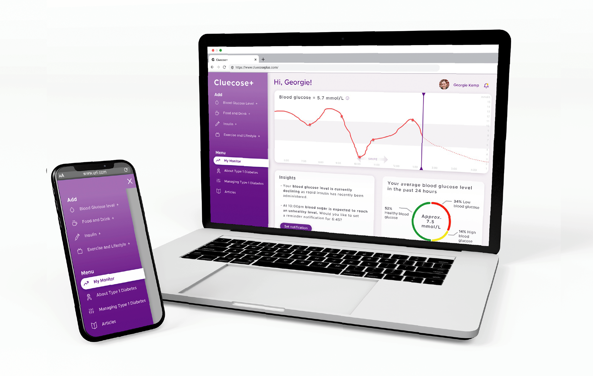
Cluecose+ diabetes tracking web app
Cluecose+ is the diabetes tracking web app designed to help all users understand how food, insulin & lifestyle can affect their blood sugar. Creating this web app has been an excellent opportunity to develop my UX and UI design skills. User interviews have been a particular highlight of mine and instrumental in discovering a diabetic's true needs when using the application. Creating a design system using Figma was a choice that has helped me develop my industry-standard software skills.
Cluecose+ is the diabetes tracking web app designed to help all users understand how food, insulin & lifestyle can affect their blood sugar. Creating this web app has been an excellent opportunity to develop my UX and UI design skills. User interviews have been a particular highlight of mine and instrumental in discovering a diabetic's true needs when using the application. Creating a design system using Figma was a choice that has helped me develop my industry-standard software skills.
I am delighted to say this project earned me the Examiner's Award for achievement in User Experience Design Practice in 2022.
The Problem Statement:
"How can carers of diabetics and diabetics, including those who may be young and/or newly diagnosed, best learn about their condition and how to effectively manage their blood glucose levels."
"How can carers of diabetics and diabetics, including those who may be young and/or newly diagnosed, best learn about their condition and how to effectively manage their blood glucose levels."
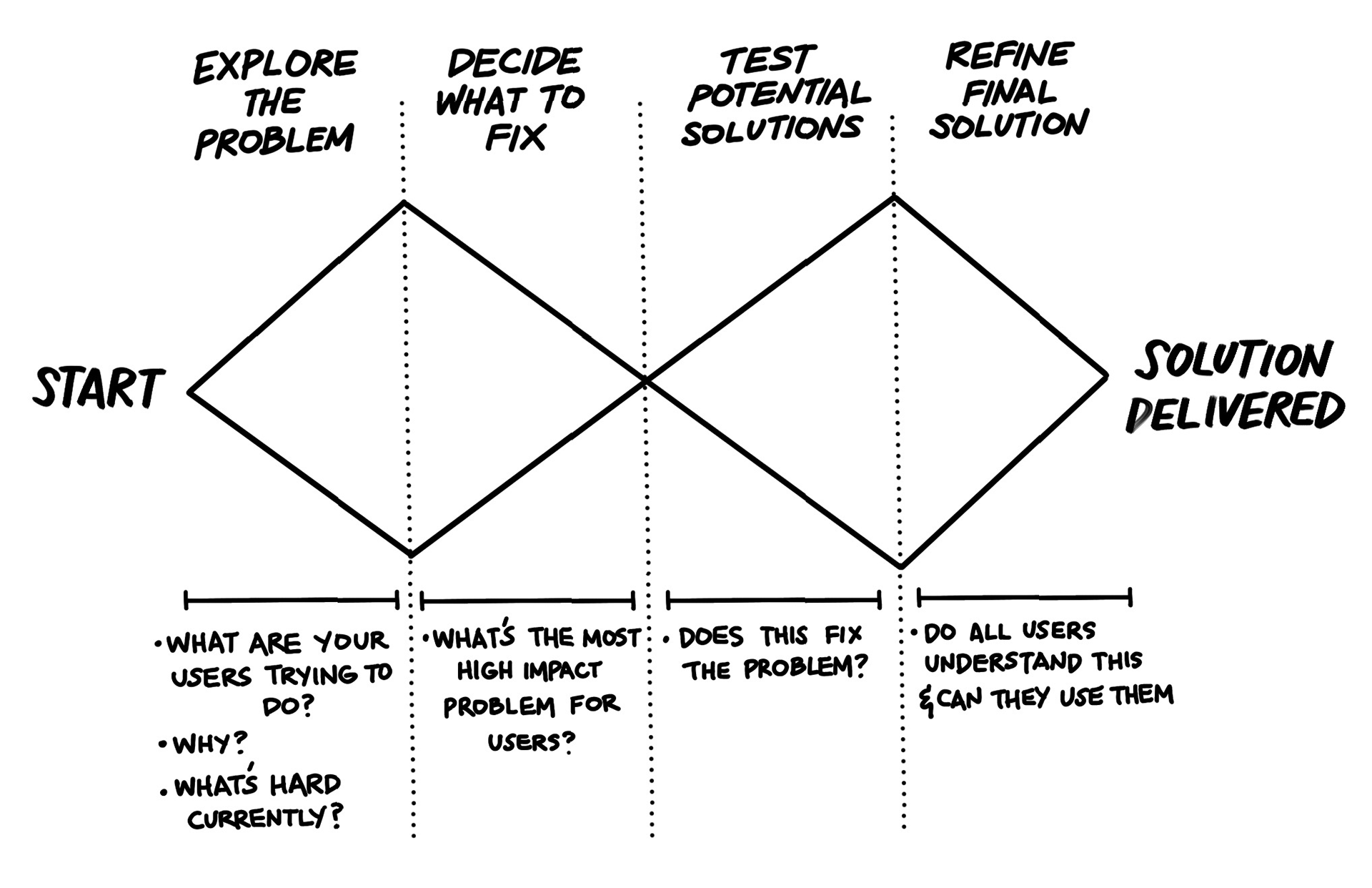
The double-diamond framework encourages an open-minded and iterative approach to solving the problem statement.
1. Discover (diamond 1)
1.1 Initial research. It goes without saying a lot of initial research went into reading about diabetes, watching diabetics' vlogs, trying to gain an understanding of what it may be like to live with the condition and how it may affect the user's daily lives, and exploring what products currently exist to help diabetics. This in turn helped inform me on what to ask my interviewee.
1.1 Initial research. It goes without saying a lot of initial research went into reading about diabetes, watching diabetics' vlogs, trying to gain an understanding of what it may be like to live with the condition and how it may affect the user's daily lives, and exploring what products currently exist to help diabetics. This in turn helped inform me on what to ask my interviewee.
1.2 User interviews were the most insightful and valuable aspect of all my research. Interviews helped identify the key pain points of the target audience. Talking with a diabetic highlighted just how many factors such as exercise, stress, and lifestyle affect blood sugar levels.
1.3 User personas & journeys were created from the rich insights gained from the interviews. Pain points and goals for each user were established. I intentionally varied the personas so each of them would have more varied pain points and goals, e.g. I plotted a younger more 'tech native' user whose goal was to eat-out with her friends and, therefore needed to calculate her carbohydrates in her meal quickly. On the other hand, I plotted a carer whose pain-point was a lack of understanding of the disease and needed to report back to the child's parents.
From these fleshed-out personas, I then created a narrative of the users’ journey, which maps out their existing routine to accomplishing their goals.
My of my user personas have three main paint points with their existing solutions where
- Inconvenience inputting data
- Lack of understanding of how much carbohydrates are in their food
- Confusion about how much insulin needs to be administered and when
1.4 User flows were built to identify opportunities to intercept their current, laborious journey. This part of the research is all about the ideation of solutions that will help users achieve their goals in a more efficient way. From this, I was able to create a list of functions needed for the site map & wireframes. it's an idealistic journey/dream scenario.
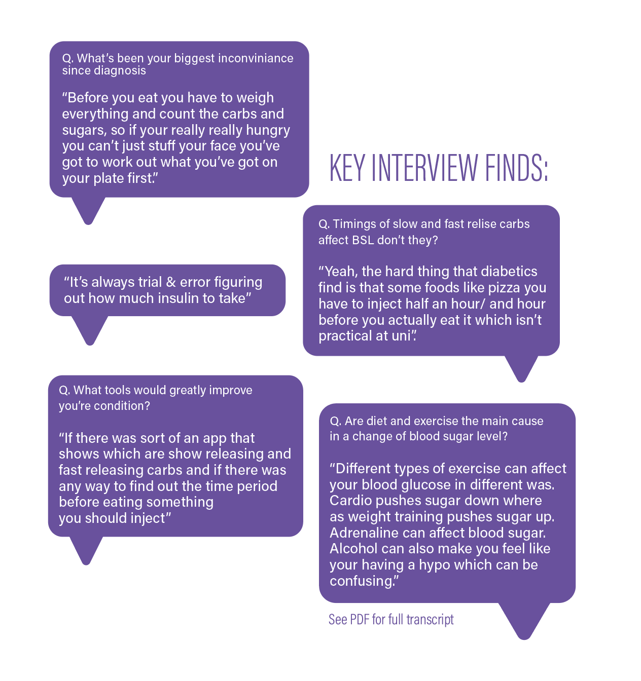
Snippets of my interviews
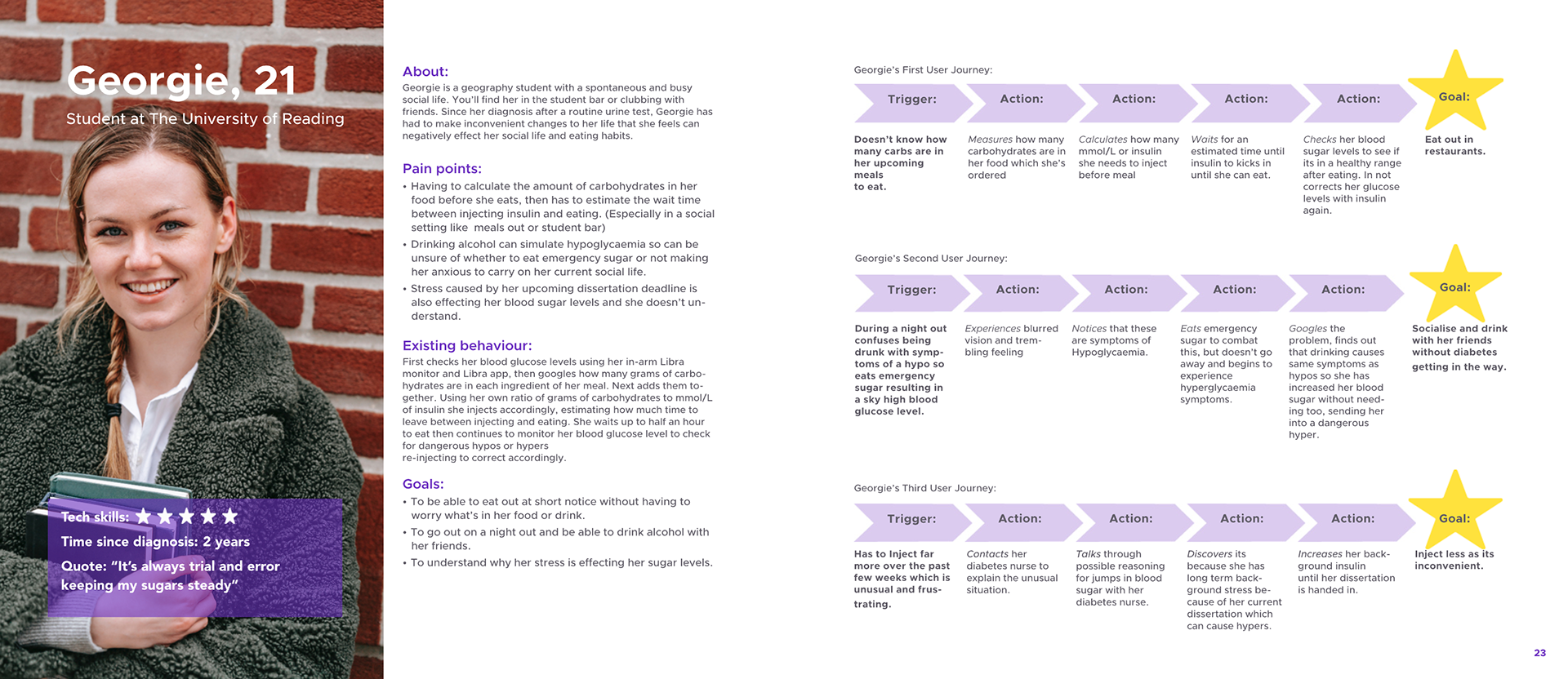
Example of one of my user personas student, Georgie
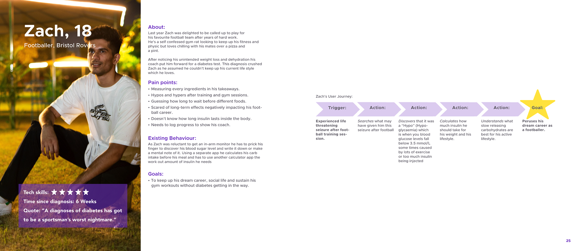
Example of one of my user personas, footballer Zach
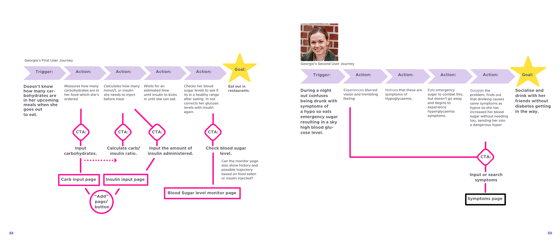
Creating a user flow from a user journey = extracting potential opportunities
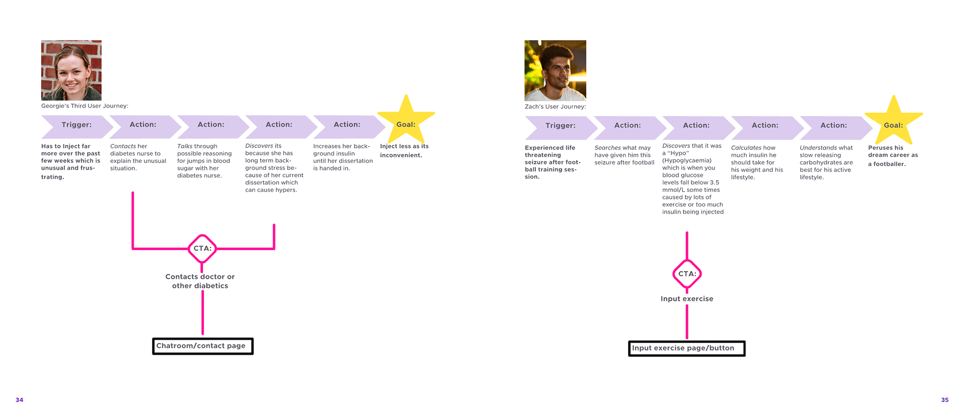
Creating a user flow from a user journey = extracting potential opportunities
2. Define
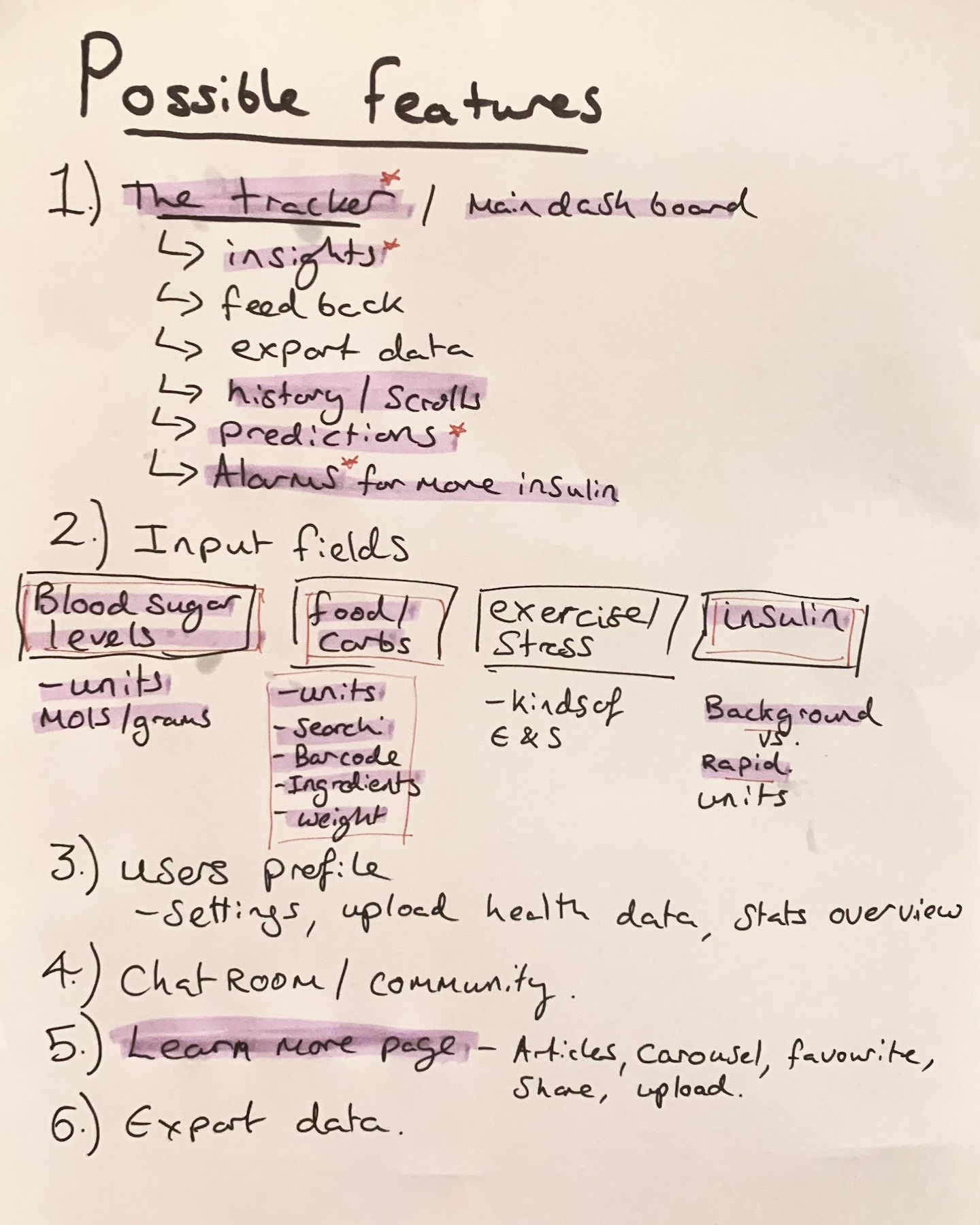
2.1 Define features. The converging stage of the design sprint is about defining areas to focus upon. The user flows (magenta diagrams) helped me create a complete list of all the possible features and action buttons.
I had to narrow down the list to what was truly necessary to create a product that solves the problem statement and what would be 'nice to have". (See hand-drawn list of possible features with selected 'must-haves' in purple highlight). I have since learned this is called a "Minimum Viable Product".
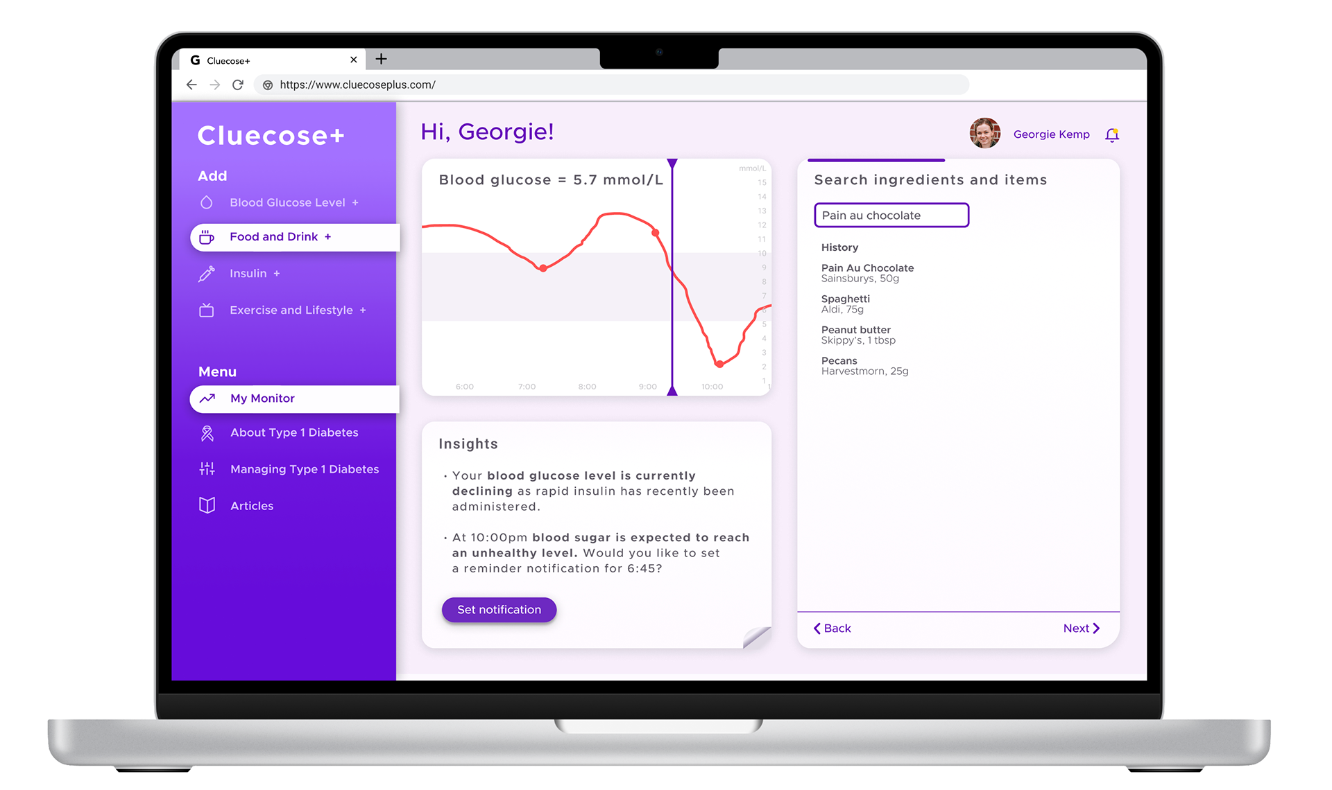
2.2 Site map After creating a list of 'Must Have' features I was able to draft up a site map. Since my initial research into tracking apps (1.1) I knew I wanted to keep the 'master input button' somewhere that would always be visible to the user. I had been inspired by the convenience of the 'plus' button from the MyFitnessPal app and the 'input on wake' style UX from the NaturalCycles app.
Purple Highlight indicates 'Must Have' features of MVP
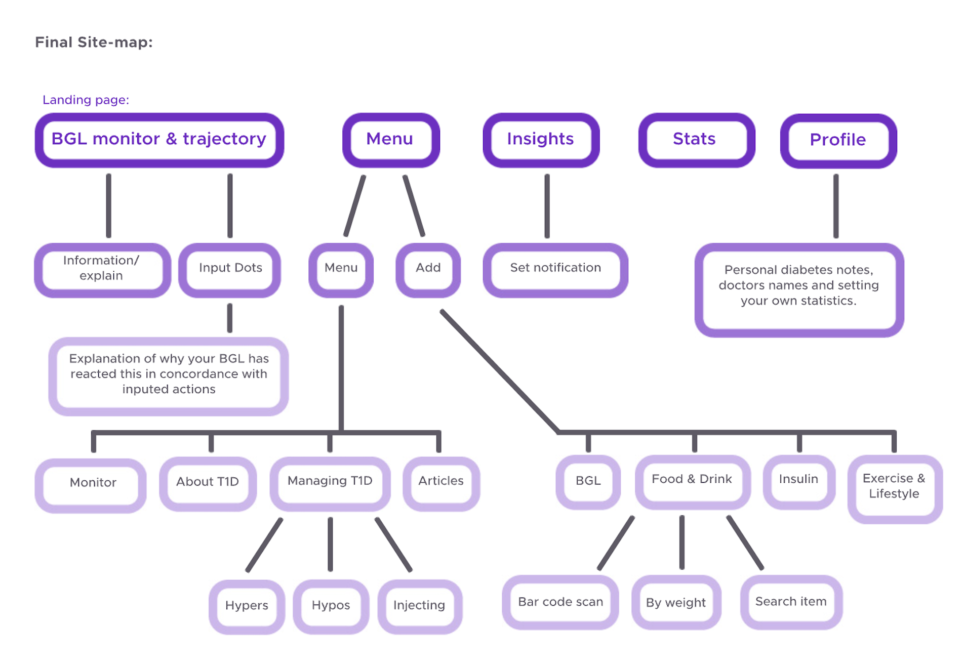
Site map created from MVP list
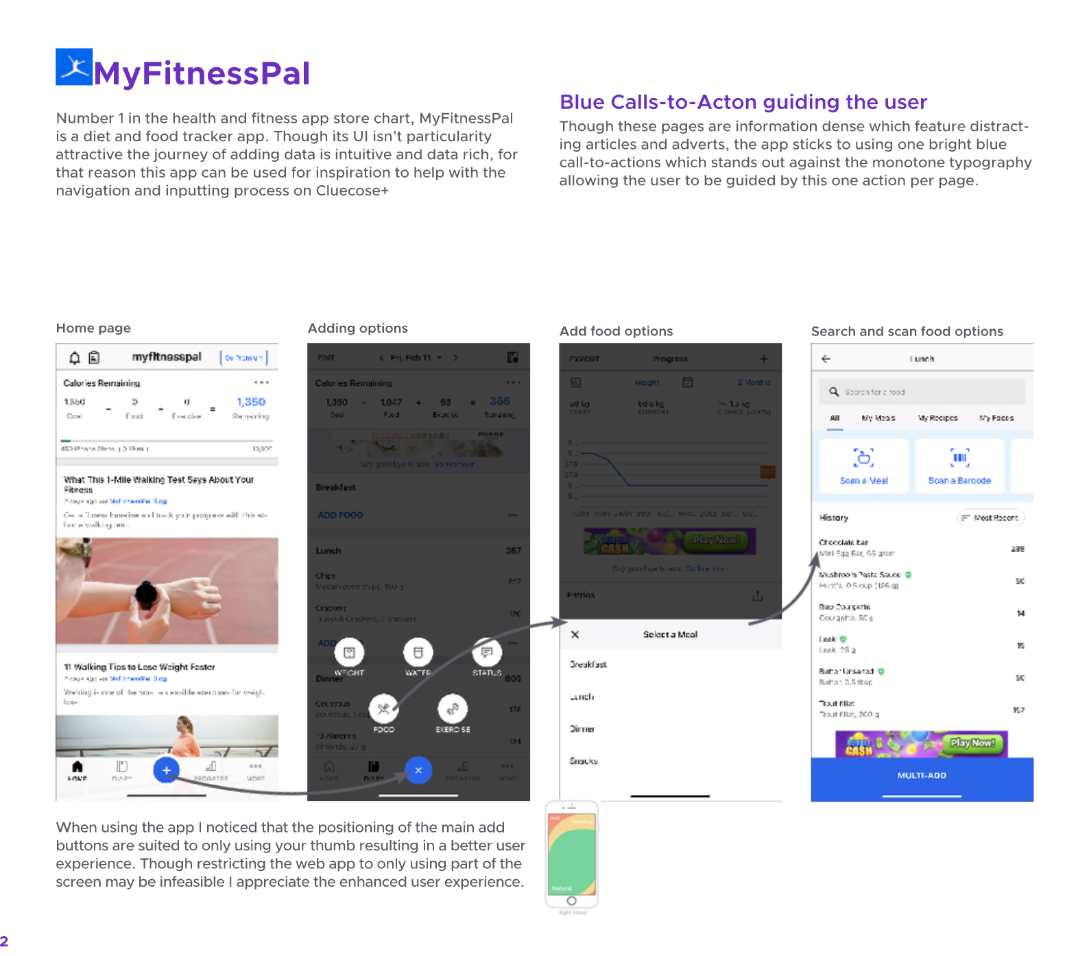
I find MFP add button really convenient to use, so took inspiration from it.
3. Develop & Test (diamond 2)
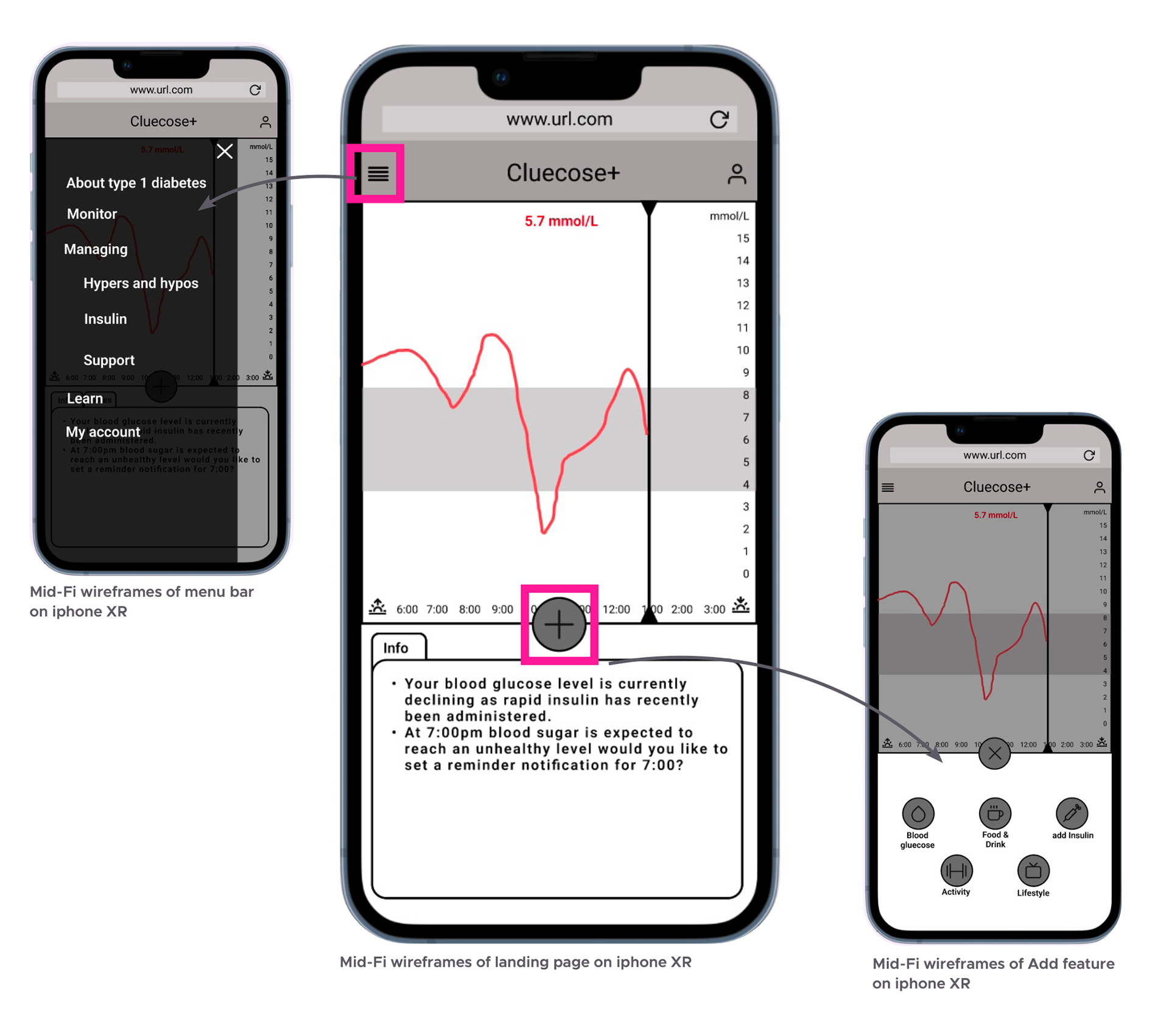
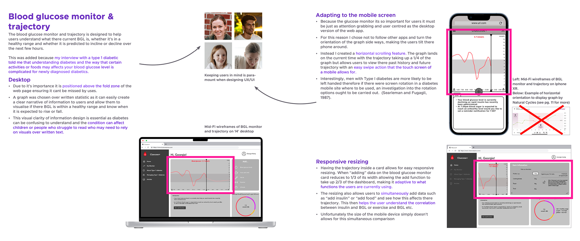
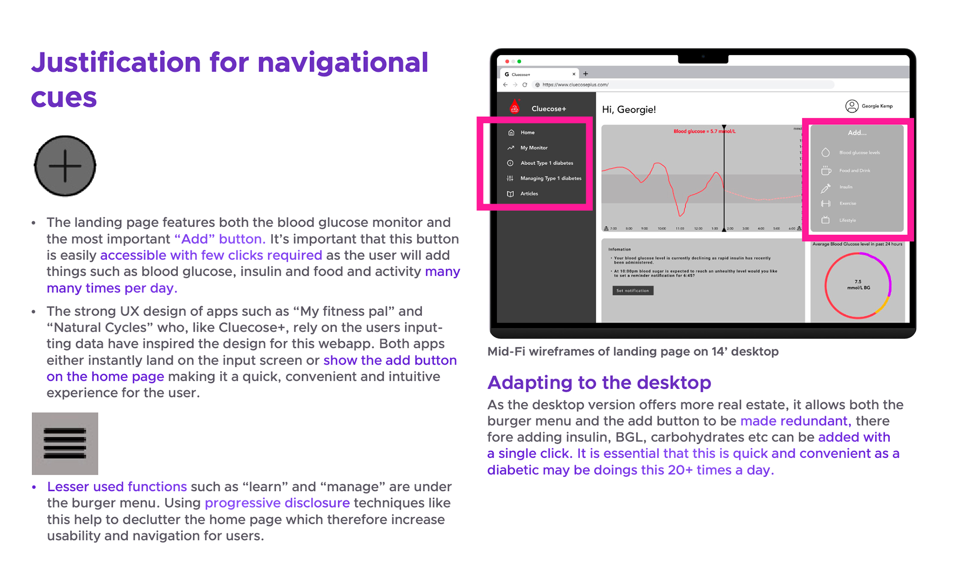
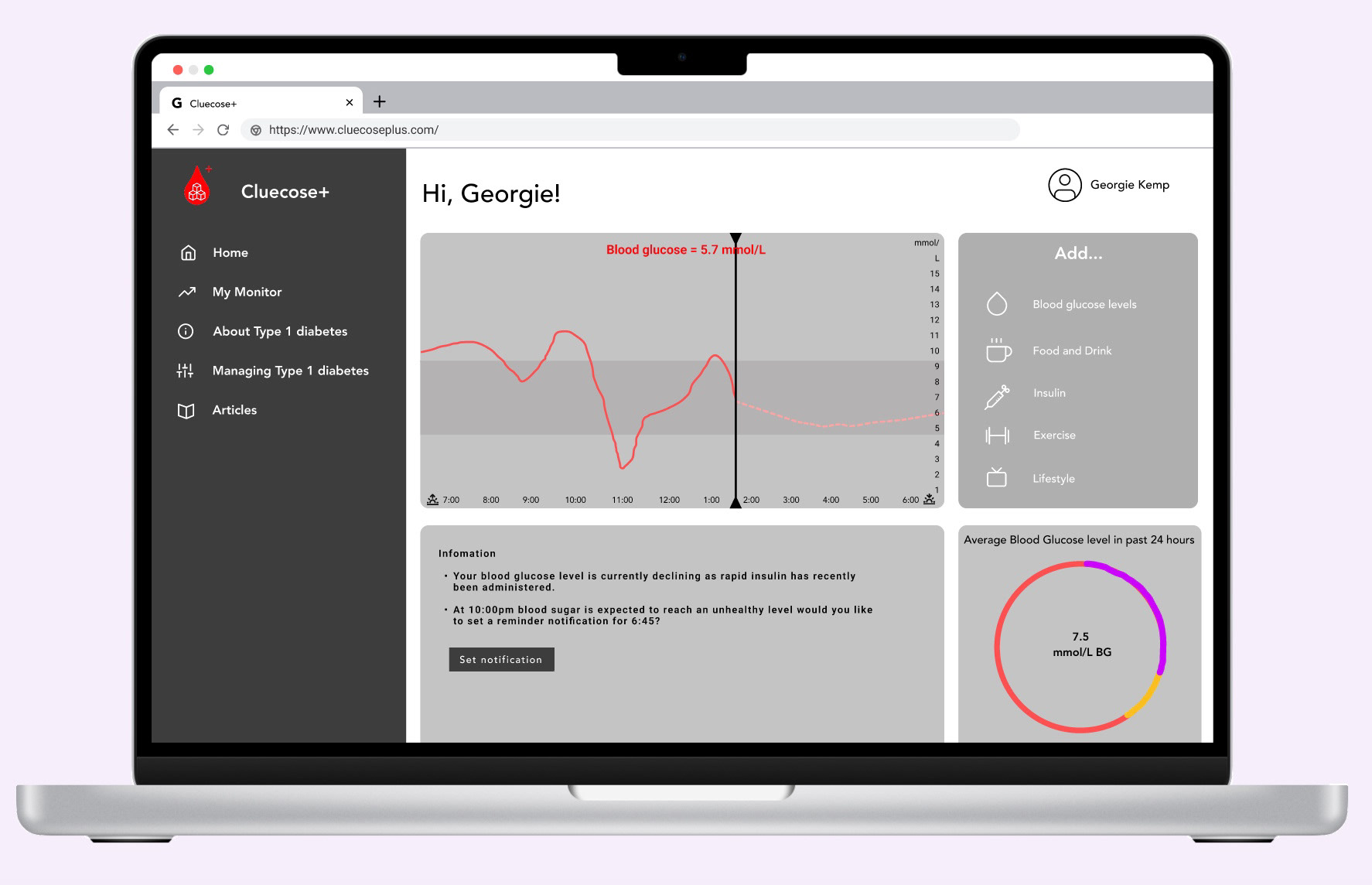
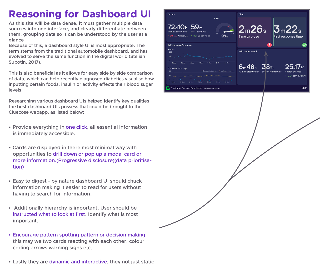
3.1 Wireframes. My users' goal was to better understand what affects their blood glucose levels. For this reason, I chose a dashboard UI as it best displays dense and varied data sets in an easily scanable way. I aimed for all information to be no more than a few clicks away.
3.1 Wireframes. My users' goal was to better understand what affects their blood glucose levels. For this reason, I chose a dashboard UI as it best displays dense and varied data sets in an easily scanable way. I aimed for all information to be no more than a few clicks away.
The hero widget for my dashboard design would be a chronological tracker. - It helps visually display trends in data over a period of time, in turn helping the diabetic user understand what controls their blood sugar levels whether that be insulin, carbohydrates, or exercise.
Creating lower-fidelity wireframes allowed me to quickly communicate the blueprint of the product to my user testing participants. The lack of UI encourages the user to focus on the bigger picture of the product rather than the UI details.
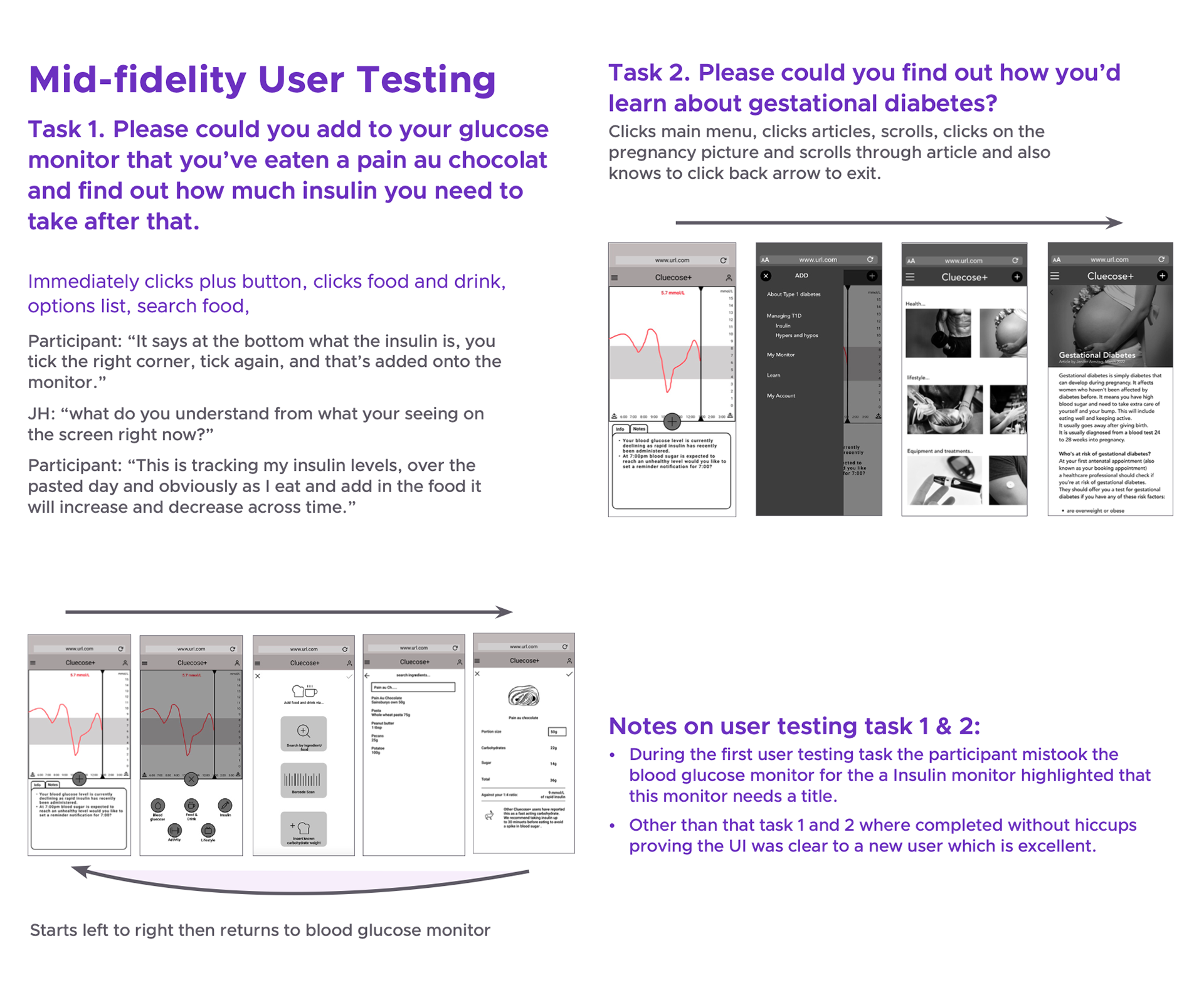
3.3 User testing. Alongside user interviews, initial user testing is my favorite part of the UX process.
It excites me to put my product to the test to see how real people use the prototype and identify which areas need more work to create the most intuitive user experience possible.
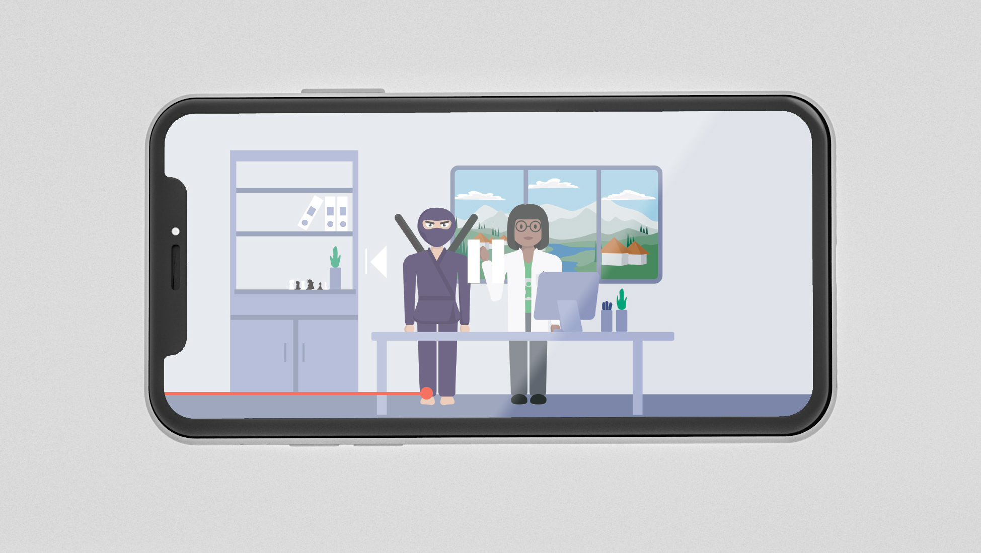
I asked my participants to complete a series of tasks and recorded their feedback. On the whole, they completed the task easily but the test did highlight some fundamental flaws in the design e.g. One user didn't know the hero widget (the blood glucose tracker) was scrollable - potentially a bit of a design disaster - but that's what testing is for! I've learned to always include a scroll bar as it's not explicitly clear to the user.
It excites me to put my product to the test to see how real people use the prototype and identify which areas need more work to create the most intuitive user experience possible.
I asked my participants to complete a series of tasks and recorded their feedback. On the whole, they completed the task easily but the test did highlight some fundamental flaws in the design e.g. One user didn't know the hero widget (the blood glucose tracker) was scrollable - potentially a bit of a design disaster - but that's what testing is for! I've learned to always include a scroll bar as it's not explicitly clear to the user.
This was my first user testing and I loved it. It revealed that one participant thought the blood glucose tracker was an insulin measure. Though this was easy to rectify, had this not been picked up in the initial user testing stages it could have caused serious issues for my target audience.
Their feedback was incredibly valuable and I thoroughly enjoyed hearing back from them.
Their feedback was incredibly valuable and I thoroughly enjoyed hearing back from them.
4. Design & Deliver
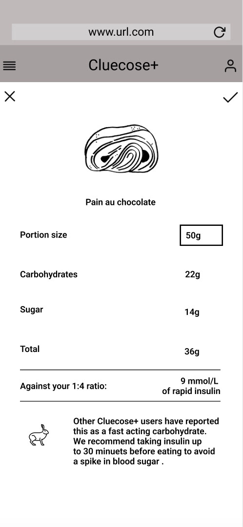
4.1 Refining design. After user testing, adjustments were made to accommodate additional features, such as flip cards. Flip cards are great as they effectively double your available screen space. This allowed me to keep essential information "above the fold" (the portion of the screen visible without scrolling), while avoiding overwhelming the user with non-essential elements.
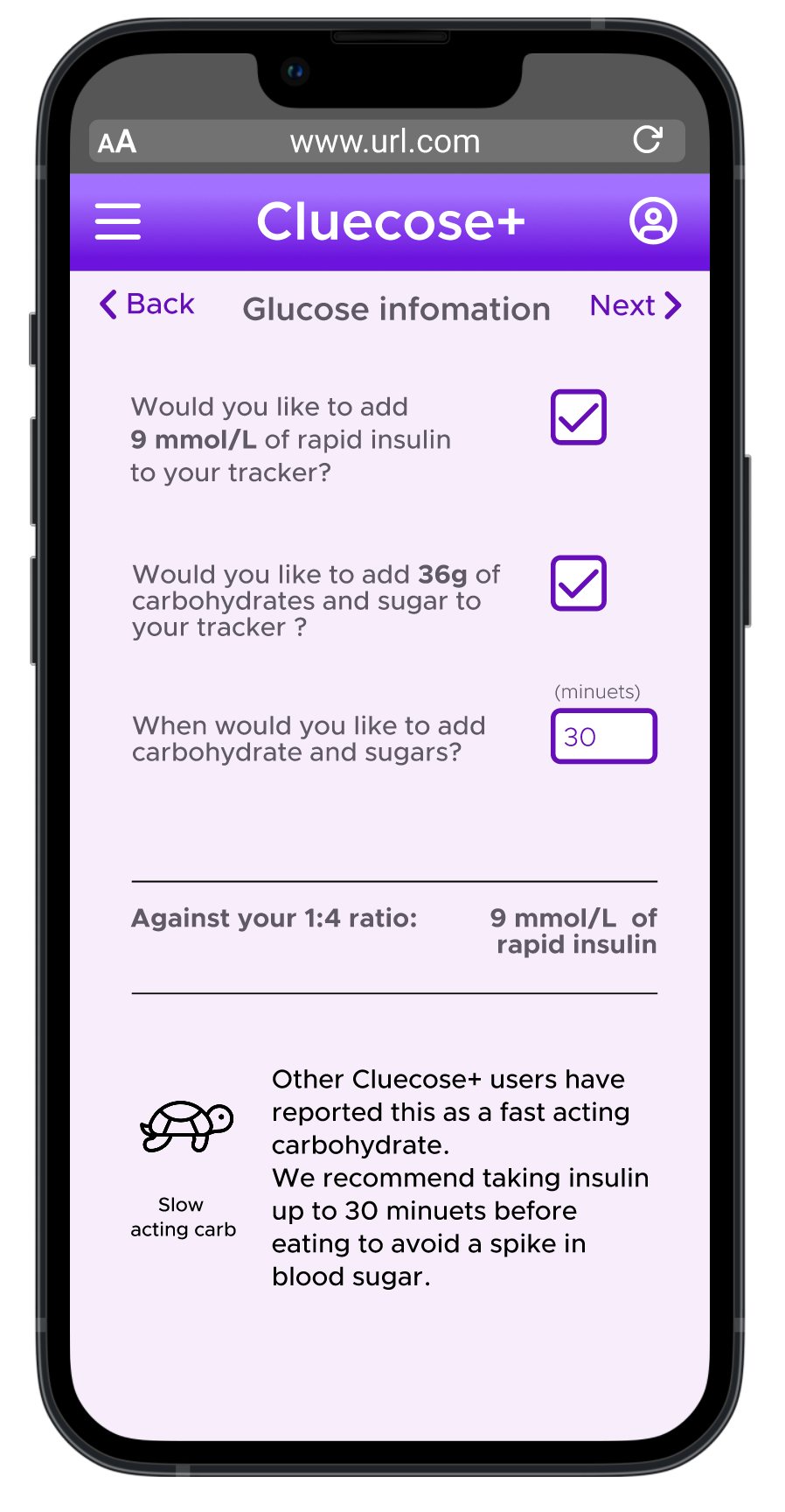
Another highly effective UX pattern I implemented was a wizard. Wizards are an alternative to fill-in-forms. Users are guided through completing one task before moving on to the next. This reduction in on-screen clutter intends to reduce the potential for human error, which could significantly impact the users health in this context.
Additionally, whilst completing many of my friend's dissertation questionnaires I found myself favoring ones that indicate how many questions are left. This observation led to the addition of a progress bar in the final prototype of our Wizard feature.
Response to users' clicks is essential... I always remember the uni website button never giving you feedback that you had clicked the submit button; leading to users clicking the button multiple times and some very anxious students! To address this issue in my own design I initially created a pop-up modal. I swiftly changed this as I hate having to close pop-ups that you didn't ask for. Instead, I implemented a toast notification, a less obtrusive and transient pop-up that slides down after a set time period, avoiding the inconvenience of having to manually close unwanted pop-ups whilst still giving the user the feedback needed.
4.1 Refining design. After user testing, adjustments were made to accommodate additional features, such as flip cards. Flip cards are great as they effectively double your available screen space. This allowed me to keep essential information "above the fold" (the portion of the screen visible without scrolling), while avoiding overwhelming the user with non-essential elements.
Another highly effective UX pattern I implemented was a wizard. Wizards are an alternative to fill-in-forms. Users are guided through completing one task before moving on to the next. This reduction in on-screen clutter intends to reduce the potential for human error, which could significantly impact the users health in this context.
Additionally, whilst completing many of my friend's dissertation questionnaires I found myself favoring ones that indicate how many questions are left. This observation led to the addition of a progress bar in the final prototype of our Wizard feature.
Response to users' clicks is essential... I always remember the uni website button never giving you feedback that you had clicked the submit button; leading to users clicking the button multiple times and some very anxious students! To address this issue in my own design I initially created a pop-up modal. I swiftly changed this as I hate having to close pop-ups that you didn't ask for. Instead, I implemented a toast notification, a less obtrusive and transient pop-up that slides down after a set time period, avoiding the inconvenience of having to manually close unwanted pop-ups whilst still giving the user the feedback needed.
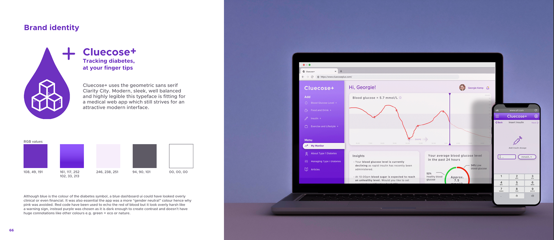
4.2 UI and branding.
Once the layout and functions had been defined it was on to creating an accessible user interface.
Initially, I had thought of going with a red-and-white colour palette to fit the medical nature of this task, but I quickly was tuned off this idea, as it was overbearing on the eyes and seemed almost warning-like. I had then thought about using blue as it is the colour of the diabetes awareness ribbon but felt that the dashboard design looked too 'financial'. Purple fit the bill as it had enough contrast with white to be easily readable and didn't elicit many other connotations e.g. green = eco, Pink = Breast cancer awareness, yellow, unreadable with white and warning like with black etc.
This project wasn't about the branding but the typeface needed to be formal enough for the project to suit the more serious medical nature of the project yet still have a modern and stylish edge, I played with IBM's Plex sans and Avenir but chose Clarity City for its geometric well-balanced and crisp look.
4.3 Design system. Lastly, I packaged up the design system I created to develop this prototype. The idea was that theoretically, someone could pick up where I had left off without having to reconstruct buttons, key icons notifications etc.
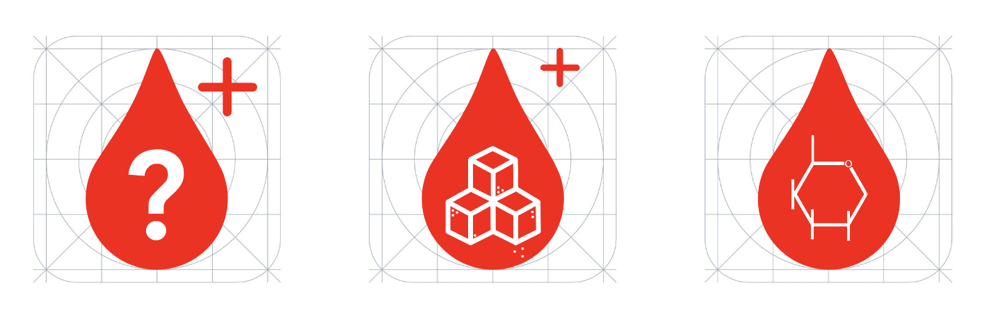
Initial logo ideas
Branding for Cluecose+
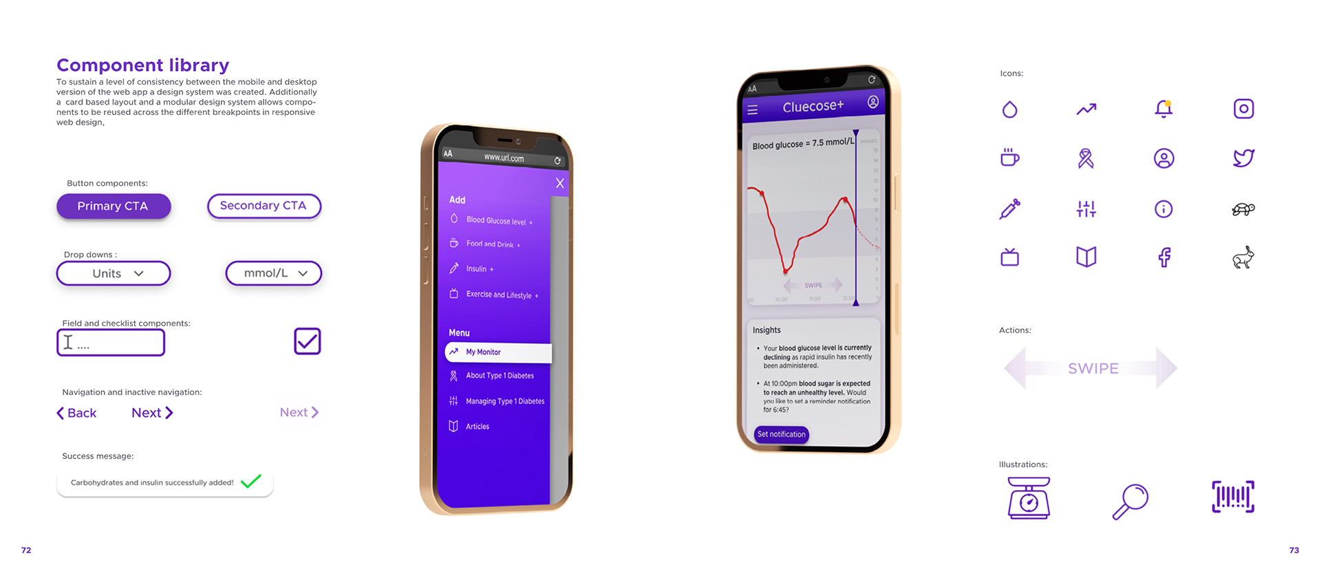
Component library
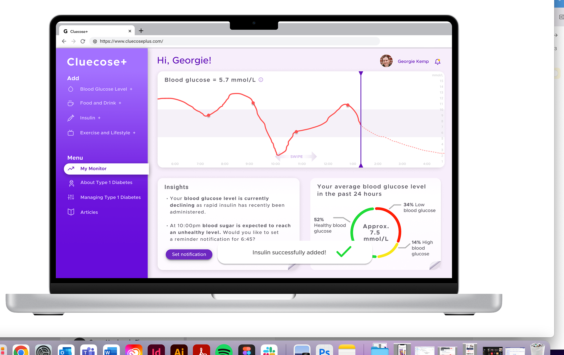
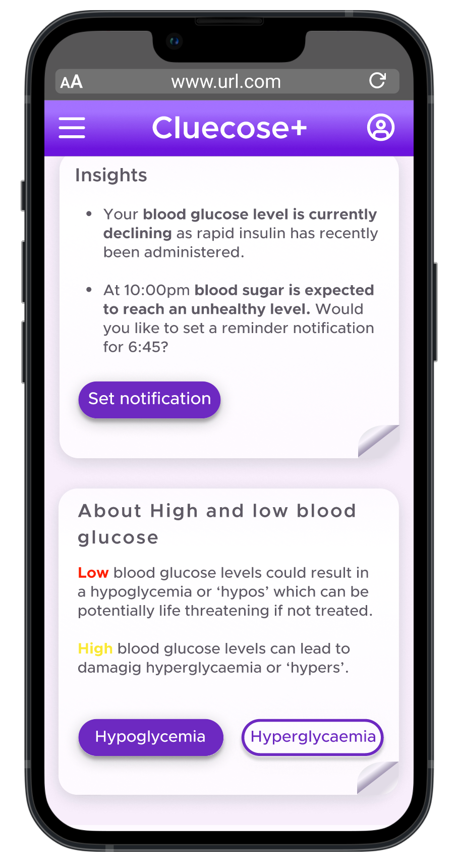
home page with hero widget and toast notifcation
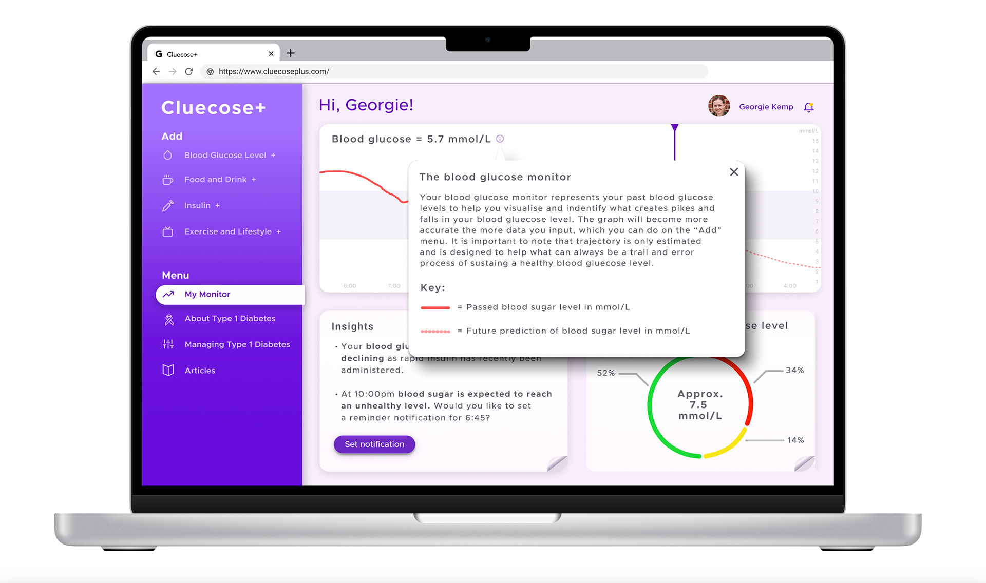
See more information tab
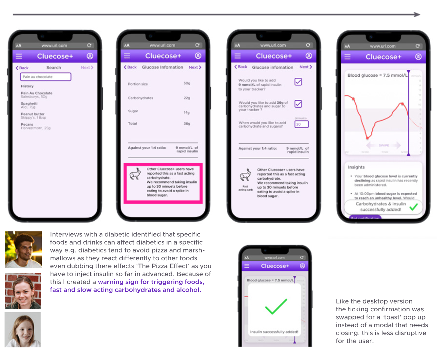
Time indicators of slow and fast realise carbs (Hare and Tortoises)
Inputing of carbohydrates with progress bar on over top of widget
Reverse side of blood sugar diagram flipcard
Conclusion
I feel my solution has successfully met the initial needs statement and furthermore resolved key pain points met by user personas by:
- Tracking user's blood sugar levels and help predict hypos and hypers
- Teaching users to understand the conditions and what foods and lifestyle actions affect their blood sugar levels.
- Help users estimate when can administer insulin and in what dose.
- Creating a more intuitive and enjoyable user experience than what existing solutions there are on the market.
Key learnings
- User testing is key. things such as labeling the charts as 'Blood Glucose Level' or adding a 'scroll' to prompt users are seemingly minor things that I would have missed without the user testing would have made my product useless.
- User testing is key. things such as labeling the charts as 'Blood Glucose Level' or adding a 'scroll' to prompt users are seemingly minor things that I would have missed without the user testing would have made my product useless.
-Less really is more. When brainstorming all possible ideas that could have been added to the features list I could have gone on and on though after developing the product to a high fidelity state realised that this clutter could have been damaging to allow the user to complete their actions. In this case, less really is more.
-Be agile, don't commit to anything. I think previously I have been attached to a certain style or idea that I had put in place but new problems crop up, content you didn't know you were going to need has to fit in. Being agile to change and open-minded in this design process has helped me create a product that truly keeps the user in mind.
- The value of screen real estate. As there was so much to add I often found myself running out of space if I wanted to keep the product primarily on one static screen. Using UX patterns such as flip-cards, responsive widgets, and wizards helped me reduce the amount of space on screen a feature would need in turn creating a less distracting end product.
- Software skills. This was my first time using Figma and I loved it, but in the space of 6 weeks I learned a lot, and I know I've still got a long way to go.
For full details on all design decisions please read the report below or watch my prototype walkthrough video below.