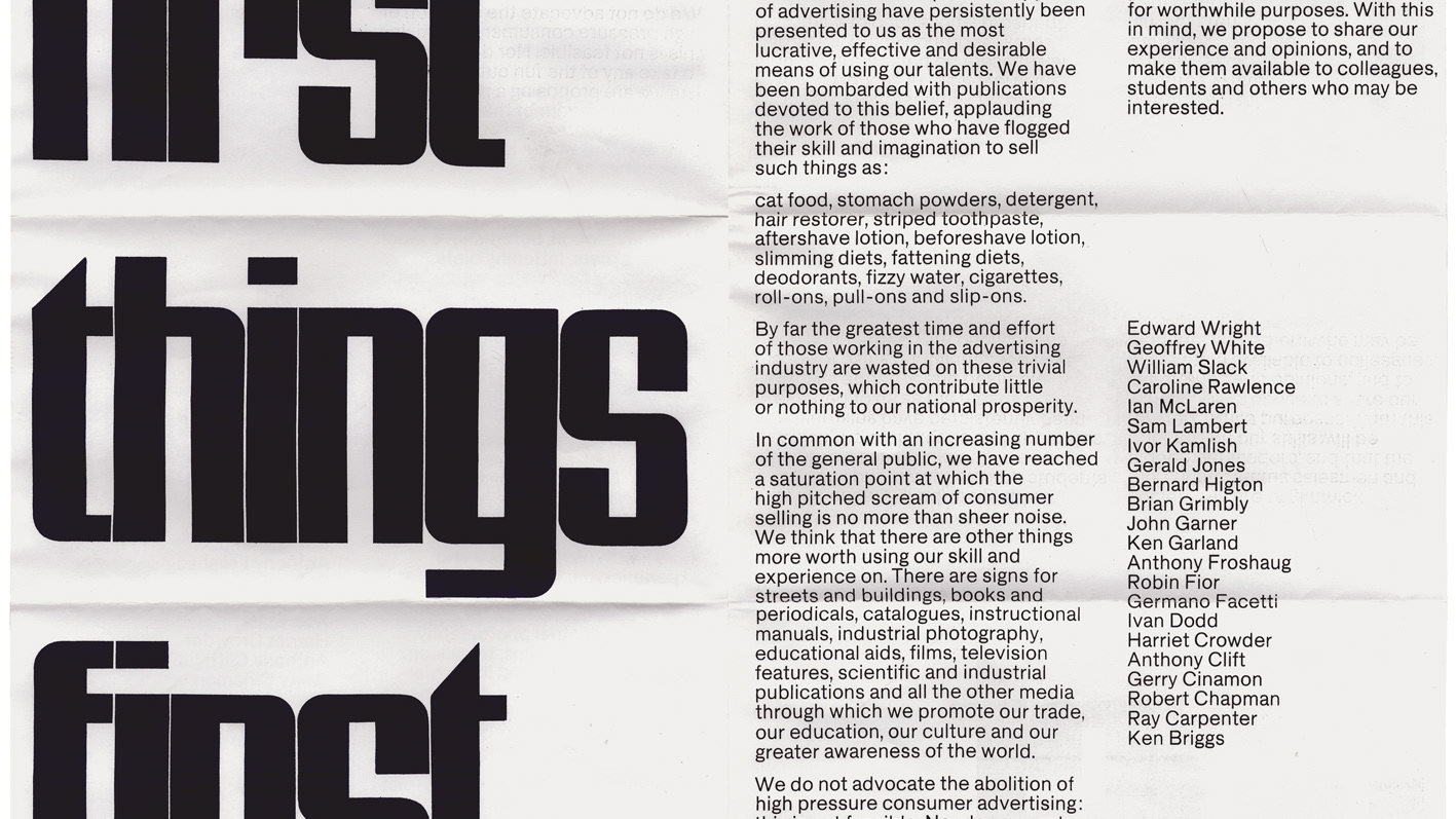
An editorial project to design and typeset an extract of a non-fiction book:
'From the book to the streets: large type in public spaces'.
'From the book to the streets: large type in public spaces'.
The brief
The task at hand was to produce a non-fiction book with the supplied copy that was particularly dense in images, captions and footnotes.
The task at hand was to produce a non-fiction book with the supplied copy that was particularly dense in images, captions and footnotes.
This project was a testing introduction too:
- Grids, layout & hierarchy
- Typeface choice
- Page furniture
- Differentiation & micro typography conventions
- Typesetting for long pros of text
- Cover design and special finishes for a press-ready file
Dimention & grids
As the book is non-fiction, a regular rectangular dimension was found to be more fitting. American sizes were considered but rejected as they were excessively large, instead, Royal Octavo Wide (170 X 234mm) was chosen as it's large enough to fit three columns and generous margins, but small enough to comfortably be handheld for long periods of time.
As the book is non-fiction, a regular rectangular dimension was found to be more fitting. American sizes were considered but rejected as they were excessively large, instead, Royal Octavo Wide (170 X 234mm) was chosen as it's large enough to fit three columns and generous margins, but small enough to comfortably be handheld for long periods of time.
A three-column grid was chosen with the main body text spanning two columns (approx 80mm) to create an optimal line length for reading (7-11 words per line)
As a rule, the remaining left column on each page is reserved for the sizeable image captions & references, although on occasion large images were spread across all three columns.
Typography
To create a traditional look, the body text was set in a serif typeface. Additionally, this is ought to aid legibility in long extracts of text over its sans serif counterpart.
Skolar Latin was chosen as it is extensively used by typography-focused graphic designers, due to its large font family, robust roman quality with thick serifs suited for body text, and comfortable reading proportions thanks to its reduced stroke contrast and larger x-height.
To contrast with the body text, a sans serif typeface was chosen for the image captions and footnotes. The type needed a large font family to create recognisable differentiation between the two categories of text, hence, Tisa Sans Pro with its 14 weights was chosen. Tisa Sans pairs well with Skolar Latin due to its large x-height and low stroke contrast. Additionally, Tisa sans worked well for this typographically testing copy as it includes features such as a complete range of figure options which would be used in the dimensions described in the image captions.
Cover design
The brief for the cover was simple yet restrictive, 'typography only cover'.
To create a cover fitting for a typography-based book the whole cover was covered end-to-end in type which was mocked up to look as if it was spot UV-ed onto black paper so it was only legible when it caught the light. The title whilst also Spot-UV-ed is both embossed and white ar bar the colon which is a bright red to add a hint of colour to the otherwise monochrome cover. The endpapers matched this pop of red to create a surprising and lively look to the design.
Finally, a matching bright red ribbon was added as a bookmark for the reader.
