Viu Systems is a customer feedback service that allows other industries to gain insights into their customers' experience.
As this plugin is a subscription service that can be added at the end of a consumers purchasing journey, viu's own brand identity needs to be subtle.
As this plugin is a subscription service that can be added at the end of a consumers purchasing journey, viu's own brand identity needs to be subtle.
Creating this product was an interesting test of how stripped back the UX and UI of a product can be whilst still maintaining a user-friendly approach.
treading a fine line between there still having a minimal bit of the viu brand whilst working in harmony with the host/existing website branding.
Importance of not swaying the user one way of another, responsive, and works alongside any other brand e.g.opteven, or RAC
UI inspo - Airbnb.

The issue
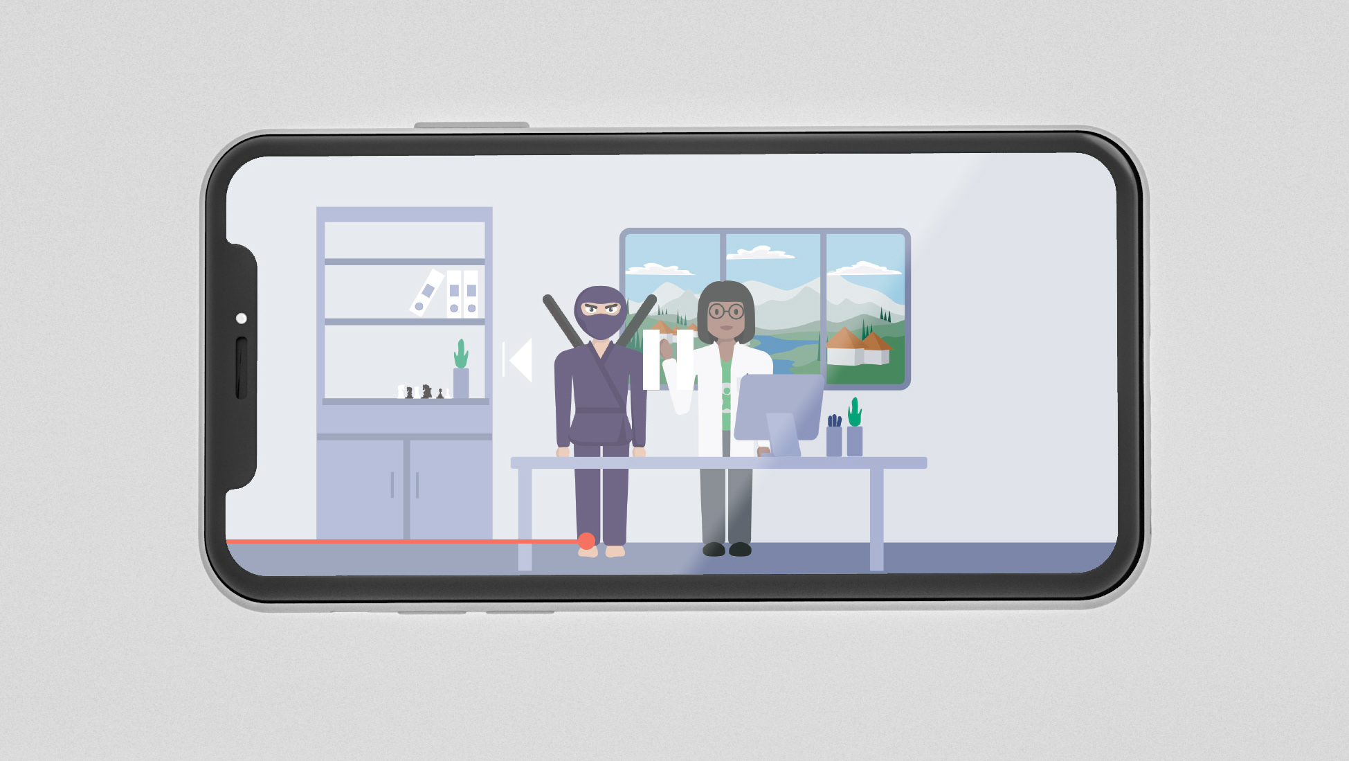
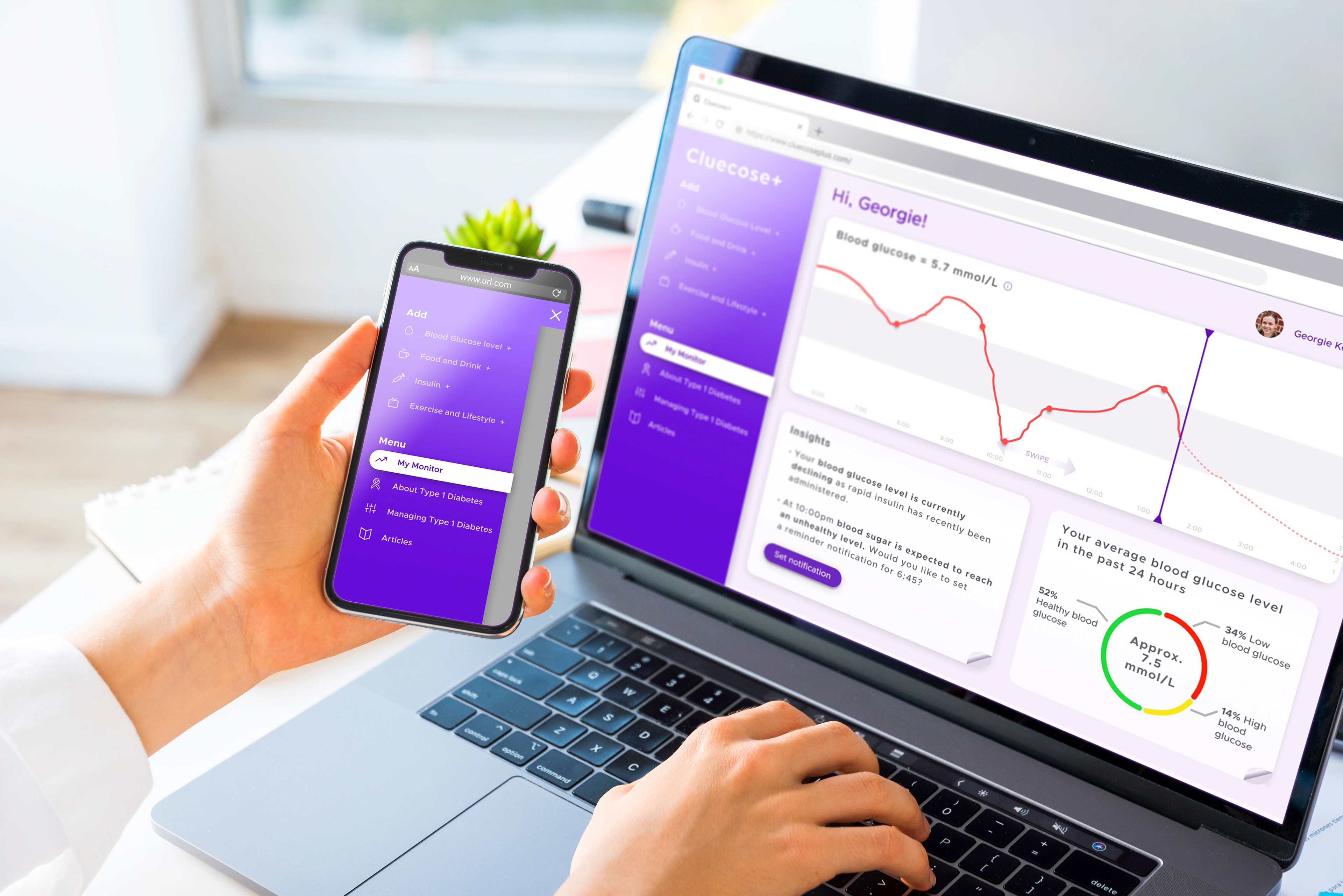
It is estimated that around 3.9 million people in the UK have been diagnosed with diabetes (Diabetes UK, 2019). Meaning millions of people struggle to monitor d maintain a healthy blood glucose level every single day. Cluecose+ is designed to help diabetics or carers of diabetics manage their blood sugar levels from their mobile, desktop or tablet!
It is estimated that around 3.9 million people in the UK have been diagnosed with diabetes (Diabetes UK, 2019). Meaning millions of people struggle to monitor d maintain a healthy blood glucose level every single day. Cluecose+ is designed to help diabetics or carers of diabetics manage their blood sugar levels from their mobile, desktop or tablet!
The task
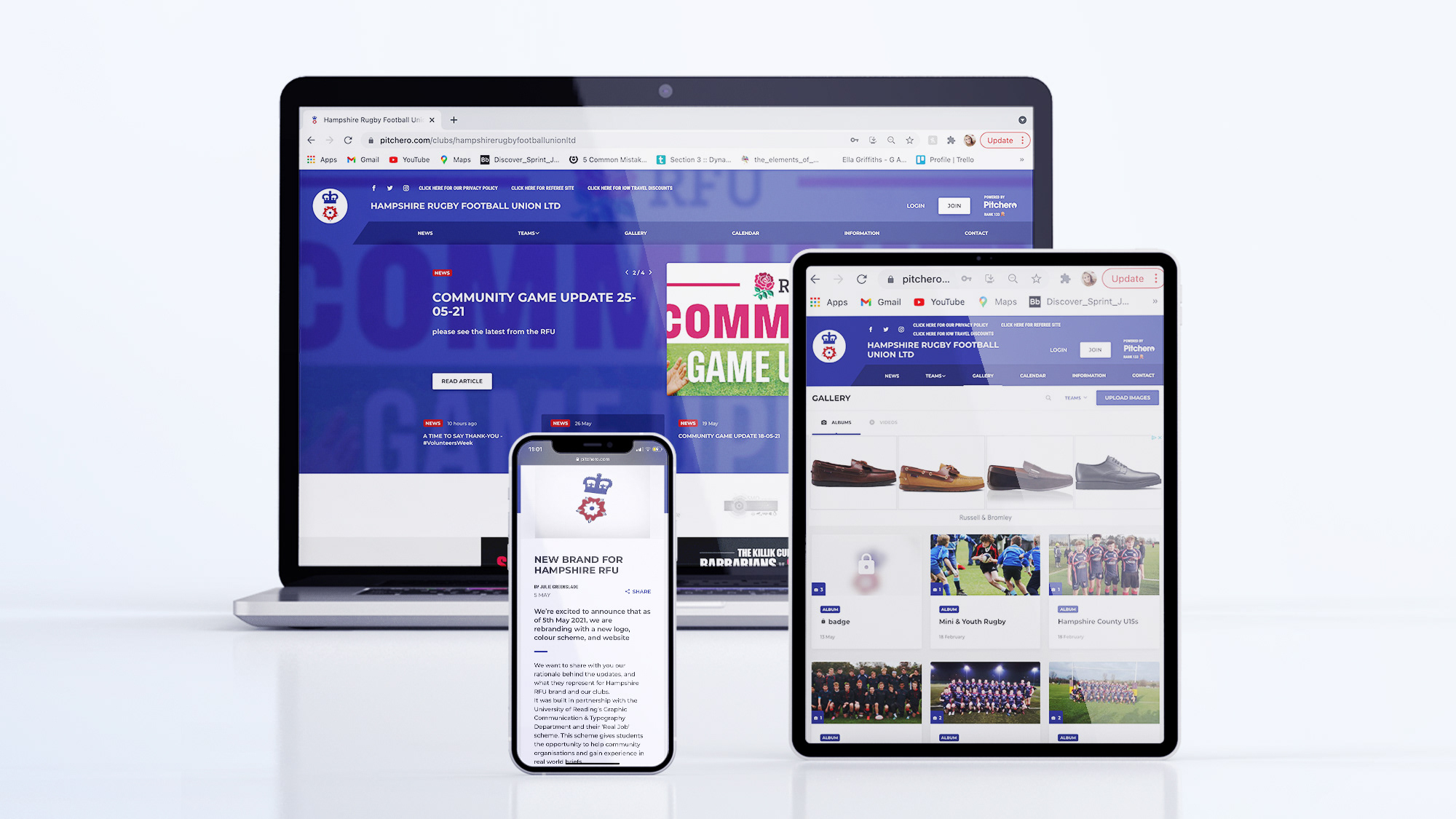
To create a responsive web app that is adaptive in layout whilst remaining consistent in communication and visual identity.
Designing a responsive platform brings about new design constraints, this project helps to explore and test how this can be tackled, approached and justified in the most effective way.
To create this is the most consistent, efficient and reproducible way a design system must also be created.
The discover, explore & define, develop and deliver stages of the
design process are described in depth in the design report below.
For the TL;DR version scroll on!
design process are described in depth in the design report below.
For the TL;DR version scroll on!
See below for a video walkthrough of the Clucose+ web app on the desktop