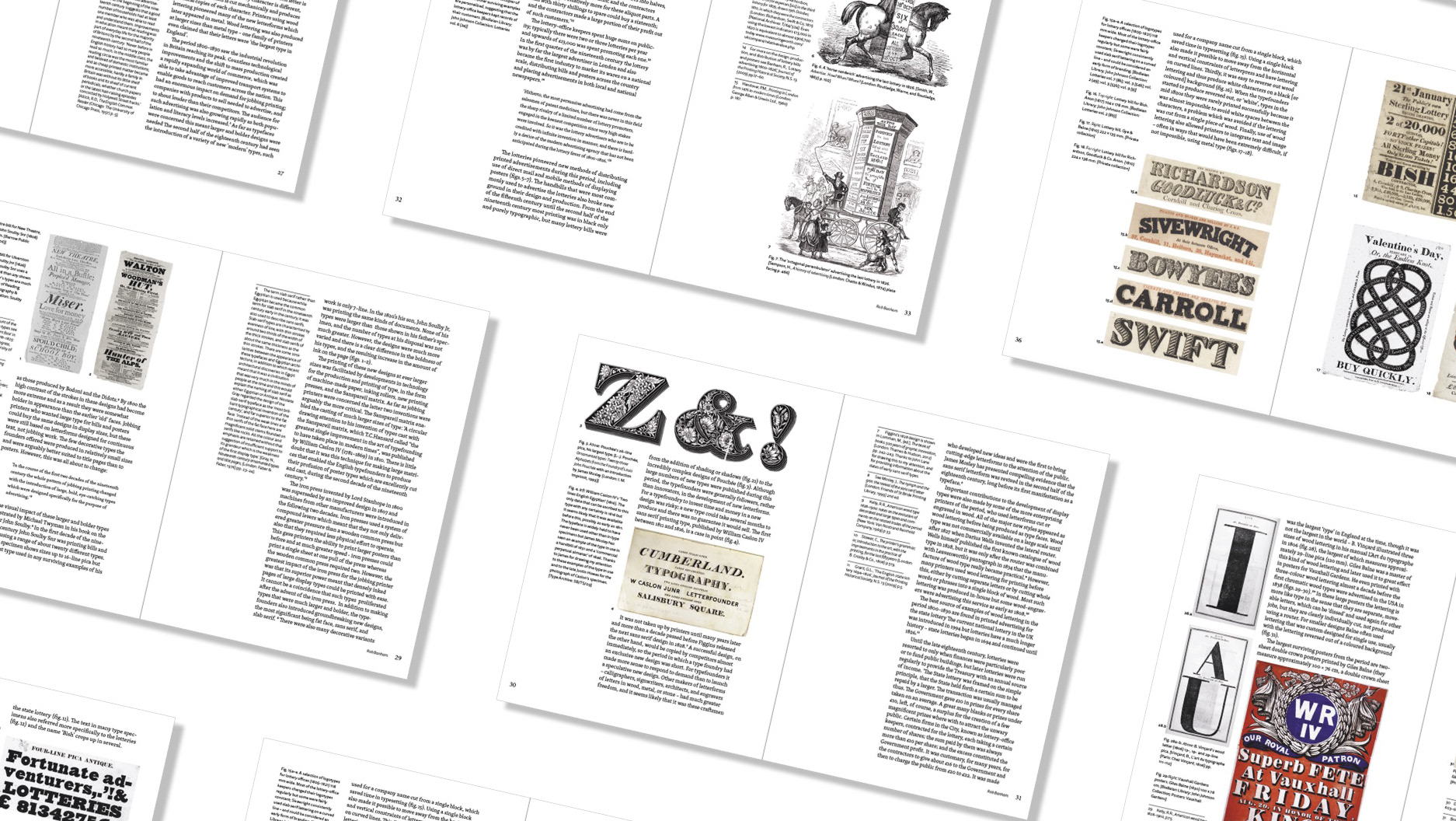
intro goes here abcdefg
Working alongside a fellow student and having our design overseen by a visual designer from IBM has been an insightful and inspiring experience and one that has influenced me to pursue a career in user experience design. The clients were looking to refresh their logo to attract a younger audience whilst sustaining the tradition behind their current logo loved by their long-standing Hampshire. Seeing the rebrand in use has been a rewarding experience, and glad to see the website is rapidly moving up the ranks to 9th place on the CMS Pitchero!
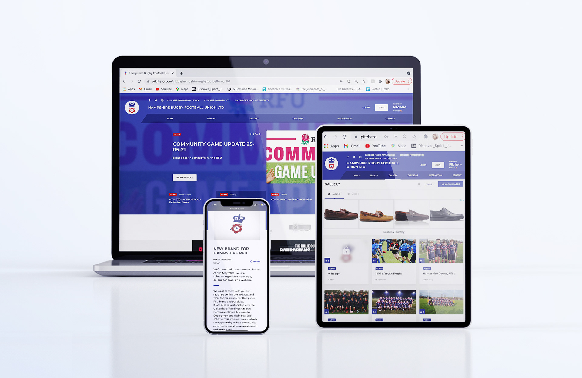
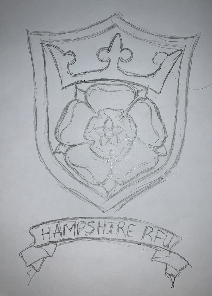
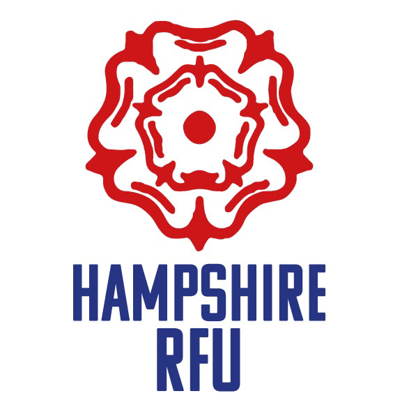
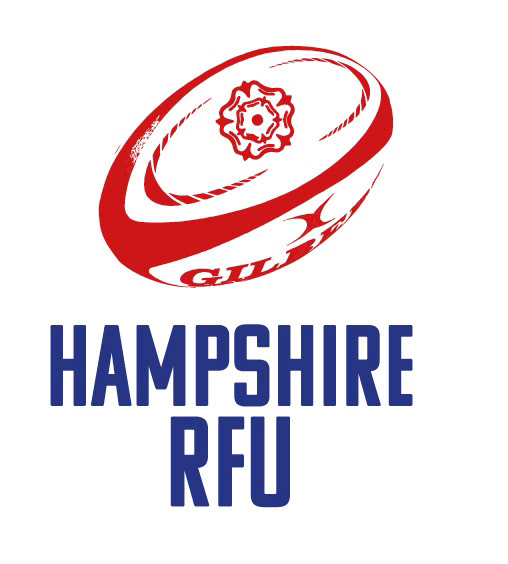
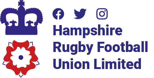
My new branding and website for Hampshire RFU
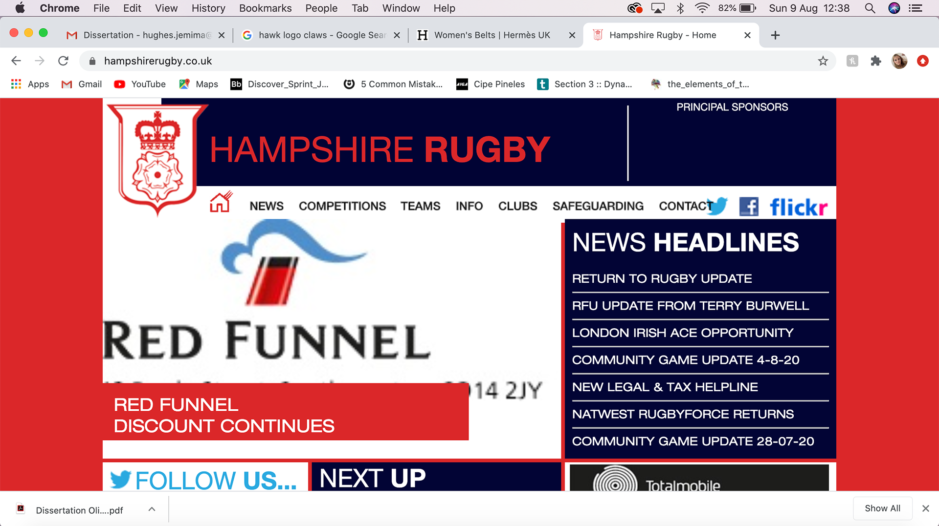
Their previous website
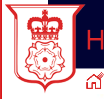
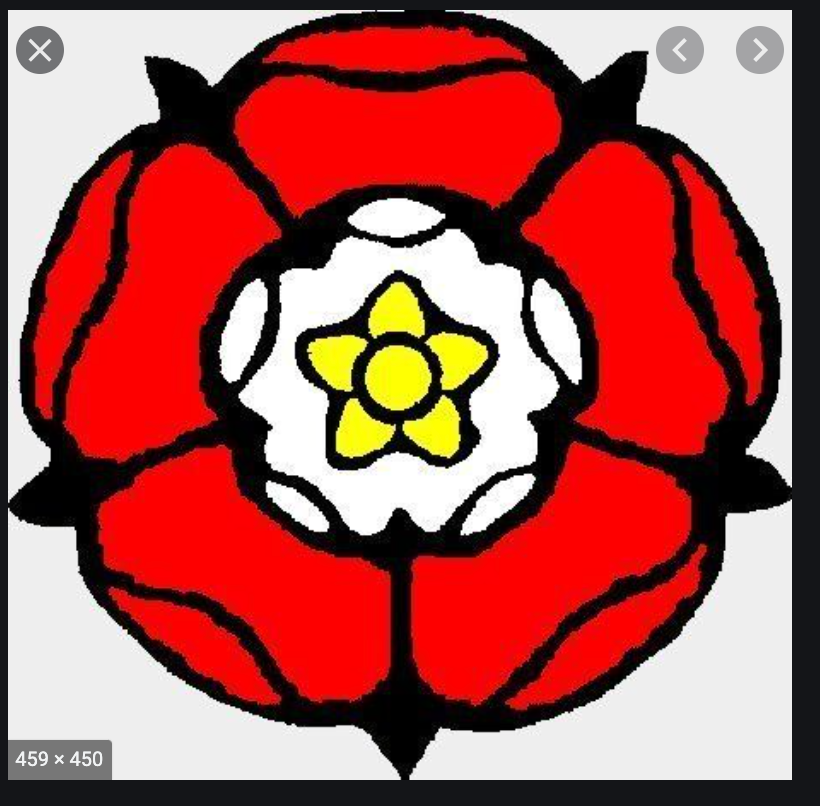
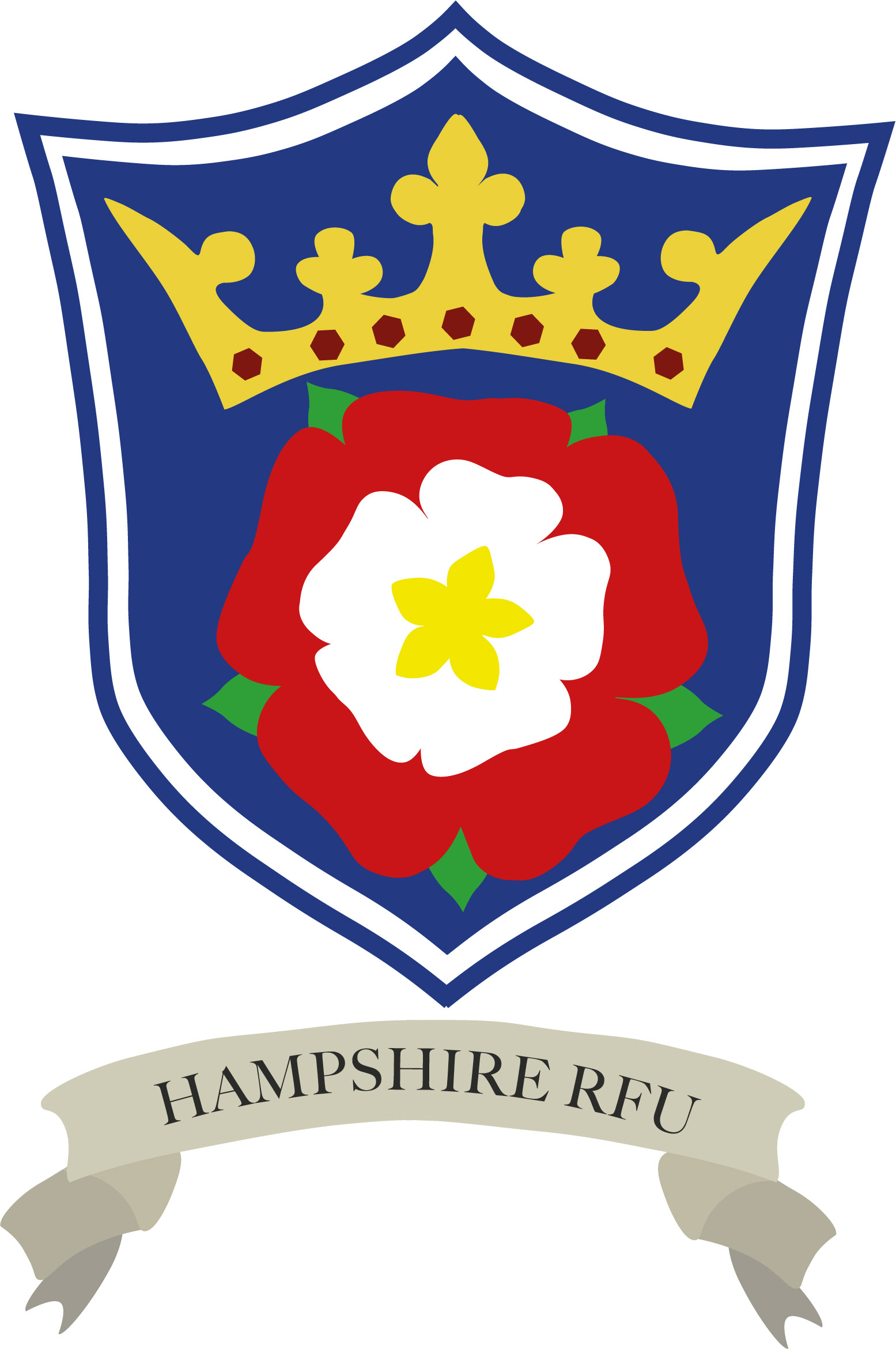
Their previous Logo
The Brief:
Hampshire RFU (Rugby) have a couple of problems.
1. People are struggling with differentiating Hampshire RFU and the main RFU (across the rest of England). Any communications that come out are not differentiated enough for users to understand they are coming from Hampshire. The brand is not strong enough to depict that they are similar, yet separate, organisations. This has an impact on sponsorship and engagement.
2. The existing brand is old and does not represent the new demographic Hampshire are looking to engage with. This includes more diverse and young group of players and volunteers through mediums such as social media and web branding. Hampshire would need to refresh the communication and language used across the board and would like suggestions there as well.
Deliverables (can be discussed):
- A new brand that resonates with the diverse membership & sponsors that works across sub brands (Coaching, Volunteering, Juniors, Seniors, Generic information).
- Social media and communication style guide.
- Suggestion for how the brand would work with a new web CMS (Pitchero).
- Deliver a clear set of brand guidelines including print guidance and examples.
- Help build out a couple of personas to help Hampshire understand their target market better.
This brand has to stand alongside other national rugby brands and will be a great chance to deliver a design that will be seen by thousands every week at county rugby games, print ephemera, shirts, AGM's etc.
I did the project in a pair and felt like I learn so so much and was lucky to have a great client and a member of IBM overseeing the project alongside the client.
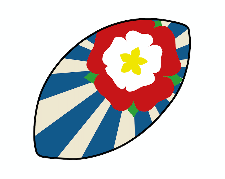
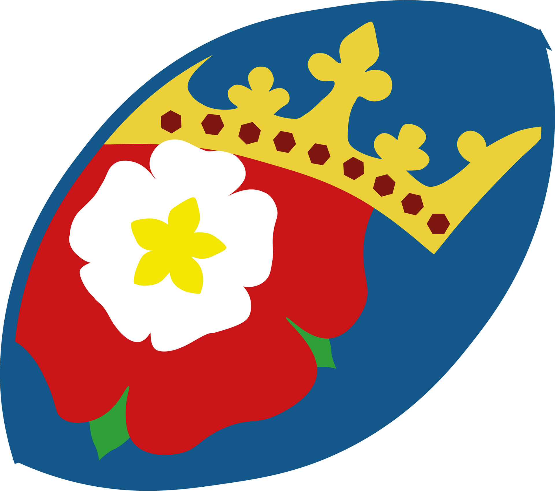
We felt the logo was overly busy and didn't need the shield shaped barer and the website was chaotic without a clear brand and overloaded the user with information.
1. People are struggling with differentiating Hampshire RFU and the main RFU (across the rest of England). Any communications that come out are not differentiated enough for users to understand they are coming from Hampshire. The brand is not strong enough to depict that they are similar, yet separate, organisations. This has an impact on sponsorship and engagement.
2. The existing brand is old and does not represent the new demographic Hampshire are looking to engage with. This includes more diverse and young group of players and volunteers through mediums such as social media and web branding. Hampshire would need to refresh the communication and language used across the board and would like suggestions there as well.
Deliverables (can be discussed):
- A new brand that resonates with the diverse membership & sponsors that works across sub brands (Coaching, Volunteering, Juniors, Seniors, Generic information).
- Social media and communication style guide.
- Suggestion for how the brand would work with a new web CMS (Pitchero).
- Deliver a clear set of brand guidelines including print guidance and examples.
- Help build out a couple of personas to help Hampshire understand their target market better.
This brand has to stand alongside other national rugby brands and will be a great chance to deliver a design that will be seen by thousands every week at county rugby games, print ephemera, shirts, AGM's etc.
I did the project in a pair and felt like I learn so so much and was lucky to have a great client and a member of IBM overseeing the project alongside the client.
We felt the logo was overly busy and didn't need the shield shaped barer and the website was chaotic without a clear brand and overloaded the user with information.
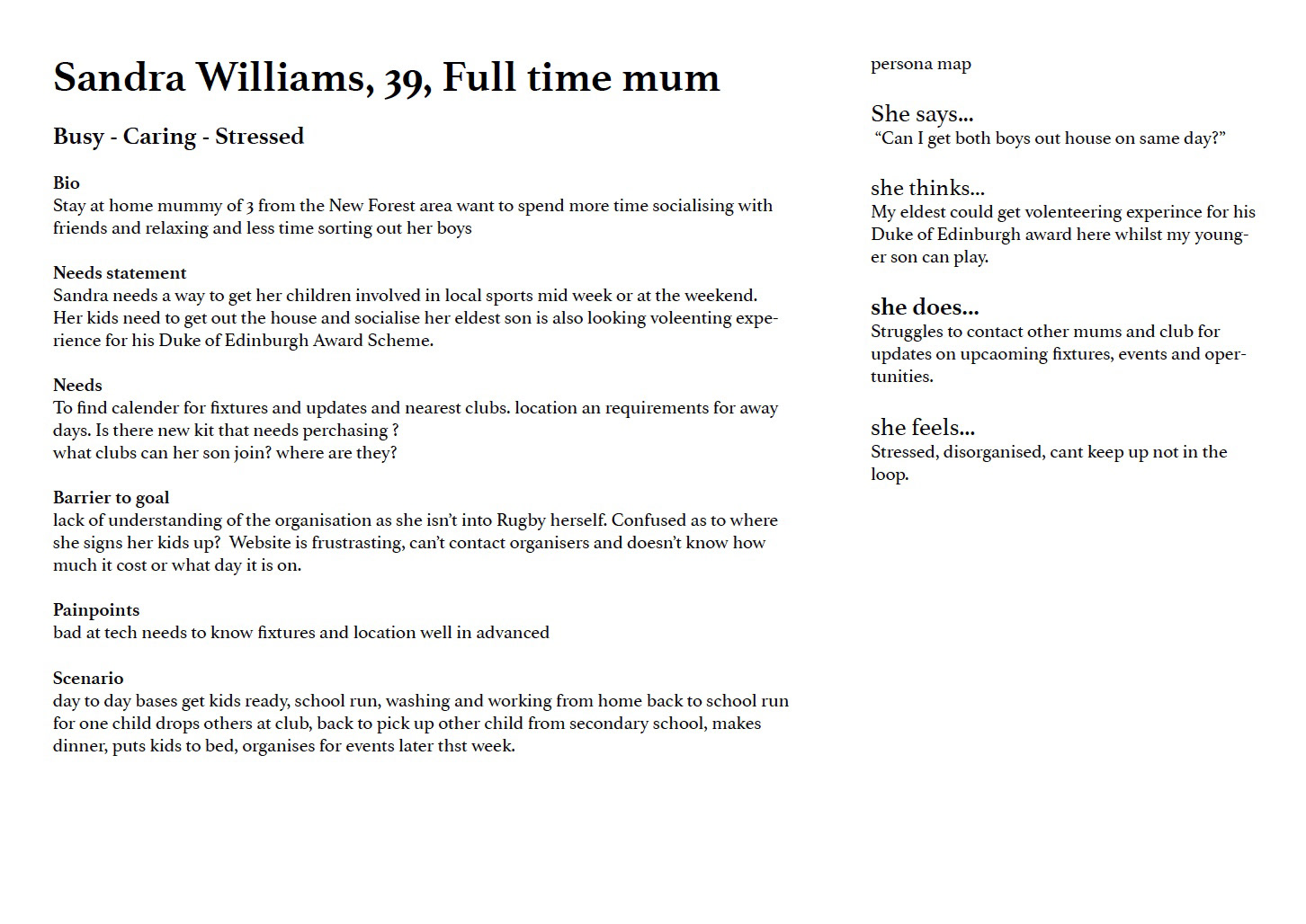
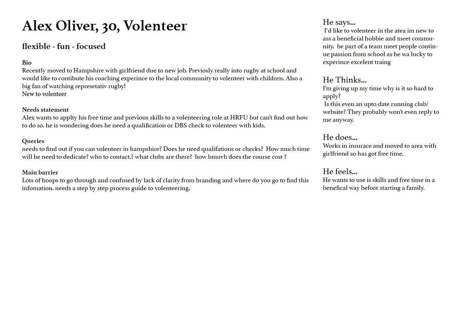
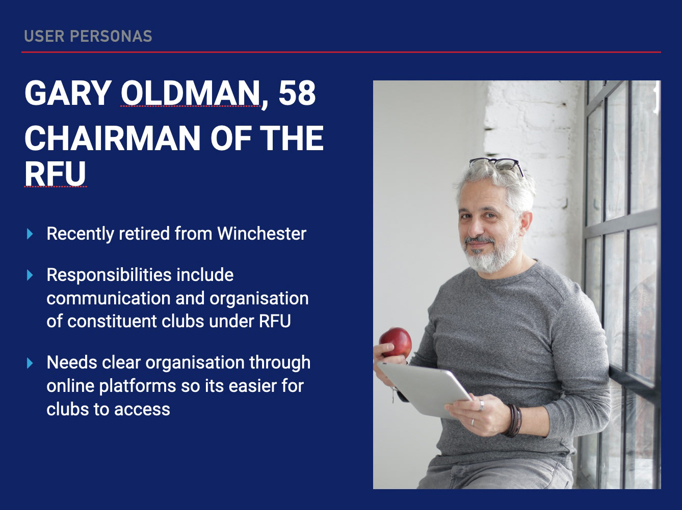
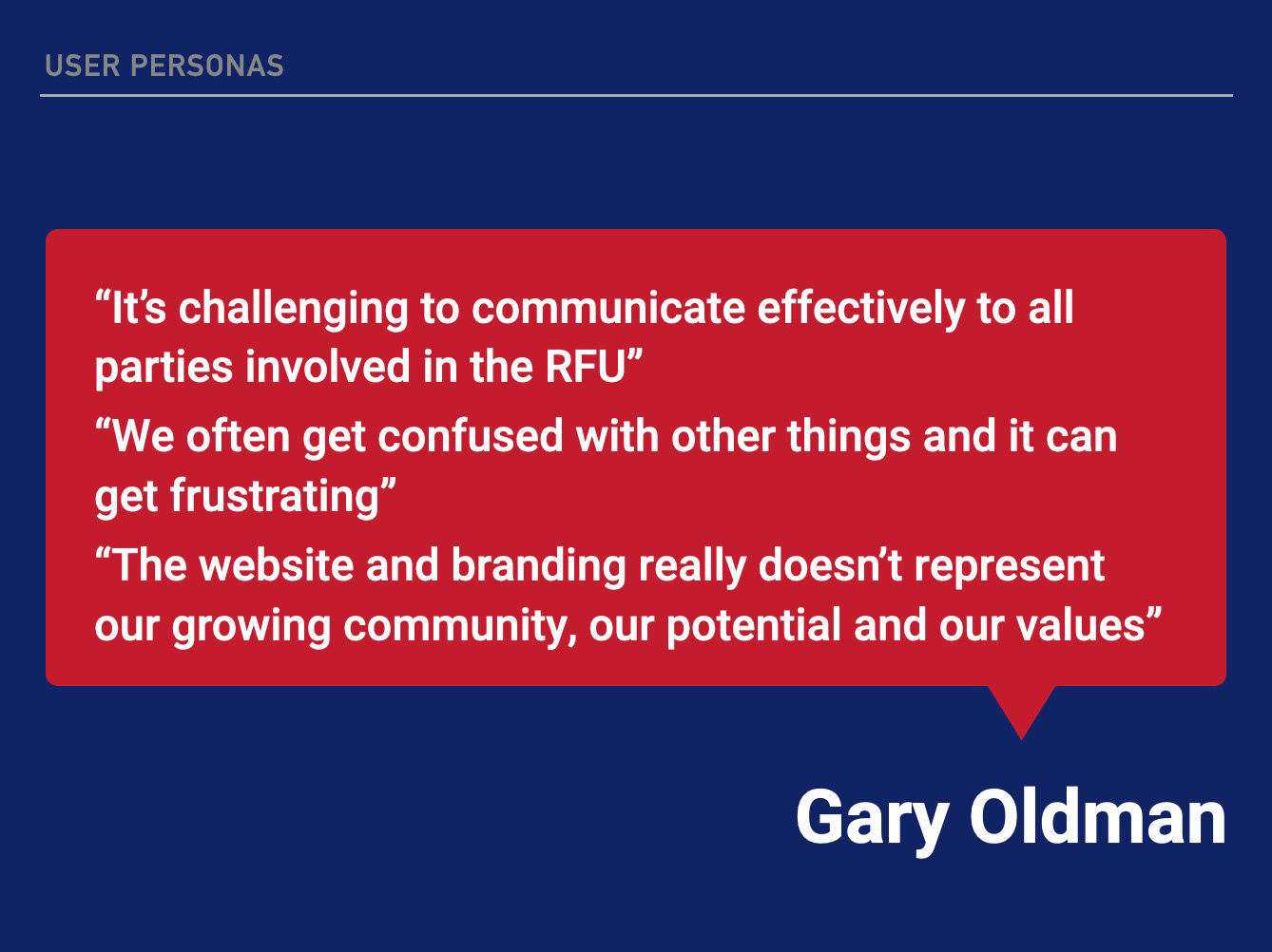
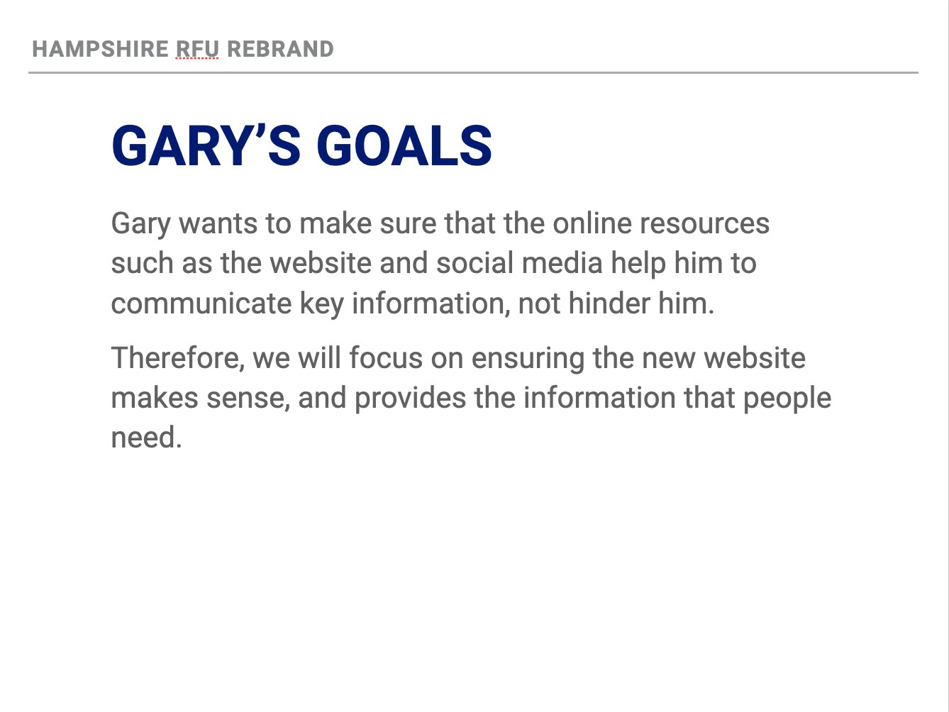
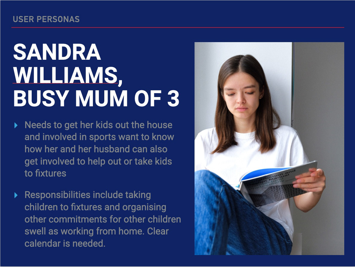
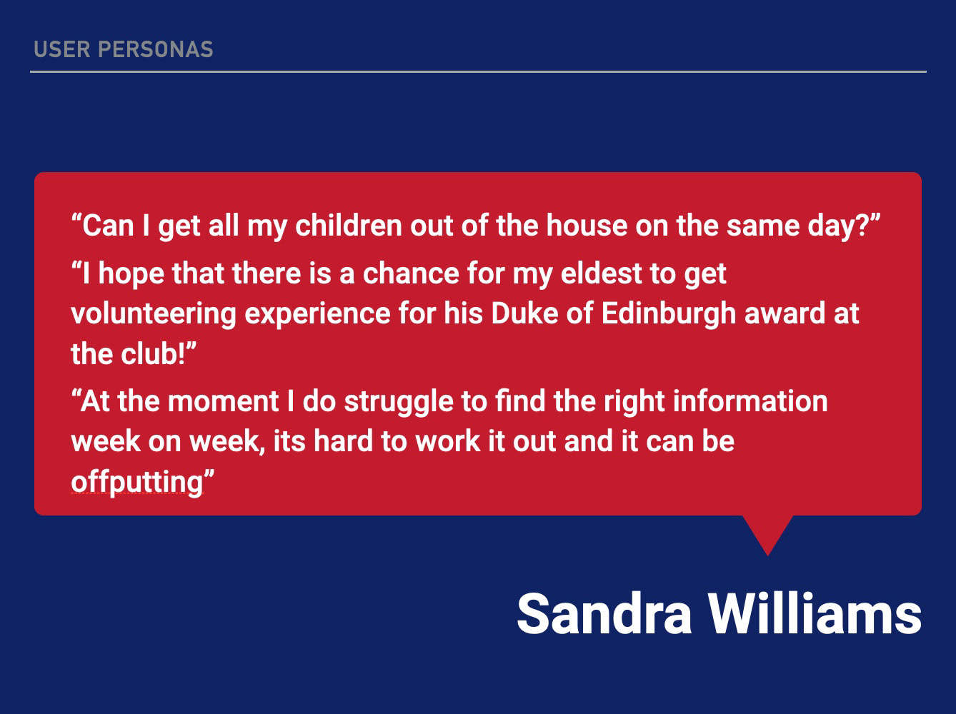
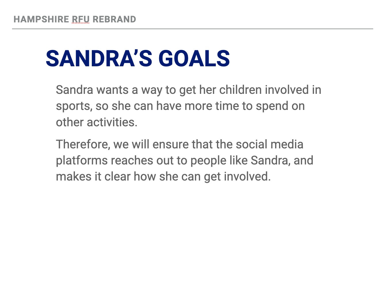
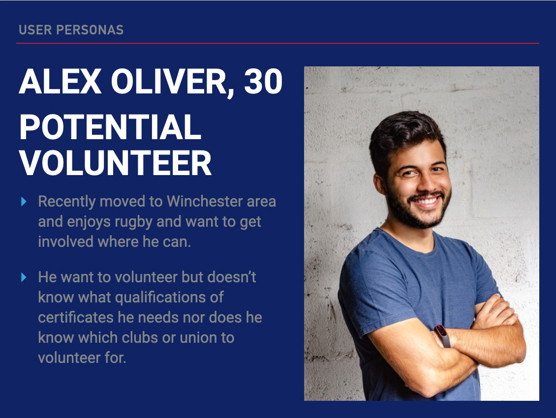
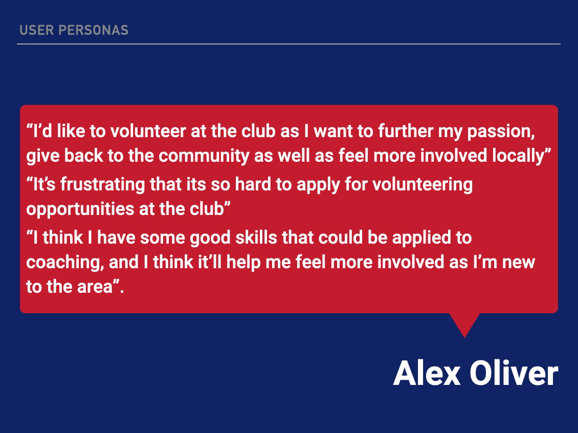
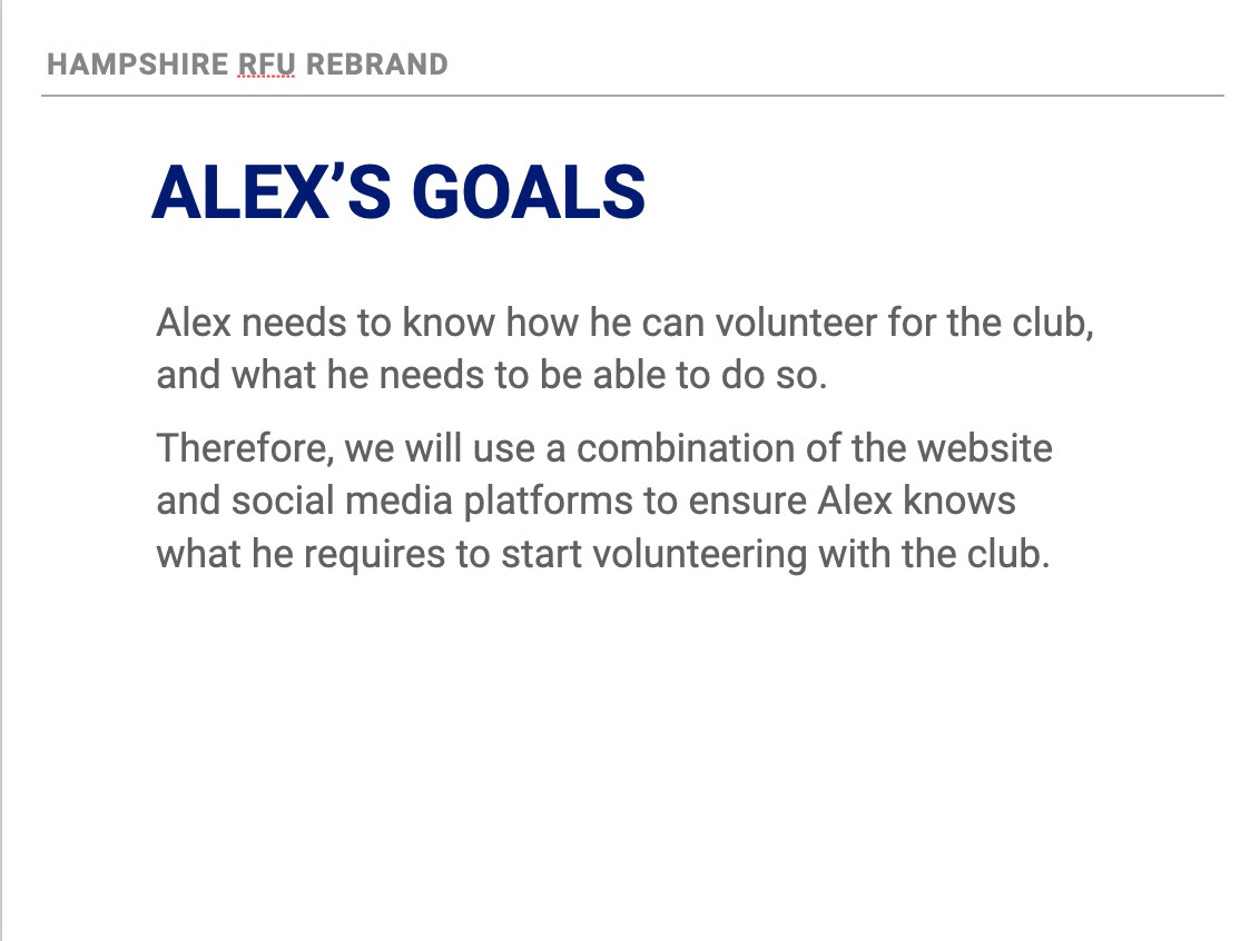
Above is the user personas we created for the brief which where checked off by the client.
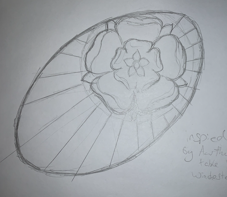
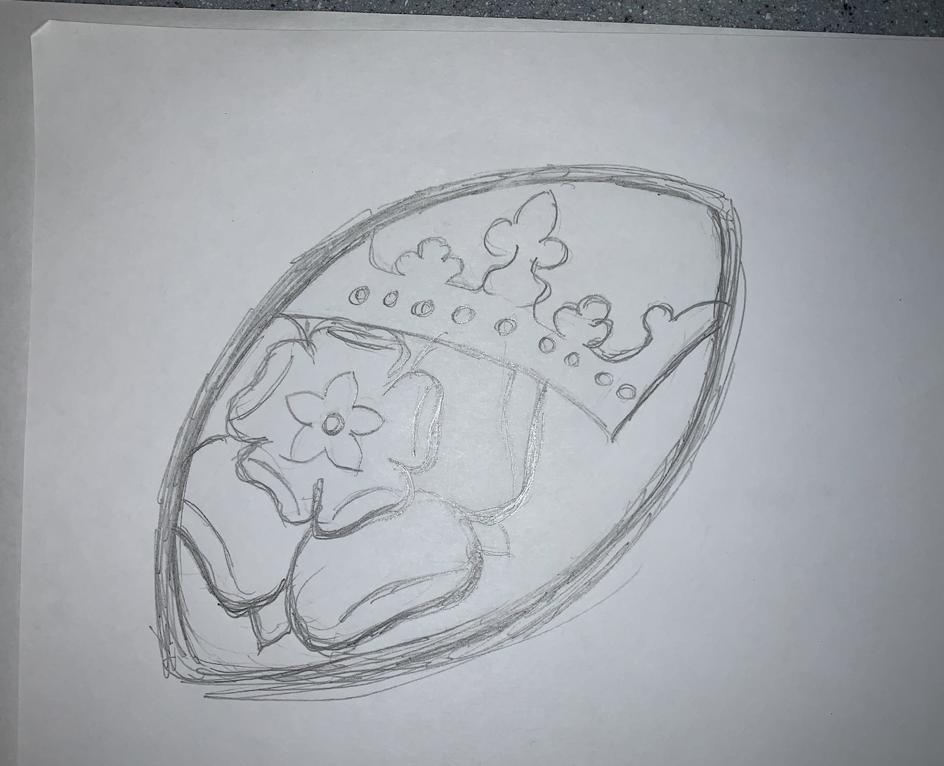
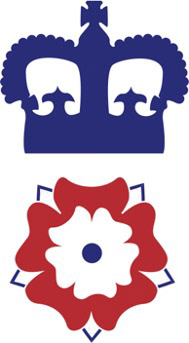
Design development
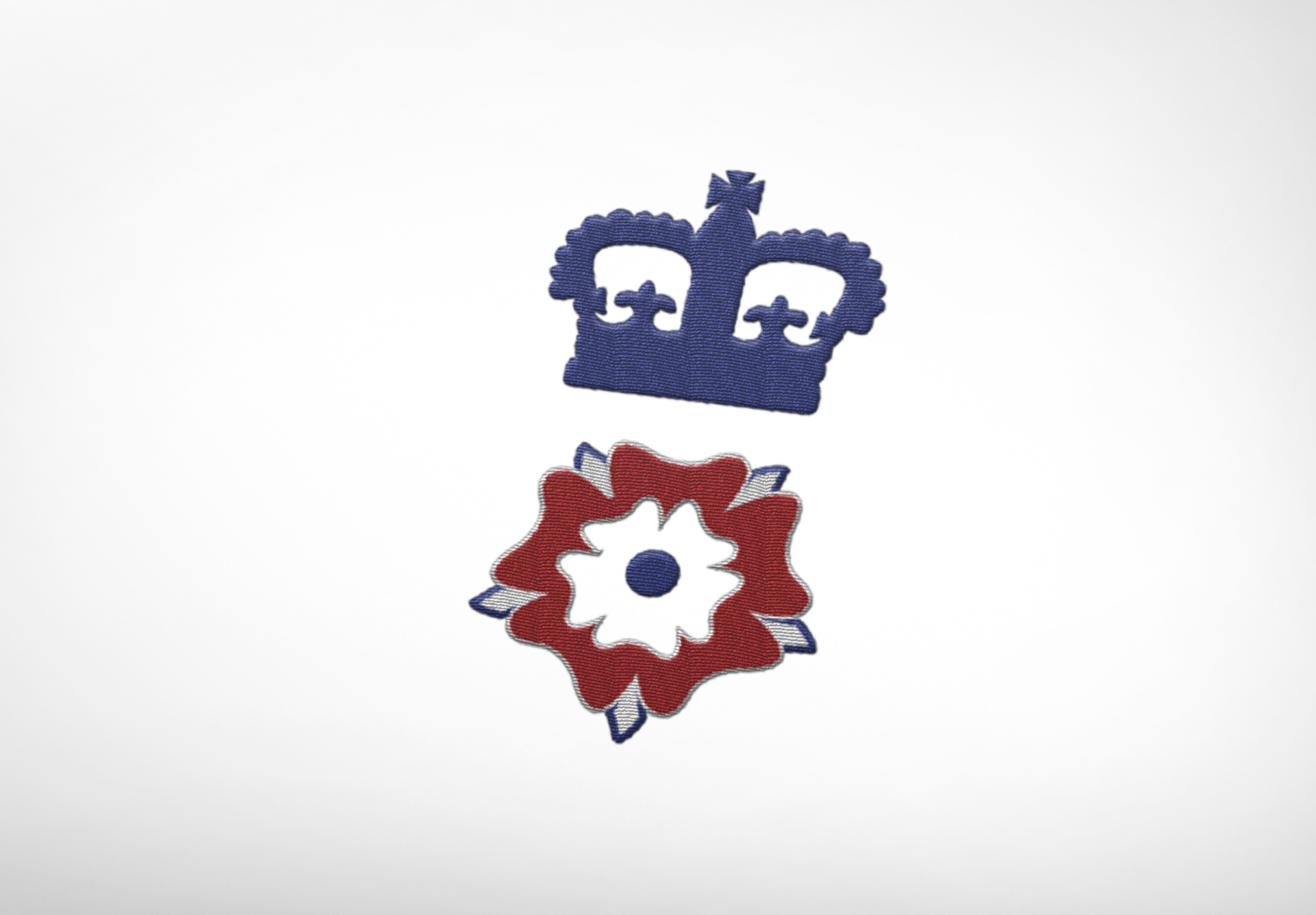
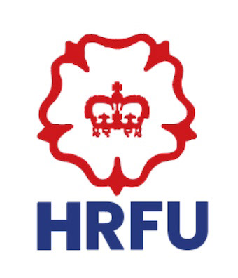
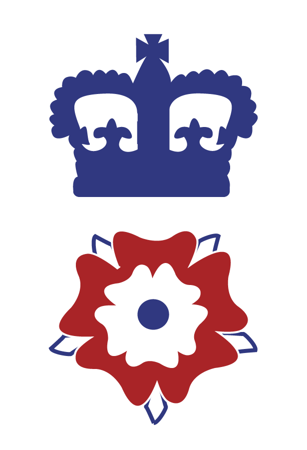
Final logos
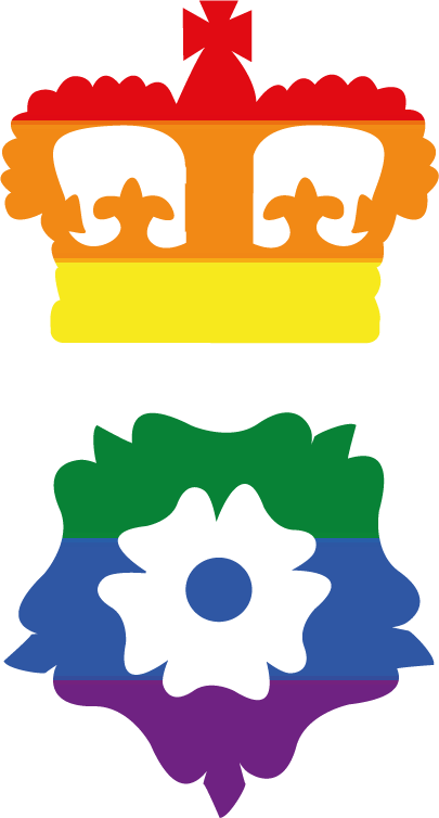
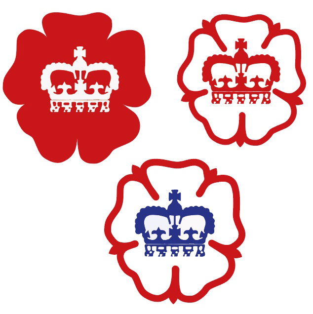
Alternative logos