The Brief:
Inform people about some aspect of Climate Change and select appropriate data to tell a story. Source data and information from anywhere (as long as you reference the source), but be critical of the reliability and motivations behind the data.
Inform people about some aspect of Climate Change and select appropriate data to tell a story. Source data and information from anywhere (as long as you reference the source), but be critical of the reliability and motivations behind the data.
Present found data using a combination of visual data displays that you feel best represent your information and communicate your argument. These are weighty topics that many people do not understand. Although our first priority is to be accurate, factual and informative, you also need to find ways of engaging interest and 'telling the story' in a compelling way.
The infographic needs to work across an awareness raising poster 210mm x 594mm (portrait). Your design should be influenced by the benefits and constraints of banner paper.
Researching:
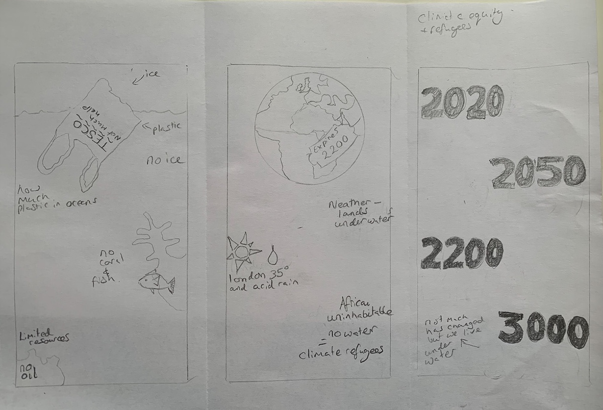
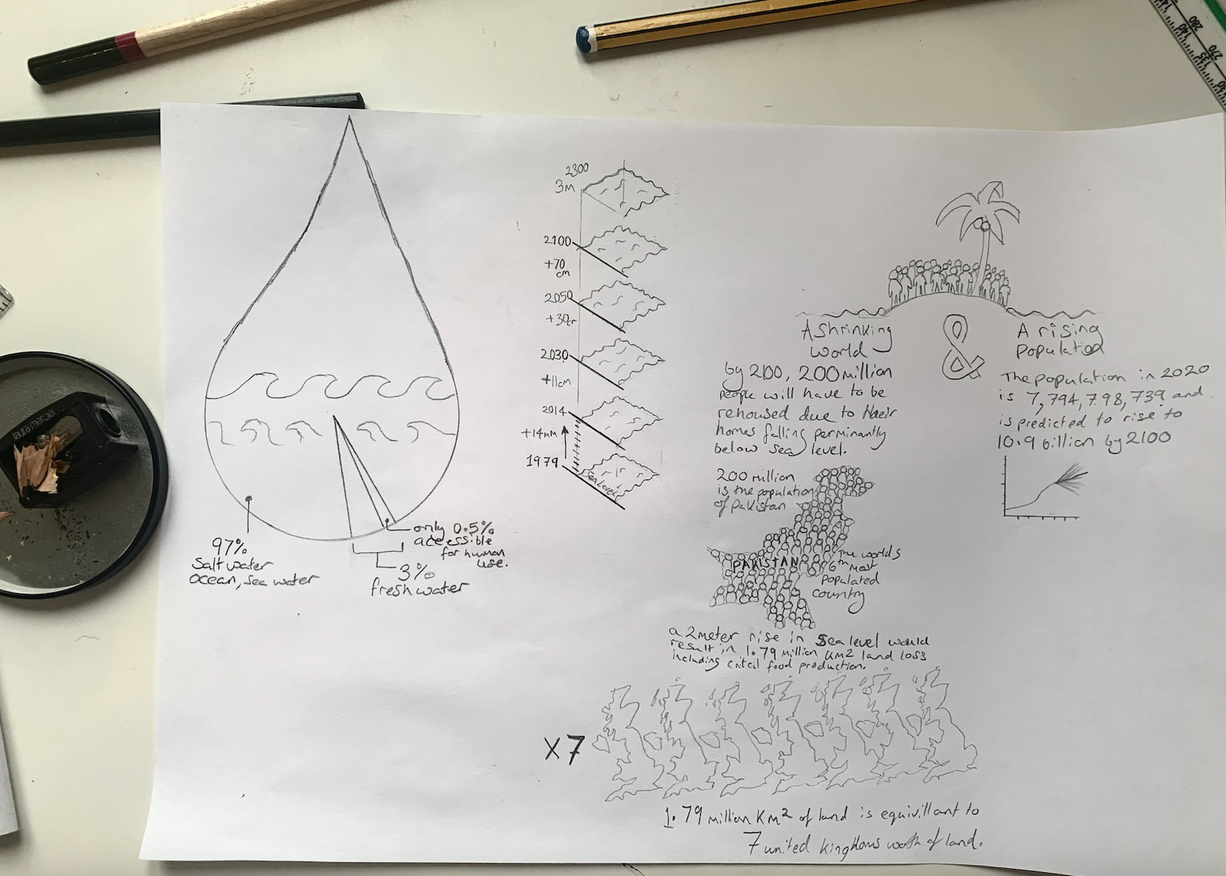
Initially I had sketched out various graphics from data I had found online to see what kind of hero graphic I could create that would be particularly eye catching to a perhaps potentially disinterested audience. I also planned to take advantage of the long slim aspect ratio of this poster and could use this to create a visual story leading the eye down from a title and hero graphic to the end statistics and a call to action to some where to learn more. I also think the length of the poster could be used to create some sort of time line down the side of the poster.
(see sketches below)
Researching:
Initially I had sketched out various graphics from data I had found online to see what kind of hero graphic I could create that would be particularly eye catching to a perhaps potentially disinterested audience. I also planned to take advantage of the long slim aspect ratio of this poster and could use this to create a visual story leading the eye down from a title and hero graphic to the end statistics and a call to action to some where to learn more. I also think the length of the poster could be used to create some sort of time line down the side of the poster.
(see sketches below)
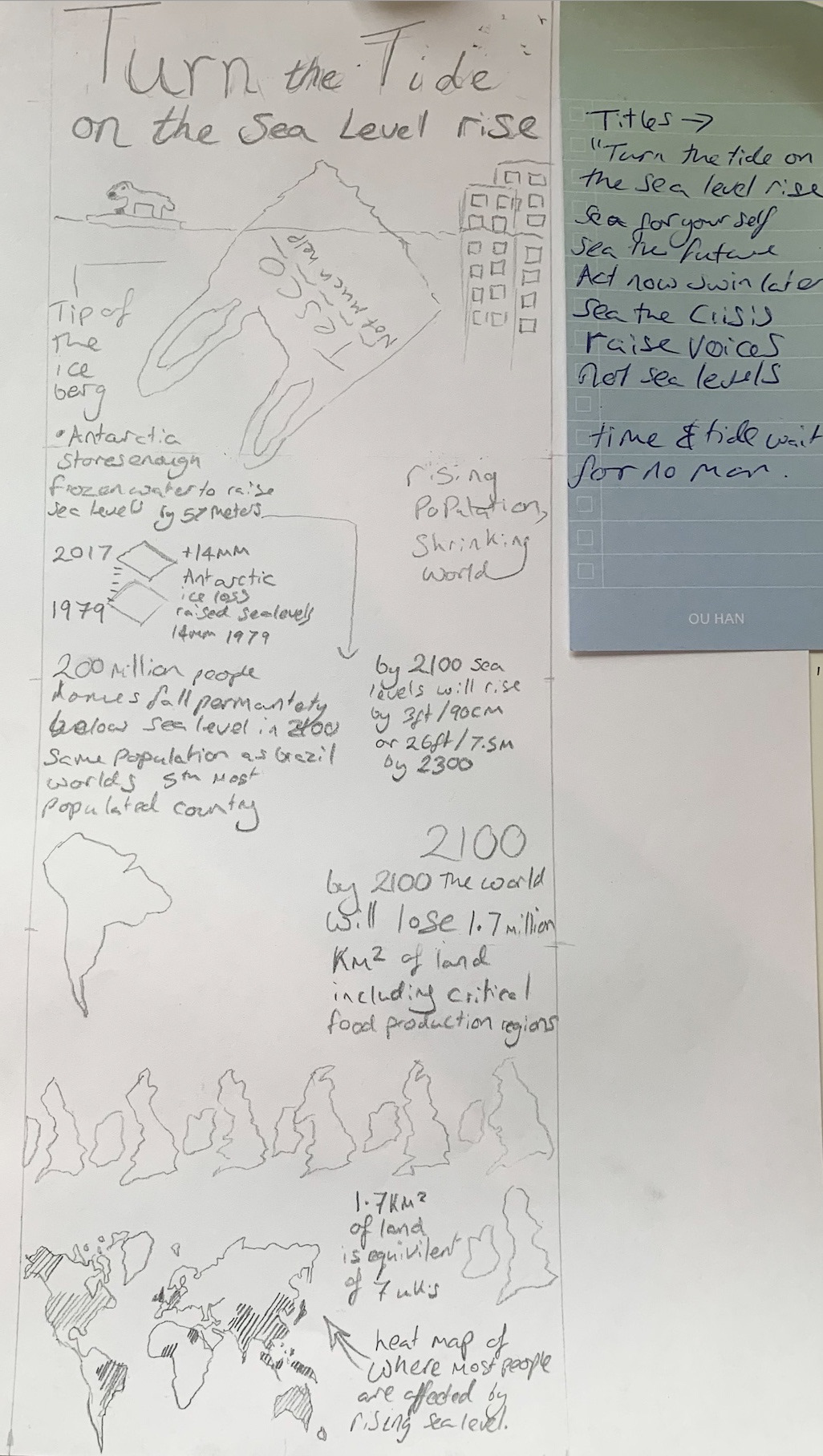
Development:
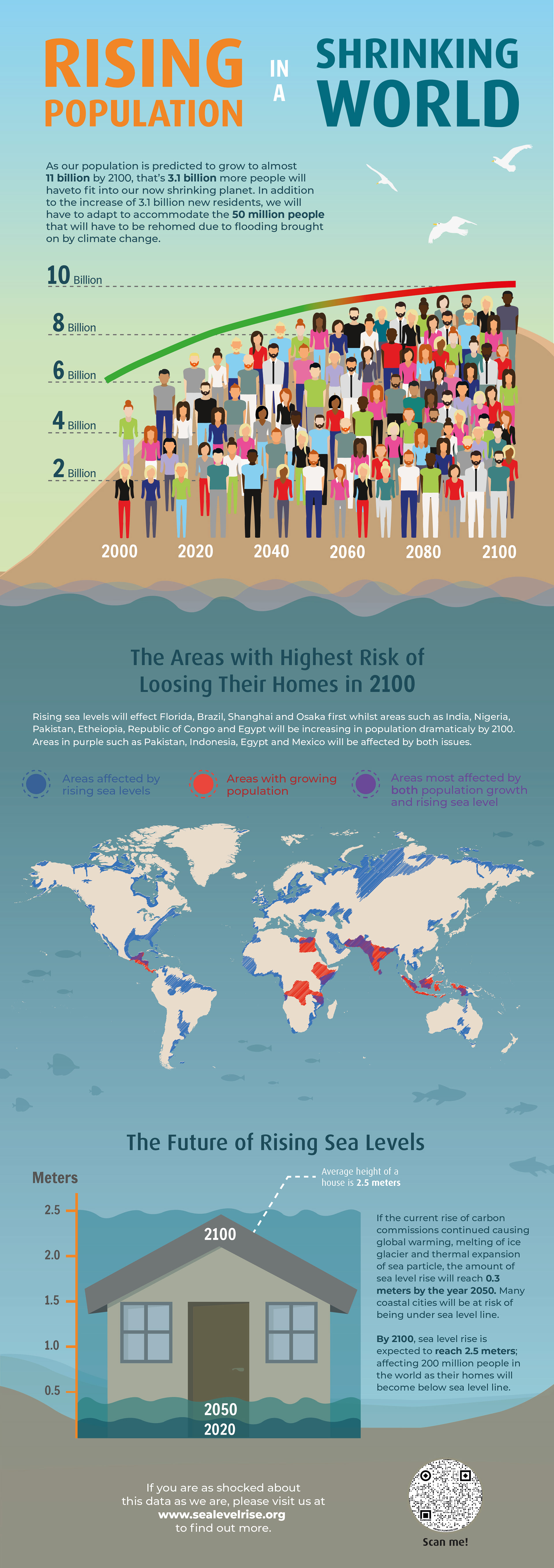
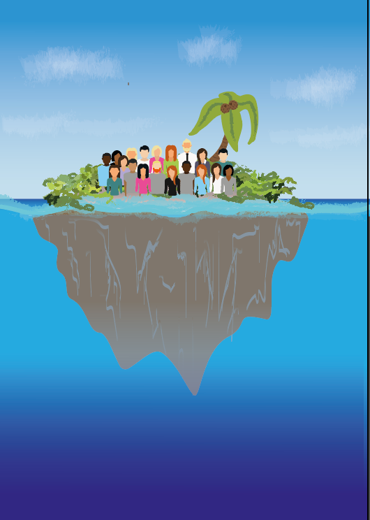
I started to create an island to represent the rising population with the shrinking world but realised this took up too much space on the poster for it to be just and illustration without representing any data. Too over come this I adapted the overpopulated island to form a graph showing the predicted population rise with more and more people in turn representing the over population.
I started to create an island to represent the rising population with the shrinking world but realised this took up too much space on the poster for it to be just and illustration without representing any data. Too over come this I adapted the overpopulated island to form a graph showing the predicted population rise with more and more people in turn representing the over population.
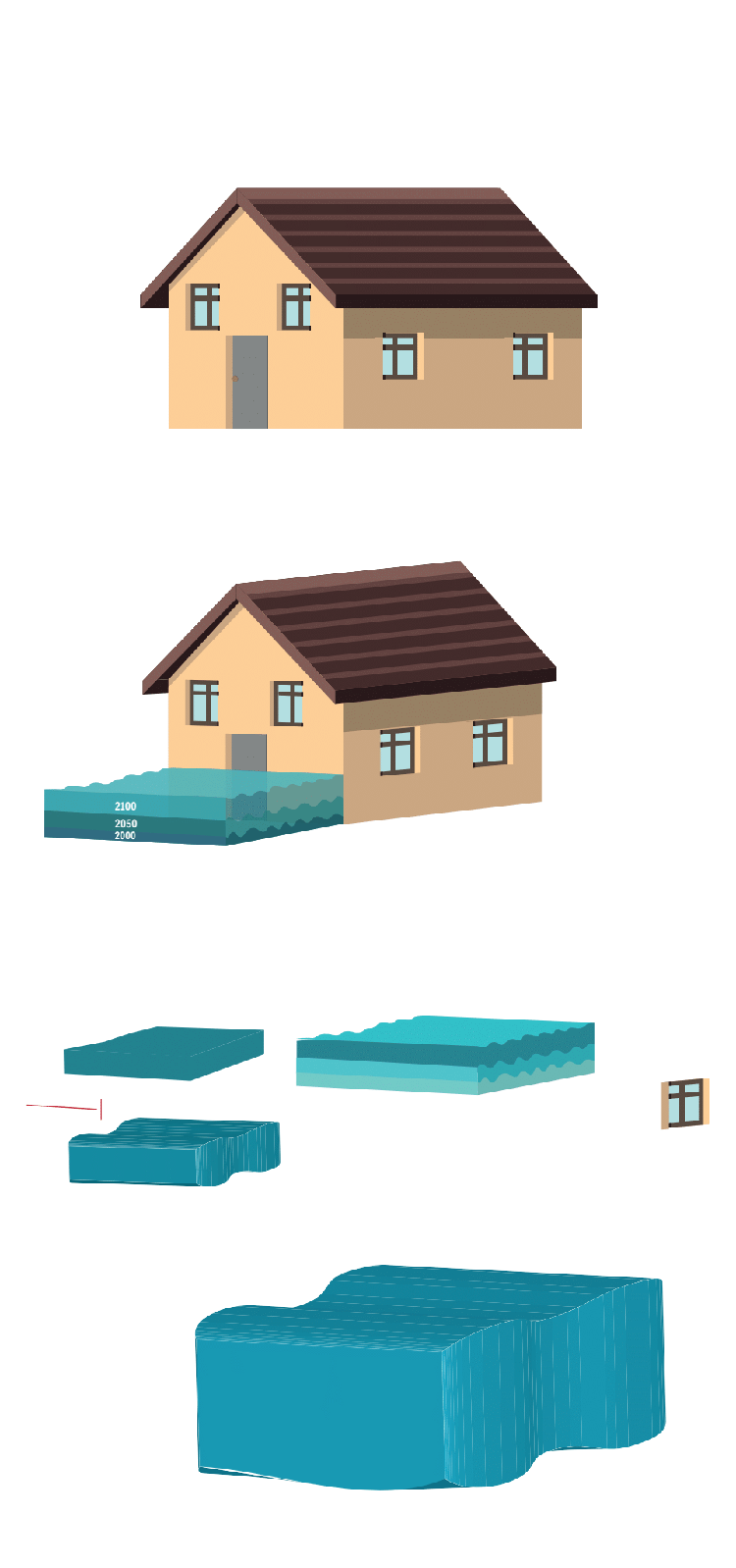
displaying water level rising
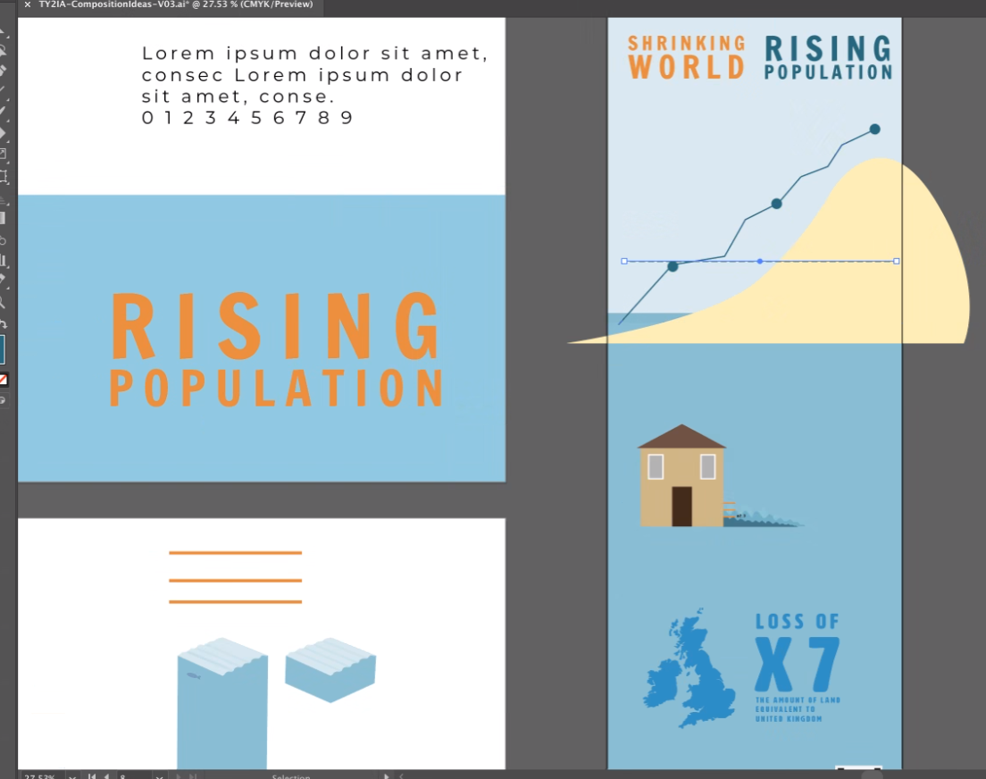
Sketching out of the poster
Following the population growth curve

Display type specimens

body typespecimens
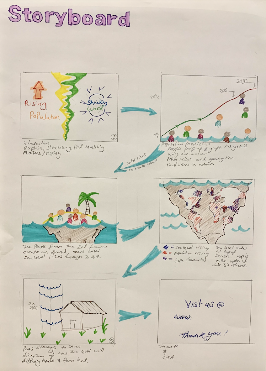
Plans for Animation:
I had intended to create an animation which would look something like the story board I have created but run out of time but might revisit this to practice animation and my adobe after effects skills.
I have also created a script for this animation which i could create with my existing graphics.
The Script:
"A rising population in a shrinking world As our population is predicted to grow to almost 11 billion by 2100, that’s 3.1billion more people we have to fit into our now shrinking planet. In addition to out planets 3.1 billion new residents, we will have to adapt to accommodate the 50 million people that will have to be rehoused due to flooding brought on by climate change. (20 seconds)
It's likely to start feeling a little cramped in here.
This world maps shows the areas of land that will be first hit by rising sea levels (shows blue) and areas predicted to experience the largest population growth, see Africa glowing red representing the estimates rocket in population with more than half of global population growth by 2100 to occur in Africa by 2050. The purple areas represent areas most affected by population growth and rising sea level meaning land loss and homes destroyed. (30 seconds)
This world maps shows the areas of land that will be first hit by rising sea levels (shows blue) and areas predicted to experience the largest population growth, see Africa glowing red representing the estimates rocket in population with more than half of global population growth by 2100 to occur in Africa by 2050. The purple areas represent areas most affected by population growth and rising sea level meaning land loss and homes destroyed. (30 seconds)
Government predictions expect if we continue to create the amount of greenhouse gas emission sea levels could rise by 2.5 meter above sea level by 2100 sweeping away homes.If you are as shocked about this data as well are, please visit us at www.sealevelrise.org to find out more.
Thank you for watching! (15 seconds)