Should Graphic Design be Client Serving or Socially Concerned?
Our ever-growing use of graphic design is undeniable; but should graphic design be client serving, meaning solely aiming to please the customer, meeting their needs and their needs alone. Or socially concerned, implying that the designer is actively conscious and mindful that their designs will be seen by an audience that could be influenced or misinformed by their work? A socially concerned designer refers to someone who would likely be sensitive and alert to current societal injustices, whether that be politically, socially, racially or ecologically, etc.
Approaching graphic design’s centennial, and, more recent mushrooming due to the digitalisation of the discipline and its exploding demand in the twenty-first century, I am opening a discourse debating who the practice should serve. This recent concern will examine the practice of both a purely client-serving method of designing, whilst also discussing the reasoning and difficulties in introducing a socially focused, client-responsible solution. I will explore two leading examples of either side of the debate; socially concerned Wolff Olins and client serving Massimo Vignelli. I will examine their benefits and downfalls using arguments published by authors, graphic design historians and sector-leading individuals and teams such as Victor Margolin, Elizabeth Resnick, Katherine McCoy and Alex Cameron.
After debating the two opposing schools of thought, I will develop my research by discussing whether this is a contemporary and current issue and what would be most important for the discipline's future. Finally, I will end with a conclusion to my debate. But firstly, I will introduce Ken Garland's pivotal First things first manifesto.
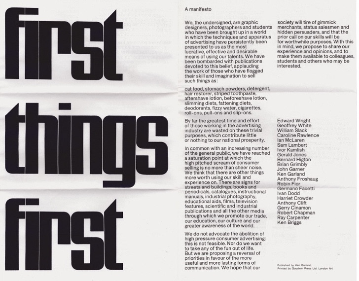
Figure 1: British graphic desinger Ken Garland's manifesto, 1963
In 1963 British graphic designer, Ken Garland alongside twenty fellow graphic designers, artists and photographers penned The First Things First manifesto. The manifesto was created in a booming economy when, for the first time, every social class was better off than ever before. This meant there was more money to spend on luxury’s, white goods, hobbies and transport (Poyner, 1999). Though the design industry could ride off the back of this commercial success of the 60s, the signatory graphic designers felt their own industry had become complacent, unselective and uncritical of the work they had been producing (Flask, 2021).
The signatory looked down upon the way in which their industry rapidly churned out trivial advertising and packaging for mainstream out-of-control consumer goods with little thought put into the design or content of the items. The manifesto aimed to pledge that its signatory would divert their driving force from monetary gain to a more selective, public-serving method that
considered the audience their work would be seen by, in turn, bettering society and the world of design. Its publishing aimed to challenge other visual communicators to do the same. The First Things First manifesto was published in 1964 by left-wing newspaper, The Guardian, increasing its broadcast, which was then stretched further when Garland was interviewed on television for the BBC news program. It has since been revisited in the year 2000.
considered the audience their work would be seen by, in turn, bettering society and the world of design. Its publishing aimed to challenge other visual communicators to do the same. The First Things First manifesto was published in 1964 by left-wing newspaper, The Guardian, increasing its broadcast, which was then stretched further when Garland was interviewed on television for the BBC news program. It has since been revisited in the year 2000.
After editing the Design magazine for six years, Garland formed a fertile association with the Campaign for Nuclear Disarmament (CND). In his own words, this was a “do-it-for-love” project. The poster he created for the CND march highlights how Garland’s work was focusing on his socialist personal beliefs, philanthropy and passion for activism. He began to revolt against the1960s societies insatiable appetite for consumer goods.
As the manifesto coincided with the boom of consumerism, the amount of visual work needed for packaging and advertisement also increased. Rick Poynor talks of an advertising “creative revolution” in New York City where some advocates of the creative revolution also worked in London agencies bringing the new ideas-based thought process of graphic design across the pond.
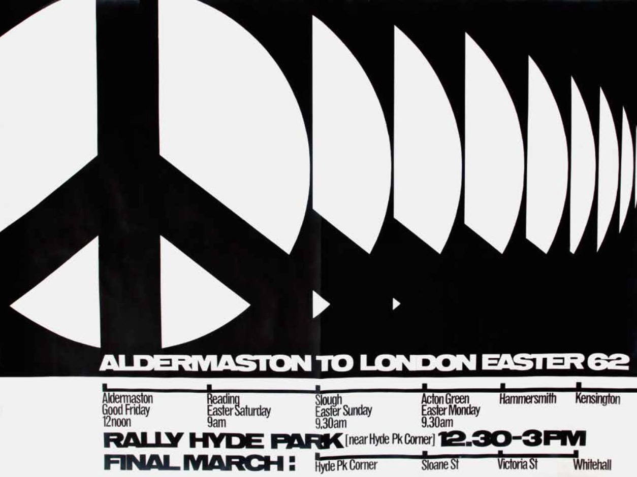
Figure 2: Ken Garland: CND Easter march poster, 1962
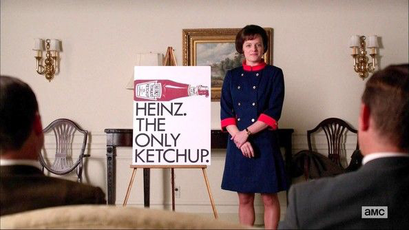
Peggy Olsen Pitches Heinz Ketchup
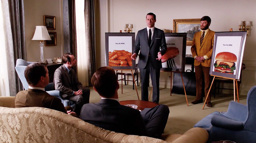
Front man Don Draper
MadMen of Madison Avenue
Briefly digressing, this new golden age of advertising with its rocketing budgets and sense of glamour can be seen in the American period drama television series “Mad Men” which focuses on the glamours and dramatic life of a creative director of a fictional advertising agency “Sterling Cooper” on Madison Avenue, New York during the evolving moods and social mores of the United States in the 1960s and 70s. The show sets the mood for the 1960’s consumerist behaviour for me, in an informative yet entertaining way as I didn’t experience this period myself. I now see that people wanted recognisable branded products and the 1960’s gave way to the birth of the iconic adverts we can still see in the media today, such as Coca-Cola, 7-up, Marlboro, Ford, VW, & Heinz. The explosion of advertisement was not only felt in the design industry, but it ricocheted into the art world, which can be seen in pop artists such as Richard Hamilton, Mel Ramos and Andy Warhol whose work features big names brands such as Brillo Pads, Campbell’s Soup and Coca-Cola.
Poynor goes on to explain the two divisions highlighted by Garland's manifesto, the first being “design as communication (giving people necessary information)”, the second being “design as persuasion (trying to get consumers to buy products)” the manifesto is arguing that graphic designers have to spend too much of their skills trying to advertise cat food and slimming diets whilst a more worthy cause had to be placed on the back burner. The signatories wish they could spend more time on design that benefits a user, such as educational aids and books but that is not where the demand or hefty commission lies, unfortunately. It must be said that the designers understood that others may not have the luxury of choice and understand that designers will have to design for commercial adverts as it's simply “not feasible. Nor do we want to take the fun out of life. We are proposing a reversal of priorities in favour of the more useful and more lasting forms of communication in the hope that our society will tire of gimmick merchants, status salesmen and hidden persuaders, and that the prior call on our skills will be for worthwhile purposes.” (Garland, 1964)
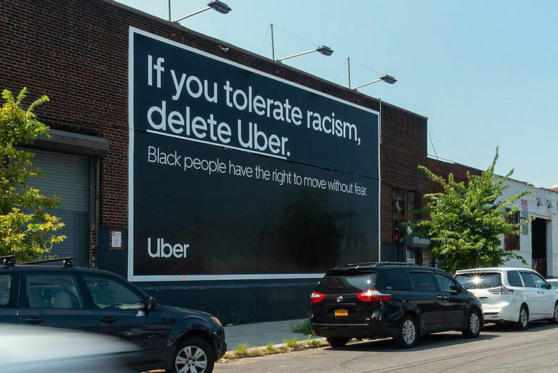
Figure 5 Wolff Olins advert for Uber
Wolf Olins website announces that “we make things different to make a difference”, this reputation has elicited countless clients whose brand identity is one that is synonymous with a trustworthy and philanthropic ethos such as Uber, Amnesty International, Google, Unilever and Cancer Research UK.
Jon Alexander MA in Global Ethics and Human Values and Chris Moody creative director or Wolff Olins discussed, in the back of a taxi, “Killing the consumer”.
Moody asks “you said the creative industry is ill-defined but do you think the creative industry is ill ?”
“I think we’ve got a load of institutions and structures that are tailored to an era that’s all about how do you flog stuff to people” and “creativity has somehow become instrumental to selling. Surely the idea of creativity is far bigger than that.”
Throughout the interview, the duo is set on the fact that we are not harnessing the power of creativity and design to its full potential. Instead, it is being used for fluffy decoration and to persuade users to part ways with their money. “the fundamental message is shush little people, shush, just go shopping.” (BackChat with Wolff Olins: Killing the consumer, 2020).
Moody, explaines in response to his Impact Award, that the world doesn’t need more brands, there are plenty, we just need better ones that can give people the things they need and can add value to the world making it a better place. Wolff Olins can be seen doing this in their designs for Uber (Figure 5). They believe it is no longer enough for design to be amoral, avoidant or not racist; they must be anti-racist, actively political and stand up for their own social stance even though it may possibly reduce their customer base.
Graphic designer, teacher and design author Andrew Howard has worked for do-gooder clients such as the BBC, Greenpeace, the British United Nations Association, the national housing charity “Shelter” and local government and health authorities (Howard, 2021). His design agency Studio Andrew Howard, situated in Portugal, choose to focus on working for beneficial cultural, charitable and educational institutions. His pledge on the original First Things Manifesto paved the way for his discussions published by Eye magazine the international review of graphic design and visual culture.
Howard first discussed the politicisation of design with Eye magazine in 2000 with an opinion titled “Design beyond commodification”, He stated that designers can “smuggle in” social issues into their work, but politics is unavoidable. His first article for Eye “There is such thing in society” was titled in response to Margret Thatcher’s 1987 quote “There is no such thing as society”. He discusses Garland’s manifesto and notes it is still relevant 30 years after its publication and how its issues remain unchanged in the design world. The argument unique to Howard is the social function and purpose of graphic design and the two opposing ideologies that emerged in mid 19990s. The first being “poststructuralism” which follows the notion that meaning is not stable, it is dependent on the interpreter rather than the structure. Ellen Lupton has stated that poststructuralism is an attitude not a style, it is an openness of meaning and a romantic theory of self-expression (Lupton, 2004). This can be seen in alumni work from The Cranbrook Academy of Art in Michigan, USA. Its fitting sobriquet the “incubator of mid-centaury modernism” is telling of the kind of alumni created at the prestigious art school whose website brands itself as an “experimental artist’s colony” which “fosters personal growth” of its students (Booth, 2021).
The second ideology being one that strives for complete clarity before aesthetic, function over form. Rick Poynor, design writer and Professor at the University of Reading has noticed an increasing backlash in both students, tutors and young graphic designers in “excesses” of additives for design without purpose (Poyner, Friedman and Bruna, 1993). Poynor has investigated the favouring of unequivocal design and brings attention to Dutch design teams Dingeman Kuilman and Niels Meulman, who seek a pure and basic approach uncluttered from the unneeded superfluous decoration.
But how is this related to the client-served or socially serviced debate? I believe the more self-indulgent ideology that allows graphic designers to produce what they themselves would like primarily, and the usability of the item is secondly, isn’t true designing as its not designing for a purpose. I believe this ideology is more of fine art or creating art for art’s sake. Rather than a client coming to a professionally trained visual problem solver. The second ideology I think of as more beneficial as what the client really needs is society to think well of the product rather than pleasing their own desires of how the design should look.
William Drenttel attributes the lack of efforts of social design to its vagueness in definition. Interchangeable terminology such as “social change” “social innovation” and “social design” are used habitually in design writings but are scarcely accompanied with a transparent and pragmatic explanation that can be understood by young designers, instantly switching off their interest in the topic due to its ambiguous definition (Drenttel and Lasky, 2010). Advocate of Social design, Elizabeth Resnick can concisely explain the meaning of social design stating its “the practice of design where the primary motivation is to promote positive social change within society.” She acknowledges that social design is still in its infancy and its teachings and research are just budding (Resnick, 2021). Whilst attending the Social Impact Design Submit held in the Rockefeller Foundation headquarters, New York in 2012, Here they distinguished the term “socially responsible design” as the title of socially environmentally and comically sustainable design. They also clarified that this term could be interchangeable with “public-interest” “social impact design” “socially responsive design” “transformative design” and “humanitarian design”, but Resnick questioned would greater clarity really lead to a better-defined goal?
The goal of social design is to shine a light on emerging concepts and recent efforts to initiate change for society's benefit rather than profit-oriented intentions. The goals for social design can be multifaceted the motivations behind it can be hard to explain.
American design historian and researcher Victor Margolin reflects on historic efforts in the design of addressing social issues in his 2015 paper “Social Design: From Utopia to the Good Society.” He uses 19th-century movements that aimed to improve the working conditions to illustrate his argument. He cites designer William Morris as a pioneer in improving the working condition for labourer by improving air quality and rivers and reducing the working hours down to a four-hour day and that we abolish the profit motive.
Margolin goes on to to suggest constructive ways our adapting the visual communications pedagogy in his chapter of Elizabeth Resnick’s 2016 book “Developing Citizen Designers”. He introduces the chapter by acknowledging that graphic design has become an increasingly more complicated subject than it was when the discourse of its teachings began in the 1950s. Undeniably the biggest change to graphic communication is the introduction of the internet which rapidly overtook printed media. Because of this jolt in communication method, design school have tried to catch up by featuring human-computer interactions courses. The ease of worldwide communication is creating a “shrinking world” with that comes new communication needs, such as universal signage systems and instructions making the teaching of graphic communication one that globally. Previously, the graphic designs curriculum largest challenge was designing for both print and digital media but now the role requires a cosmopolitan thinker who is agile to changes and sensitive to different cultures visual cues (Resnick and Margolin, 2016). The role of graphic designers is requiring more skills than ever anticipated. Not only do we need traditional communication and semiotic theory but sensitivity in global visual culture and an understanding of sociology, anthropology and cultural norms.
Margolin states “at one time graphic design was for the most part design to promote commerce, but today social communication in all its multifarious forms is the central challenge to graphic designers.” This calls for designers to apply skills in information design and sensitivity to recent social issues and semantics rather than the previous skill set of persuading consumers to part money with a product. Margolin suggests using our persuasive skills to “promote positive social behaviour such as ethnic and racial tolerance, energy conservation, and overall environmental citizenship.” He encourages designers to move their use of typography, information architecture and symbolism from not only a purely visual motive but to a social motive as well. Social design also can be used to increase inclusivity for example limiting the use of language in favour of a universal visual language that transcends the language barrier of world-wide travel and communication. Victor Margolin is passionate that ways of combatting the new social challenges of a graphic designer should be a pivotal part of a design school education just as designing for digital media has become during the 21st centaury. Margolin states “for design schools, whether they be part of independent art academies or programs within comprehensive universities, engagement with fields of knowledge beyond design is mandatory. How this task can be converted into new curricula remains to be developed but, given the enormity of the task ahead, communication between and among design school is essential, particularly schools that belong to different cultural milieus.”
Figure 7 Examples of Massimo Vignelli’s work for various clients
Vignelli associates, ran by Massimo and his wife Lella, took on a modernist 1960’s style approach to work. The size of this agency is made clear by a quote from Michael Bierut for an essay he wrote in the design observer "it seemed to me that the whole city of New York was a permanent Vignelli exhibition (around 1981). To get to the office, I rode in a subway with Vignelli-designed signage, shared the sidewalk with people holding Vignelli-designed Bloomingdale’s shopping bags, walked by St. Peter’s Church with its Vignelli-designed pipe organ visible through the window. At Vignelli Associates, at 23 years old, I felt I was at the centre of the universe." (Bierut, 2014)
His Clients such as American Airlines, Knoll, IBM and Bloomingdale would be expecting a certain uniformed look indicative of his work. Some of his style is still prevalent in his clients branding today. Vignelli’s theory of design was “if you can design one thing, you can design everything” this would be made easy by his strict obedience to grids and use of Helvetica. Vignelli declares that type should not be expressive at all. Another of his quotes (see figure 10 below ) concisely explains that he serves the client and the client alone.
Figure 8,9,10 Massimo Vignelli famous quotes
Design as a Social and Political Force by Katherine Mccoy, co-chair of the graduate design program for Cranbrook Academy of Art, weighs in on the lack of subjectivity and social awareness designers used to put into their work. She raises a drastic yet thought provoking question asking “how many graphic designers today would feel a loss if their freedom of expression were handcuffed? Most of our colleagues never exercise their rights to communicate on public issues or potentially controversial content. Remove our freedom of speech and graphic designers might never notice. We have trained a profession that feels political or social concerns are either extraneous to our work, or inappropriate. (Heller, Vienne and McCoy, n.d.)” She reminds readers of the social climate in the late 60s at her job for Unimark international design firm where idealistic and rejecting of the idea of self-expression in design in favour of a strict following of grids, the famously neutral typeface Helvetica and general standardisation within the design work (Conradi and Rau, 2010). Unimark International employees were bound by its sacrosanct approach to objective design believing it was a designer’s role to be neutral and convey the clients message removed from their own style of possible subjectivity, objectivity was paramount. McCoy recalls her colleagues at Unimark international being remarkably detached from the fiery American politics from the Vietnam war, assignation of John F. Kennedy, Robert F. Kennedy and Martin Luther King during the 60s. McCoy describes her fellow employees as “apolitical” designers who “cherish the myth of universal, value-free design” even going as far to alike their unbiased behaviour to someone who is fit for the equitable nature need for scientific testing. Working in a socio-politically disinterested environment turned McCoy’s interests further towards social and political idealism such as the anti-Vietnam peace movement. McCoy was torn between her own passion and beliefs and working for a commerce focused politically disinterested international firm.
Katherine McMoy even goes as far to liken the recent profession to the world’s oldest profession, prostitution. Saying they too must remain neutral and unreactive to the situation are able to be dispassionate to remove them self from their ethical and political values. Designs calling for impartial arbitrator is also discussed at length by typography scholar Beatrice Warde whose essay “The Crystal Goblet” uses the metaphor of a goblet of wine, the goblet being the typography and the wine being the content. Warde explains there are two choices of vessel “one is of solid gold, wrought in the most exquisite patterns. The other is of crystal-clear glass, as thing s a bubble, and as transparent.” (Warde and Lange, 1980). She suggests that one could identify whether another person is a connoisseur of wine by their choice of the two goblets. If you are a wine novice you may choose the embellished golden goblet, if you are well versed in fine wine, you may choose the crystal goblet as you would know it is designed to help reveal the beauty of what it contains. Though this metaphor seems to require a rather long stretch of the imagination Warde goes onto describe the similarities between the perfect wine glass and typography she is describes the “long thing stem that obviates fingerprints on the bowl. Why? Because no cloud
must come between your eyes and the fiery heart of the liquid. Are not the margins on the book pages similarly meant to obviate the necessity of fingering the type-page?”
Undeniably the graphic design discourse has been heavily shaped by the world renown post world war German art school, The Bauhaus and their diligence towards Swiss typography. Though the Bauhaus is widely well regarded, there teaching have done much to increase the ignorance of cultural milieus whilst perusing universal design. The Bauhaus’ paradigm of universal design is much alike to Unimark international as their desire for value free-design and objectivity is much the same. These one-size-fits-all methods can be credited to the current lack of teaching and practicing of social design. Yes, there was a time when the Bauhaus’ revolutionary call for objectivity was relevant especially in the wake of the pre-war eclecticism where functionality of design was secondary to the beauty and decoration of 19th century design (Heller, Vienne and McCoy, n.d.).
Striving for true neutrality and objectivity allows designers to bypass compassion and social concerns all together. Branding this strategic ignorance as functionalism and utilitarianism allows the designer to exclusively design for the client without thinking about the social context the design will be used in when it is released to the world. McCoy can be quoted “the idea of value-free design is a dangerous myth. In fact, all design solutions carry a bias, either explicit or implicit. The more honest designs acknowledge their biases openly rather than manipulate their audience with assurance of universal “truth” and purity.” Artist and Designers where able to distance themselves further from the audience and the reasoning behind their work by using abstraction. Popular after World war two, the style removed the use of imagery, illustration and symbolism making the work inoffensive to any viewer and devoid of meaning in turn it was suitable for any commercial job. Modernist designers favoured this style of design as it was suitable for any job, lack of meaning also means lack of misinterpretation by its viewers, something that cannot be said for the use of imagery. McCoy pleas for designers to “break out of the obedient, neutral, servant-to-industry mentality, an orientation” that was prevalent during the 1980s. the difficulty for a designer is problem solving for the client is paramount, but it is also our social responsibility to question should we really be helping advertise cigarettes and alcohol? This is up for debate, but McCoy concludes that one thing is for certain that design is not simply neutral or value-free, the computer science term often just abbreviated to GIGO, garbage in, garbage out can be used to concisely summarise deign for ethically questionable products. A design can have no more integrity than the content it is designed for.
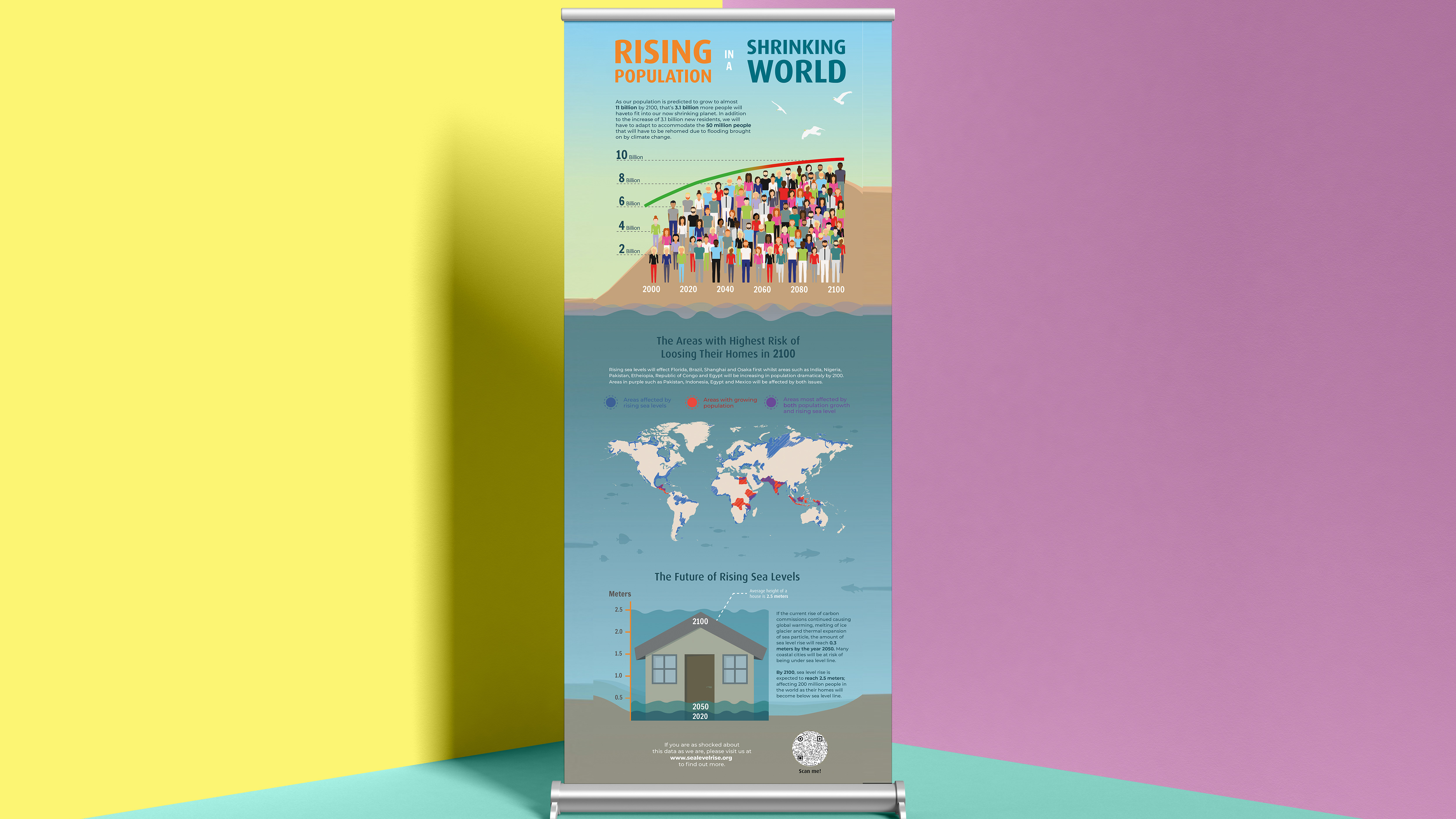
As described in Ken Garlands manifesto, designing for commerce is essential to designers as it is by far the most lucrative client to design for, but how do we meet in the middle of creating compassionate social design whilst also creating a living? McCoy emphasis that the occasional pro bono work for a charitable cause is not enough. The selective choice of client is how the design world can make the most change. But being selective over clients is a privilege alien to many young designers who are in need of making a living. Only the most fortunate designers can work for a socially sound client who also has the budget to pay for a skilled designer. It is well known that more worth-while courses such as charities and organisations are likely to have the least resources as opposed to multinational corporations. The solution to this is debatable, does the responsibility lie with the ethically questionable business itself? what can we do to train future designers to be wary of this? Could design school teach political conscious, if so, who enforces where the ethical line in the sand starts and ends? The answer to these questions is likely no. Ethics themselves are also subjective but can we sow the seed of questioning the ethics behind a job or commission into young designers. Well-seasoned graphic design educator at the Cranbrook academy of arts instructs that teaching these issues to student designer must be done early before their approach to design is locked onto neutrality. It is essential we teach students to marry together design choices with the content and context of which it will be displayed in, we cannot allow students to become passive in the school of thought that content is unrelated to visual form. Interestingly McCoy notes that “It is disheartening to see the vast number of undergraduate projects dedicated to selling goods and services in the marketplace devoid of any mission beyond business success. Undoubtedly all students need experience in this type of message and purpose. But cannot projects cover a broad mix of content, including issues beyond business? Cultural, social, and political subjects make excellent communication challenges for student designers.”. After reading this quote I could help but draw parallels between Katherine McCoy’s stance and what design practice we are taught at reading, though we are taught commercial project such as book design, property brochure design, design for movie posters and a whole module in packaging design we also have had experience in social design whilst studying ways in which we can display data for visually impaired people or older generation, instructional design with an emphasis on language free instruction and design for social issues such as out recent poster in animations cover topics such as rising sea level, period poverty, bleaching of the coral reef, forest fires and antibiotic resistance.
Alex Cameron introduces his chapter for Stuart Meaning and Esther Dudley’s year 2000 book, Becoming Designers: Education and Influence by explaining the plot of Steven Spielberg’s based-on a-true-story Blockbuster “Amistad” in which captive slave mutineers stand on trial in America. The slaves speak no English and are appointed a translator who speaks both English and the native language Mende, the translator is also a former slave. The court continue to ask questions to the salves through the help of the translator. Damming and irrational accusations were thrown at the defendants and rather than awaiting the response of the slaves the translator screamed his own defence of those in the dock. It is a highly emotional act based on his own experience of what is right and wrong. But was the translator right to do so? He “broke the rules” momentarily by not acting as a translator and letting his own opinion and experience spur him in to defend the slaves but was he right in doing so? I believe Cameron introduced this narrative to the audience to set the scene for how me may identify with the translator being a graphic designer who isn’t supposed to speak up and voice their own opinion but merely translate one piece of language to another.
Cameron’s stance on design is an unusual one and the article is hard to navigate as he seems to acknowledge the benefits of social design but dismisses practising it evening going as far to say bringing ethics into design is potentially damaging for all concerned. His questioning of ethics is odd, who wants to be unethical? He draws similarities of the recent design thinking trend by looking back to the 1980’s design thinking trend of “green design”. Green designers focused their efforts on practicing sustainable design by encouraging users to read lengthy reports online or download them instead of printing 70+ page reports or print them on recycled materials using non-toxic inks and packaging and saving energy on mass printing when possible (Dougherty, 2010)
Cameron’s chapter introduced me to a conference held in Texas by the American Institute of Graphic Artists titled “Dangerous Ideas” which started a conversation about the position of designers in a much broader social and political landscape (Dudley and Mealing, 2000). Hungarian designer Tibor Kalman and conference attendee exposed the design industry’s contradictions making reference to the deceitful marketing used by making filthy oil companies look “clean”. During an interview Kalman was questioned if he was a design world “spin doctor” meaning someone employed to encourage a favourable impression of something. He answered, “Isn’t that what most of design is about – using design to make something seem different from what it truly is?” but his answer ignited his own self-reflection on the power of designers and how we can use them in the World. Another example is how a new car brochure can be made higher quality than the car or making supermarket pasta sauce look like it was made by Grandma or putting a “hip” spin on a run-down apartment (Kalman, 2021). These examples encouraged Kalman to co-chair the AIGA Dangerous Ideas conference.
Tim Rich acknowledges the difficulties that come with striving to be an ethical designer. The issues are ethics are subjective. He humorously states in his article for Critical Writing on Graphic Design “where do you draw the line? “or in the case of designers and illustrators, just who will I draw the line for?” (Bierut., Drenttel. and Heller., 2002). Rich understands that most budding graphic designers may have to work for anyone with a cheque book and pen he confesses that “I too have sold my soul” for a business he does not necessarily support. He questions why highly moralistic designers leave their own moral conscious at home when entering the studio. In particularly this is true of owners of graphic agencies who call the final shots on who they are willing to work for. However, how is a threshold set for which clients the agency will work for? Do you create a prior ethical questionnaire for
the potential clients? Do you still work for pharmaceutical companies with a large budget who test on animals? Alex Cameron brings to attention that social design doesn’t necessarily makes a difference as we do not yet know if social design is effective in social engineering. His example of this is the change in legislation to ban advertising of cigarettes in public places in the hopes to discourage new smokers to take up smoking. Research from professors of marketing shows that the ban on cigarette advertising does not have a significant effect on their consumption (Capella, Taylor and Webster, 2008).
In conclusion, the rapidly changing landscape of where we view client facing or socially serving design makes it hard to keep up as both a designer and a viewer. Over the past 30 years the average person as changed their main platform of news and information from print, newspapers and books to downloading from the web to online articles to ever changing social media. Because of this infeasible need to keep up as a designer, the reader themselves must become more conscious and alert as a thinking consumer and become more wary of what we are being sold and the hidden motives and bias that come with new media. As we fix social problems in one platform, another will inevitably sprout. I personally am in favour of educating designers to show social sensitivity and political activism within their work when appropriate. But to also practice objectivity, even if that means putting their own personal biases aside in certain scenarios. Eventually, we as digesters of visual design must take responsibly to consider and judge what we choose to consume.
Bibliography
BackChat with Wolff Olins: Killing the consumer. 2020. [video] Directed by C. Moody. London: Wolff Olins.Available: https://www.youtube.com/watch?v=ZNQmTm4-b34
Booth, G., 2021. Our History | About | Cranbrook Academy of Art. [online] Cranbrook Academy of Art. Available at: <https://cranbrookart.edu/about/history/> [Accessed 21 March 2021].
Capella, M., Taylor, C. and Webster, C., 2008. The Effect of Cigarette Advertising Bans on Consumption: A Meta-analysis. Journal of Advertising, [online] 37(2), pp.7-18. Available at: <https://www.jstor.org/stable/20460839?seq=1> [Accessed 25 March 2021].
Conradi, J. and Rau, K., 2010. Unimark International. Baden, Switzerland: Lars Müller.
Dougherty, B. and Staff, C., 2010. Green Graphic Design. New York: Skyhorse Publishing Company, Incorporated.
Dudley, E. and Mealing, S., 2000. Becoming Designer. Exeter: Intellect Books, p.143.
Drenttel, W. and Lasky, J., 2010. Winterhouse First Symposium on Design Education and Social Change. [online] Design Observer, p.Challenge 1. Available at: <https://designobserver.com/feature/winterhouse-first-symposium-on-design-education-and-social-change-final-report/22578> [Accessed 23 March 2021].
Flask, D., 2021. First Things First : Design Is History. [online] Designishistory.com. Available at: <http://www.designishistory.com/1960/first-things-first/> [Accessed 5 March 2021].
Gabriella, V., 2017. Graphic design trends ideas: the 60s. [online] Vera Design. Available at: <https://veradesignblog.wordpress.com/2017/02/23/graphic-design-trends-the-60s/> [Accessed 5 March 2021].
Garland, K., 1964. ken garland:graphic design:committee of 100. [online] Kengarland.co.uk. Available at: <http://www.kengarland.co.uk/KG-published-writing/first-things-first/> [Accessed 5 March 2021].
Heller, S., Vienne, V. and McCoy, K., n.d. Citizen designer. Allworth press, p.3.
Howard, A., 2021. about andrew howard / studio andrew howard. [online] Studioandrewhoward.com. Available at: <http://www.studioandrewhoward.com/about/andrew-howard/> [Accessed 7 March 2021].
Kalman, T., 2021. Tibor Kalman on social responsibility. [online] Hellerbooks.com. Available at: <http://www.hellerbooks.com/pdfs/dialogues_kalman.pdf> [Accessed 25 March 2021].
Lupton, E., 2004. Typotheque: Deconstruction and Graphic Design: History Meets Theory by Ellen Lupton. [online] typotheque. Available at: <https://www.typotheque.com/articles/deconstruction_and_graphic_design_history_meets_theory> [Accessed 21 March 2021].
Resnick, E., 2021. Introduction. In: The Social Design Reader. Bloomsbury Visual Arts.
Resnick, E. and Margolin, V., 2016. DEVELOPING CITIZEN DESIGNERS. [S.l.]: BLOOMSBURY VISUAL ARTS, p.14.
Poyner, R., Friedman, D. and Bruna, D., 1993. Eye Magazine | Opinion | Whatever became of the content?. [online] Eyemagazine.com. Available at: <http://www.eyemagazine.com/opinion/article/monitor-quest-for-clarity> [Accessed 22 March 2021].
Poyner, R., 1999. Emigre: Essays - First Things First Revisited. [online] Emigre.com. Available at: <https://www.emigre.com/Essays/Magazine/FirstThingsFirstRevisited> [Accessed 5 March 2021].
Warde, B. and Lange, G., 1980. The crystal goblet. St. Paul [Minn.]: Bieler Press.
Image credits
Figure 1, Manifesto : https://fontsinuse.com/uses/19456/adbusters-first-things-first-billboard
Figure 2 CND poster : https://collections.vam.ac.uk/item/O242989/aldermaston-to-london-easter-62-poster-garland-ken/
Figure 3 MadMen Screenshot: http://www.jordanorlando.com/ns/mad-men-outgrew-its-ads/
Figure 4 Wolff Olins Taxi interview video : Available: https://www.youtube.com/watch?v=ZNQmTm4-b34
Figure 5 Wolff Olins Uber campaign: https://www.wolffolins.com/views/six-sigs-of-a-conscious-brand/
Figure 6 Wolff Olins Tesco bag: https://www.creativereview.co.uk/creative-collaborators-tesco-wolff-olins/
Figure 7: Examples of Massimo Vignelli: http://www.iitaly.org/magazine/style/articles/article/massimo-vignelli-good-design-responsible-design
Figure 8,9,10 Vignelli quotes: https://thefutur.com/blog/massimo-vignelli-best-quotes