Diptypch magazine
Inspired by a visit to the Frieze art fair, Diptych magazine is a prototype independent magazine focusing on fine art and the art world. Designing Diptych has been a thoroughly enjoyable experience. Creating a recognisable brand identity, testing how best to combine word and image, and crafting a unique masthead has led to convincing and authentic mock-up that could catch a reader's eyes in stores such as Jeremy Lesily's Magculture.
Inspired by a visit to the Frieze art fair, Diptych magazine is a prototype independent magazine focusing on fine art and the art world. Designing Diptych has been a thoroughly enjoyable experience. Creating a recognisable brand identity, testing how best to combine word and image, and crafting a unique masthead has led to convincing and authentic mock-up that could catch a reader's eyes in stores such as Jeremy Lesily's Magculture.
Cover ideation
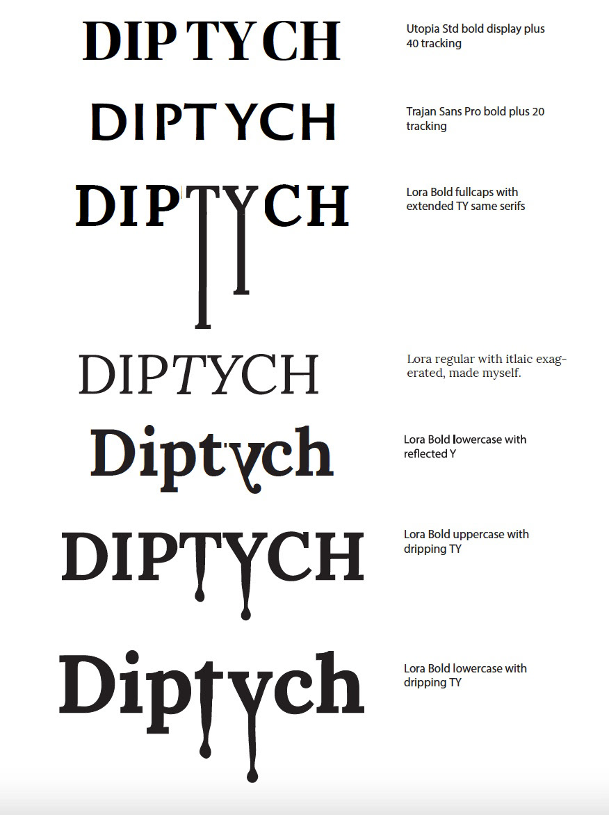
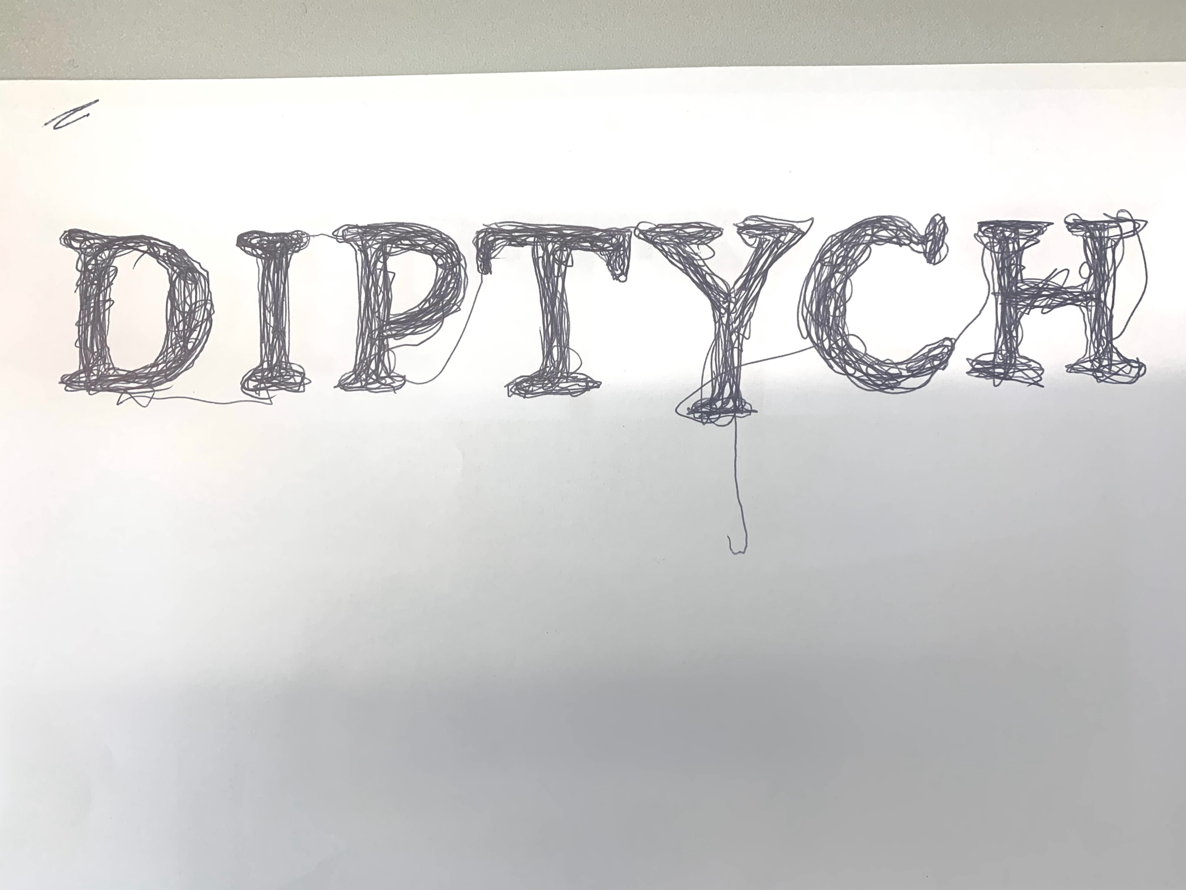
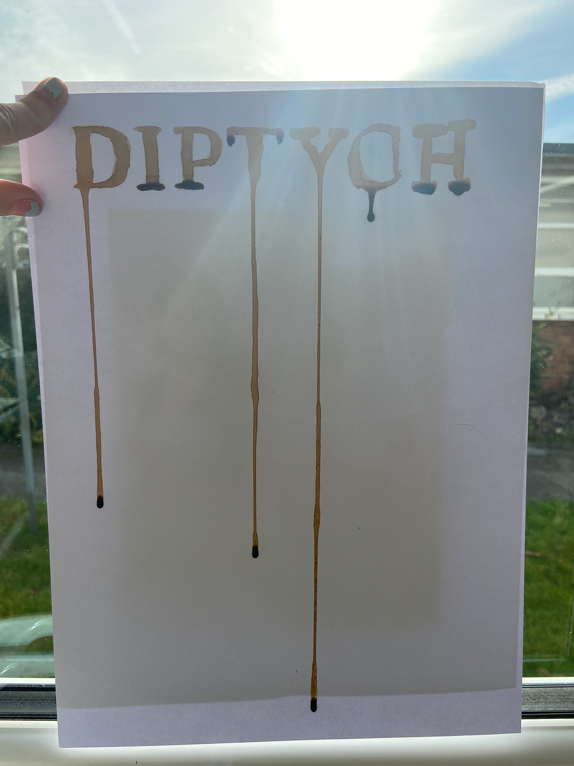
Initial mastheads were developed and critically discussed where it was decided there was potential in the dripping lettering concept as the magazine focuses on art.
However, this masthead needed much work, as the stiff Roman letters contrasted too starkly against the fluidity of the dripping effect.
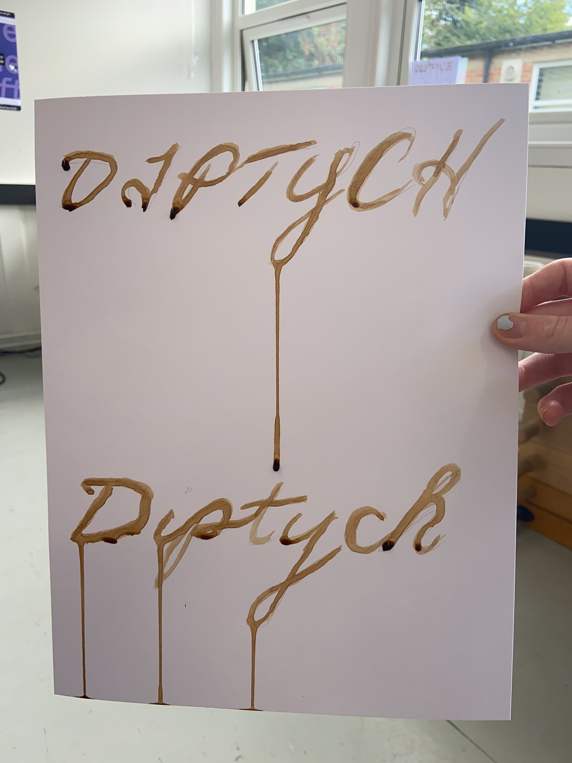
Due to this unsuccessful stark contrast, a more organic and fluid approach was trialed, using liquid and painting on letters to observe how they would naturally run down a page.
Initial mastheads were developed and critically discussed where it was decided there was potential in the dripping lettering concept as the magazine focuses on art.
However, this masthead needed much work, as the stiff Roman letters contrasted too starkly against the fluidity of the dripping effect.
Due to this unsuccessful stark contrast, a more organic and fluid approach was trialed, using liquid and painting on letters to observe how they would naturally run down a page.
Cover development & finishes
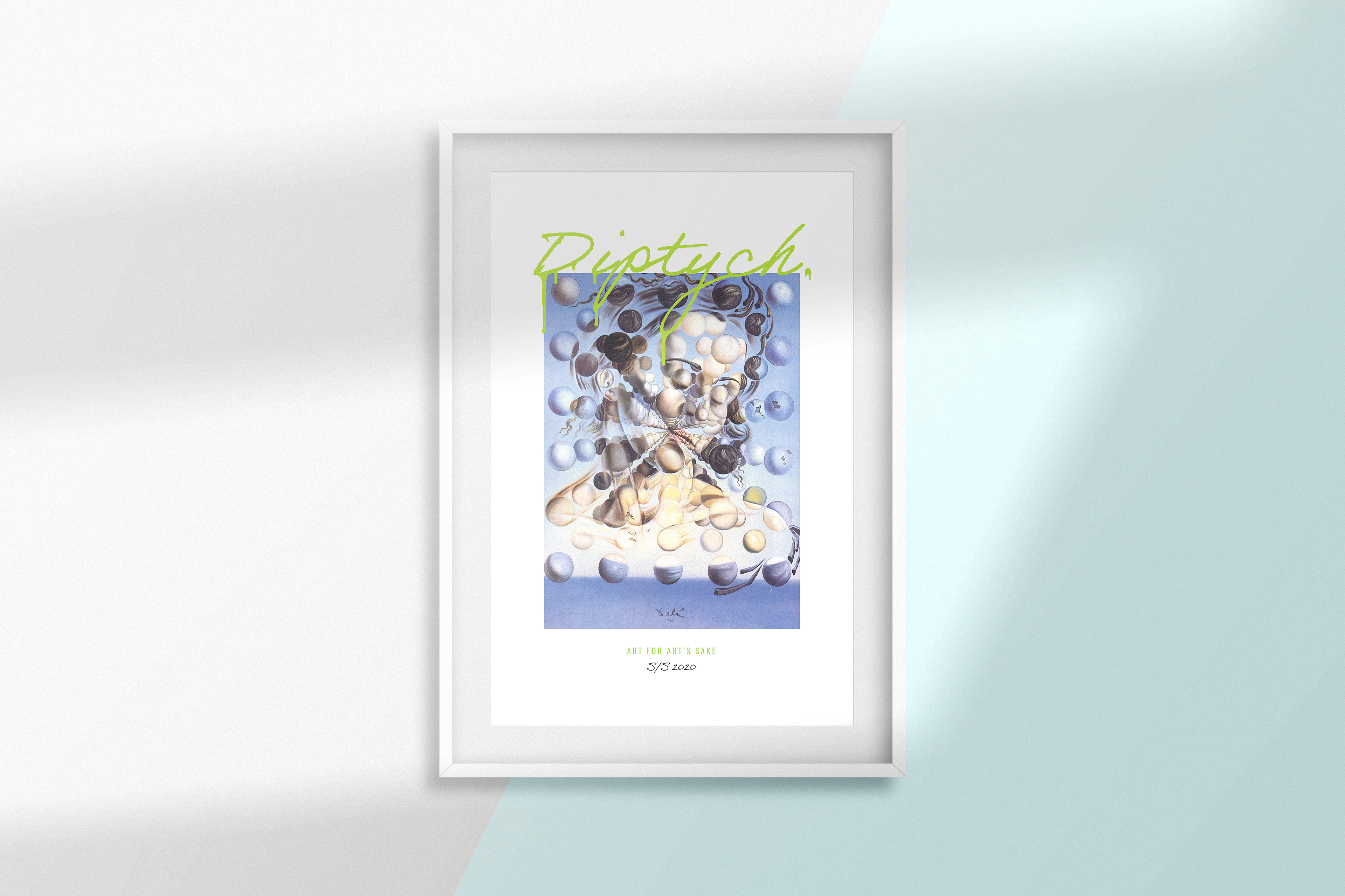
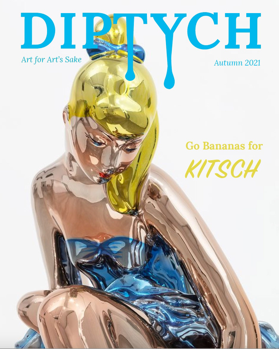
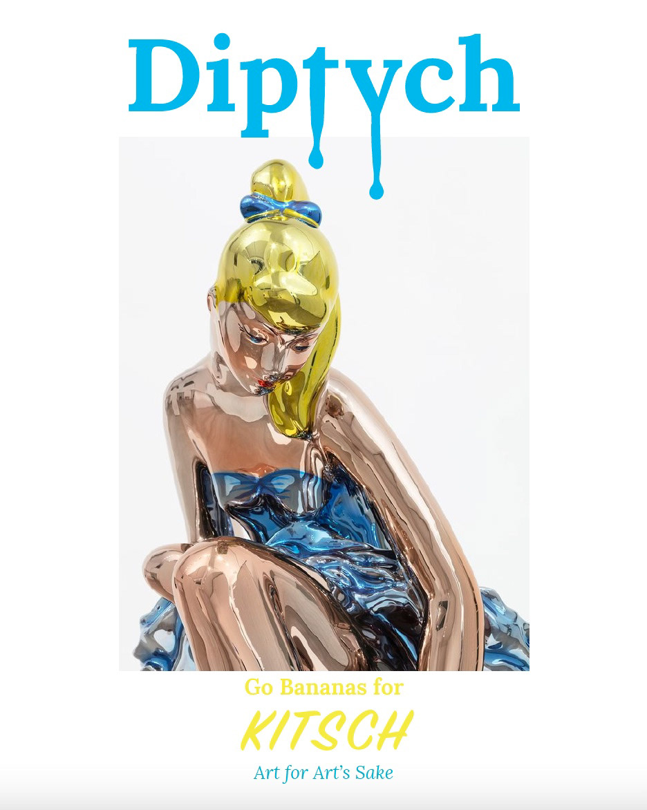
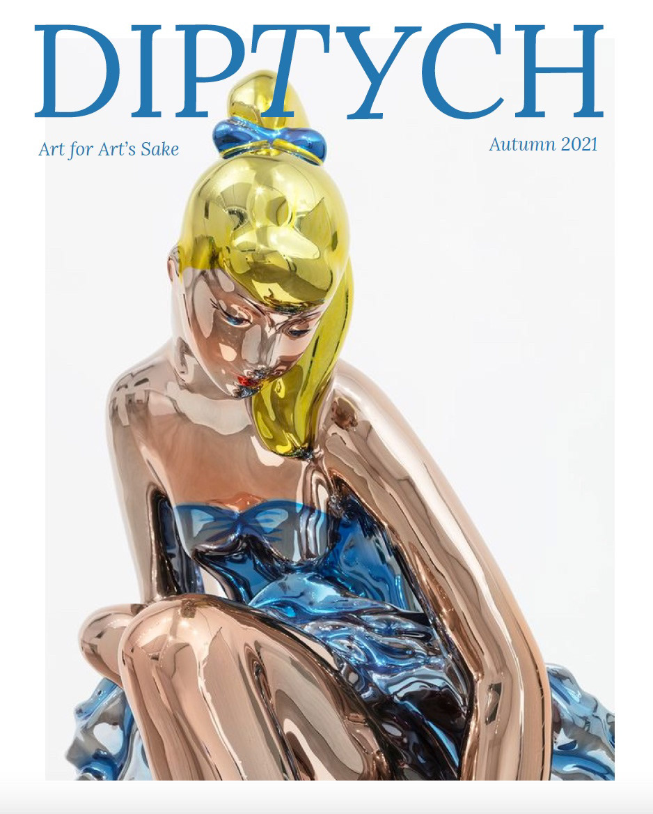
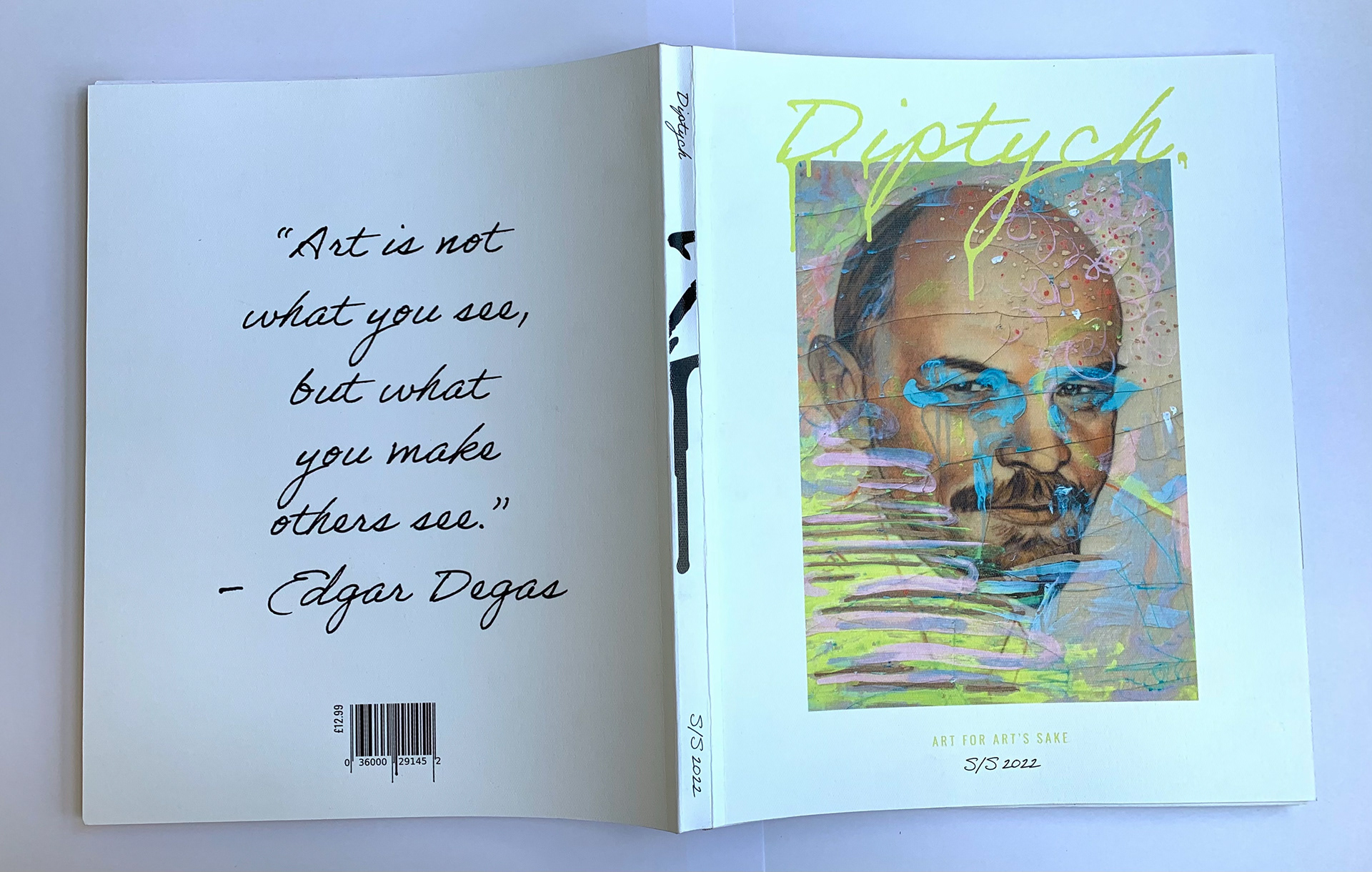
A digital version of the hand-drawn fluid masthead was created. A large border was placed around the cover image, firstly to eliminate the problem of various colours of type disappearing into the imagery below and secondly to emulate the large mount features in picture frames to further bring a modern art-like quality to the cover.
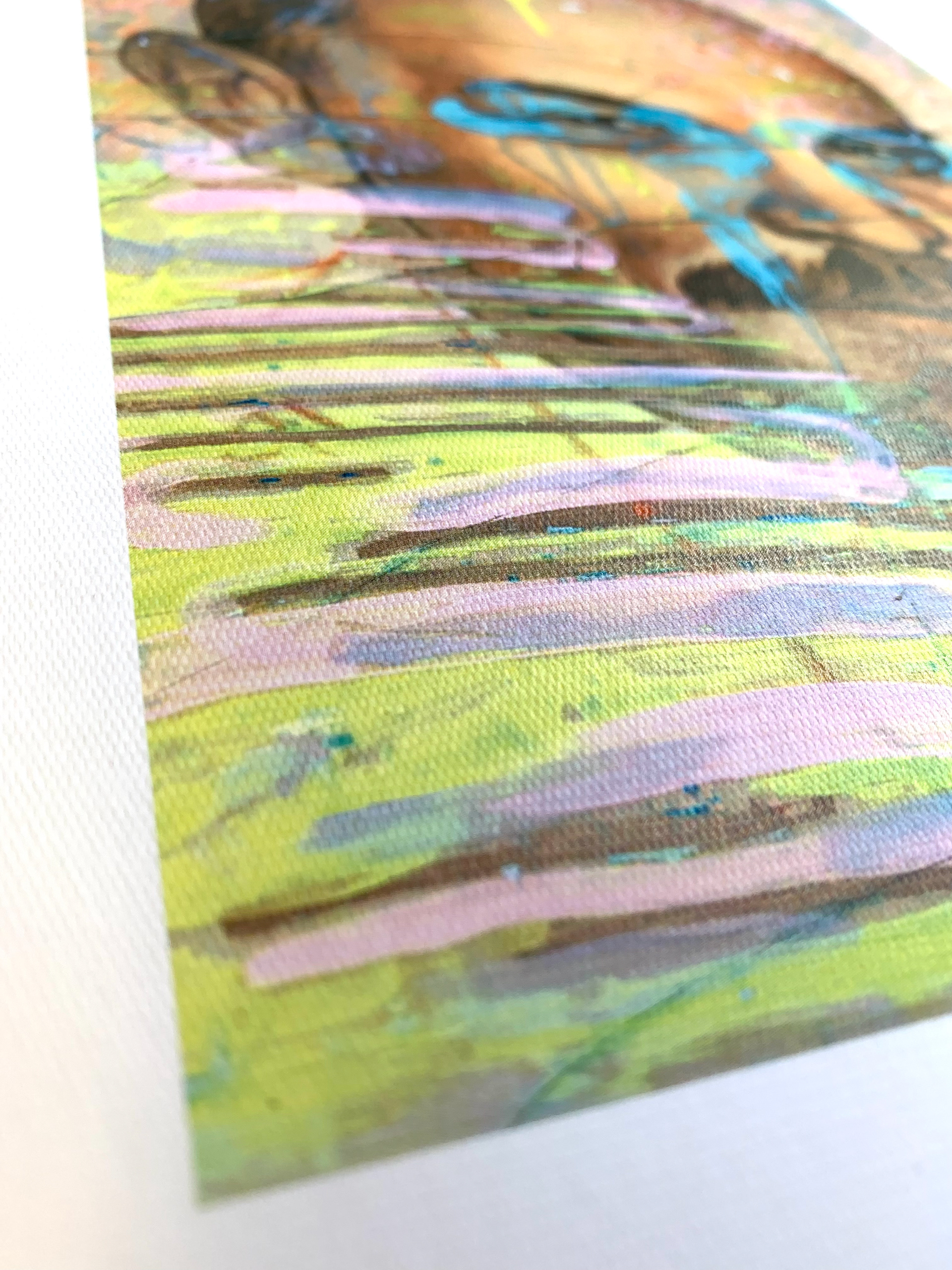
To further emphasise that this was an art-focused magazine various paper stocks were trialed to mimic canvas to create an effect that the cover imagery and masthead were painted onto a canvas.
A digital version of the hand-drawn fluid masthead was created. A large border was placed around the cover image, firstly to eliminate the problem of various colours of type disappearing into the imagery below and secondly to emulate the large mount features in picture frames to further bring a modern art-like quality to the cover.
To further emphasise that this was an art-focused magazine various paper stocks were trialed to mimic canvas to create an effect that the cover imagery and masthead were painted onto a canvas.
For full details of various covers, spines, and back covers see the pitch document below.
Initial experimentation
Exploring bringing personality and an element of surprise to spread layouts. These were found to be inconsistent with the brand identity of the magazine.
Exploring bringing personality and an element of surprise to spread layouts. These were found to be inconsistent with the brand identity of the magazine.
Typographic variation
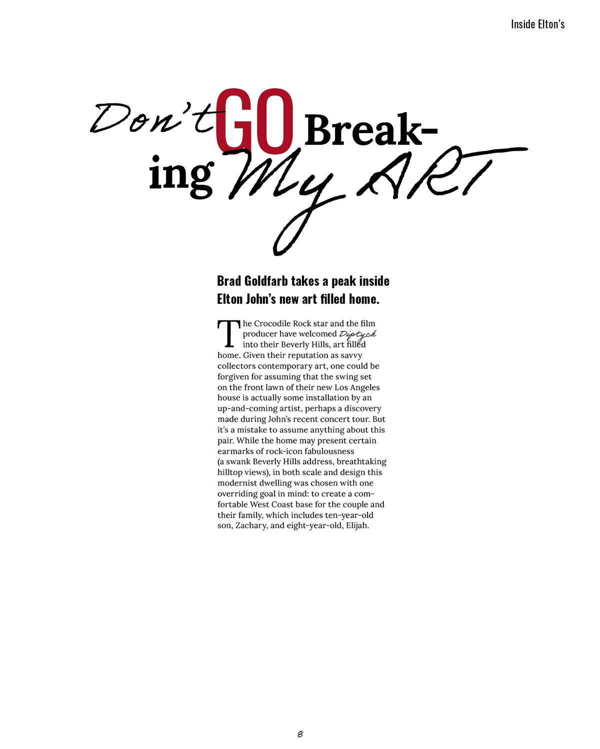
Talking about initial spread ideas and typeface
Lora oswald etc.... elegant meets artistic. dots to show the end of article personality etc. not replicable
Talking about initial spread ideas and typeface
Lora oswald etc.... elegant meets artistic. dots to show the end of article personality etc. not replicable
Spreads & pages
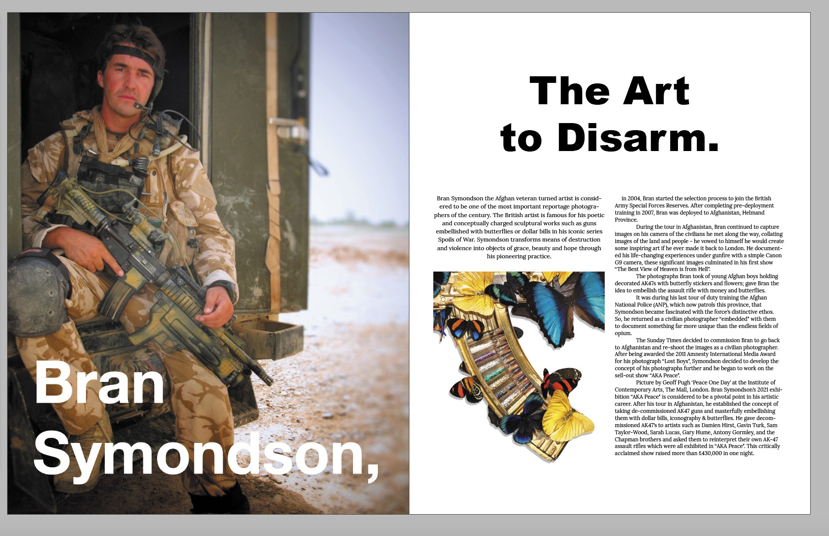
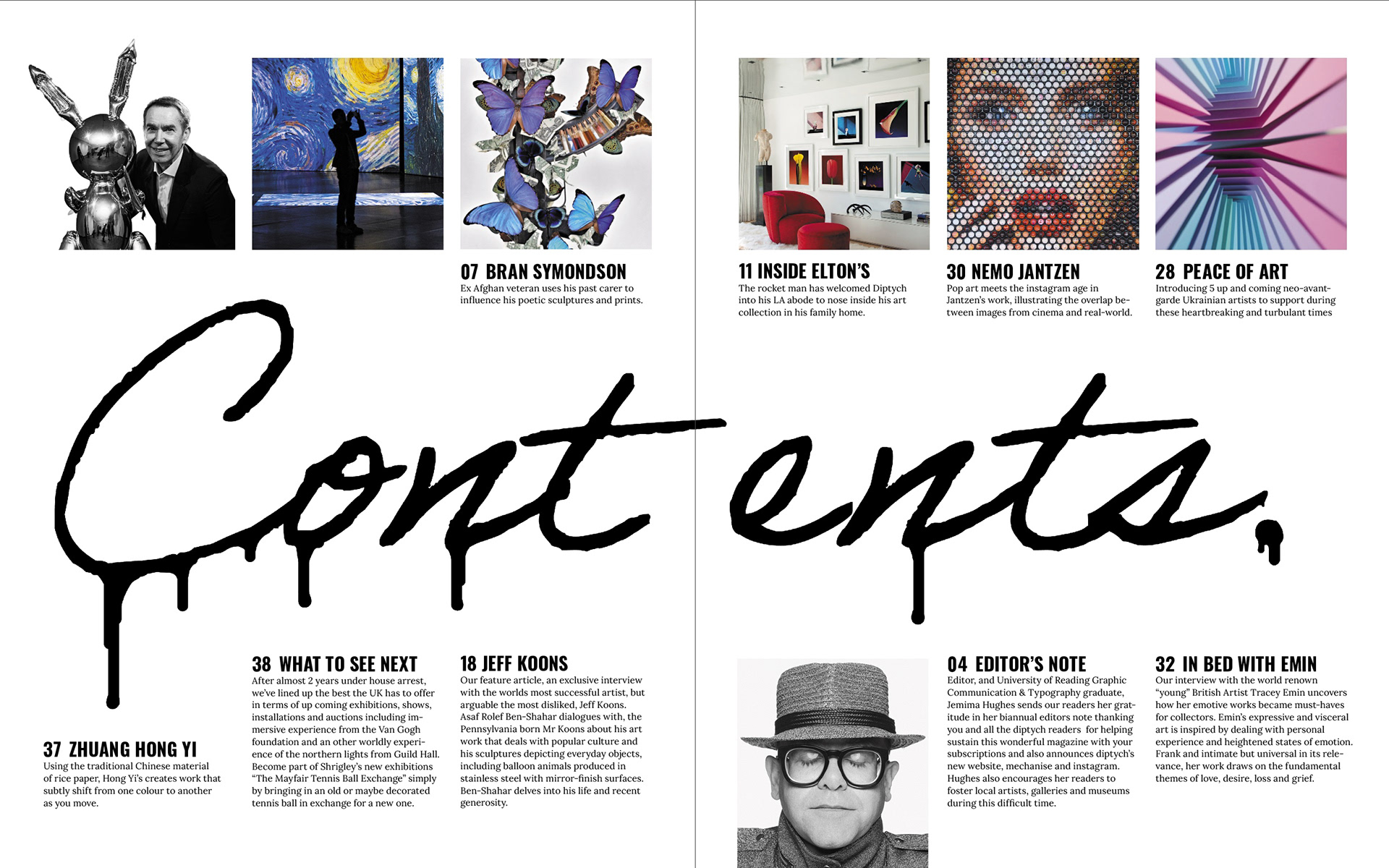
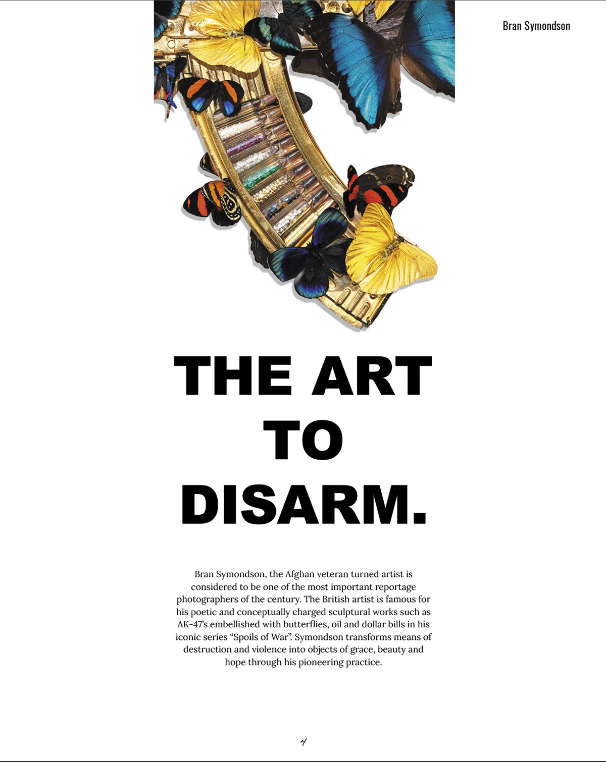
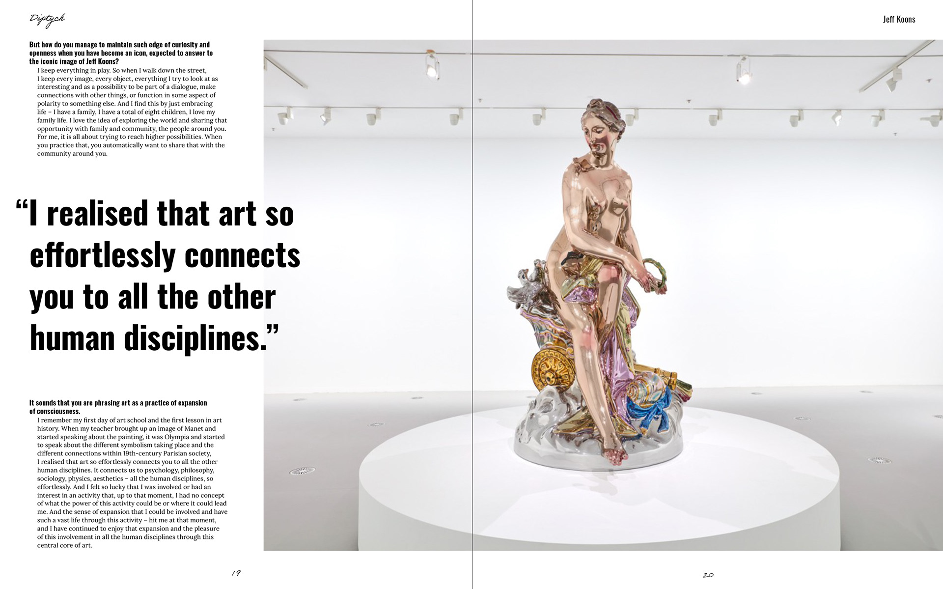
Whilst the full magazine can be seen below, there is often a reoccurring theme in the layout, as shown in the selected spreads. These selected spreads use the rule of thirds to create verticle and horizontal strips that lead the viewer's eye across or up the page. Having this reoccurring layout helps create spreads that look like they all belong together and create a recognisable identity for Diptych.
Whilst the full magazine can be seen below, there is often a reoccurring theme in the layout, as shown in the selected spreads. These selected spreads use the rule of thirds to create verticle and horizontal strips that lead the viewer's eye across or up the page. Having this reoccurring layout helps create spreads that look like they all belong together and create a recognisable identity for Diptych.
The Pitch:
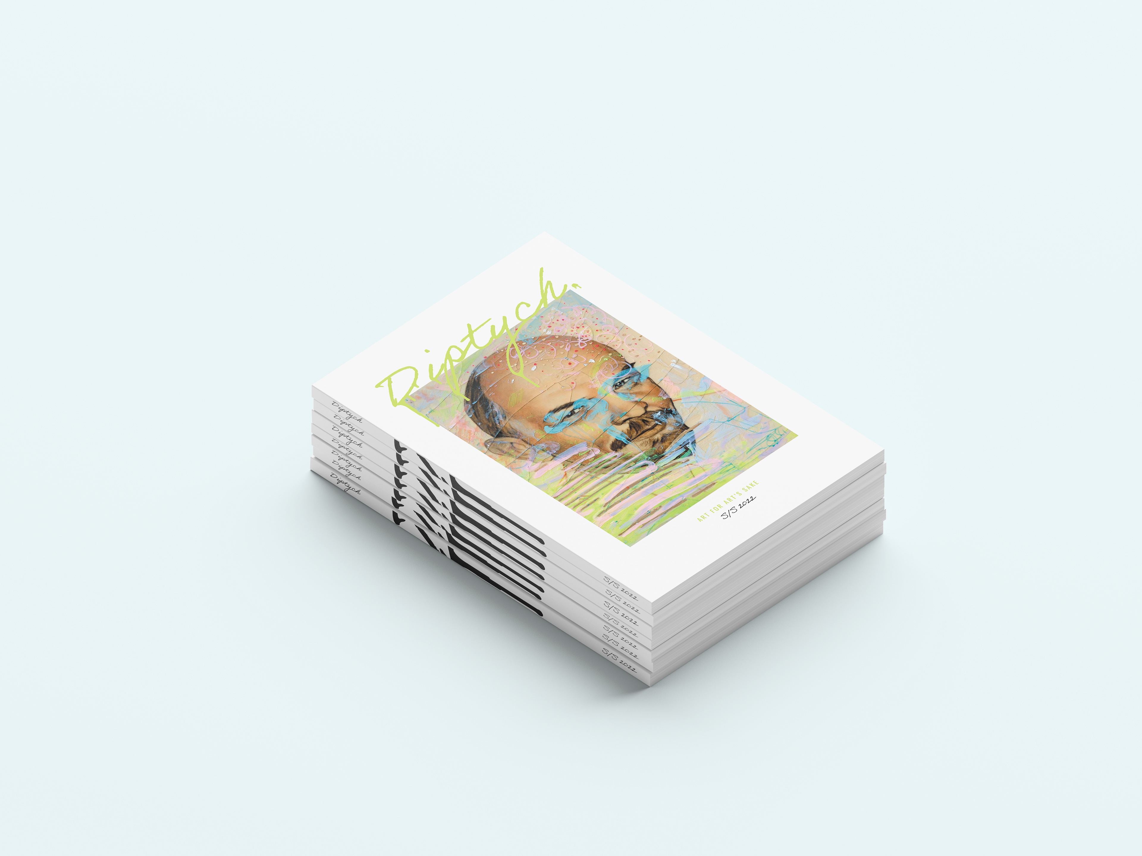
DIPTYCH S/S 2022 issue:
Diptych's online presence:
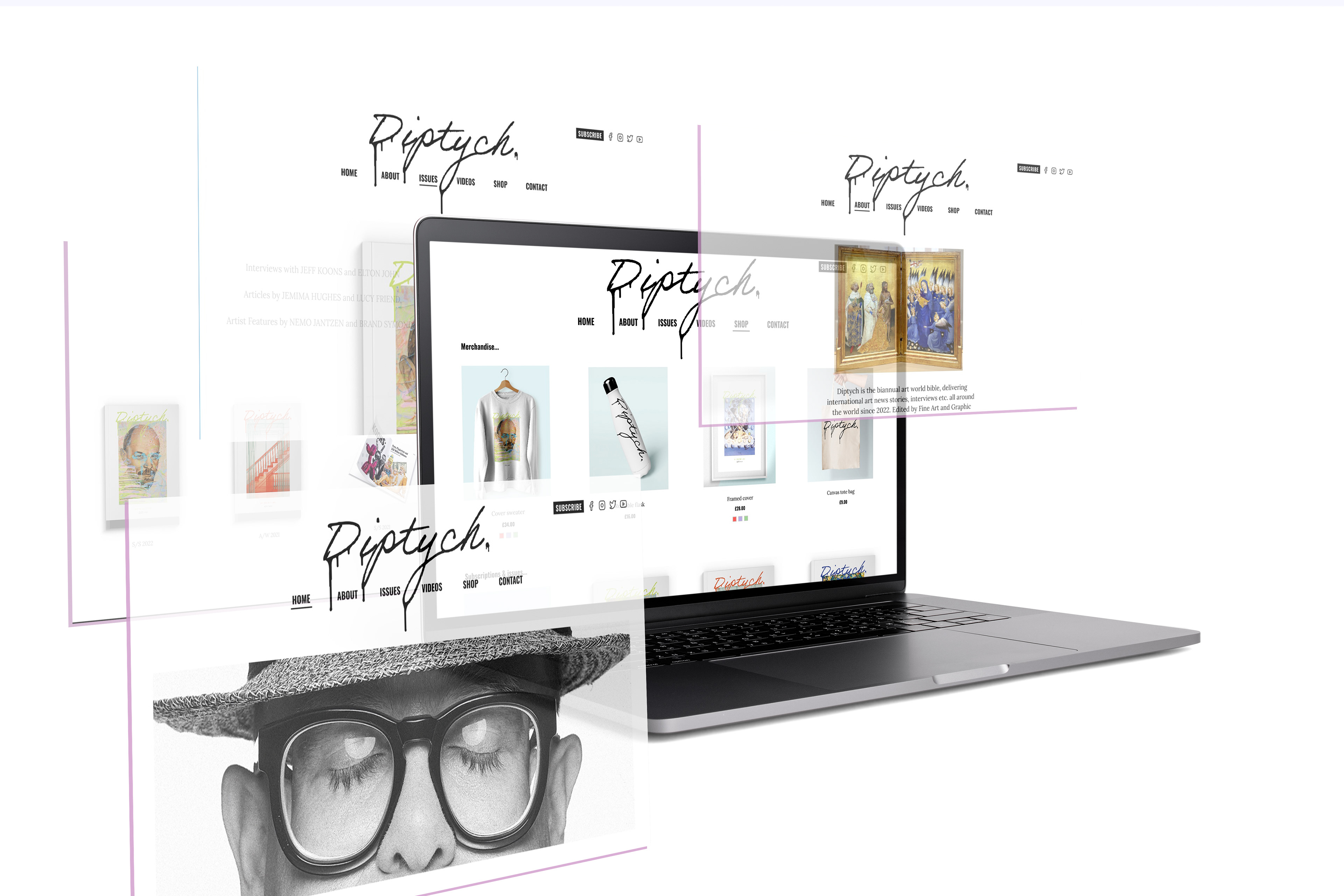
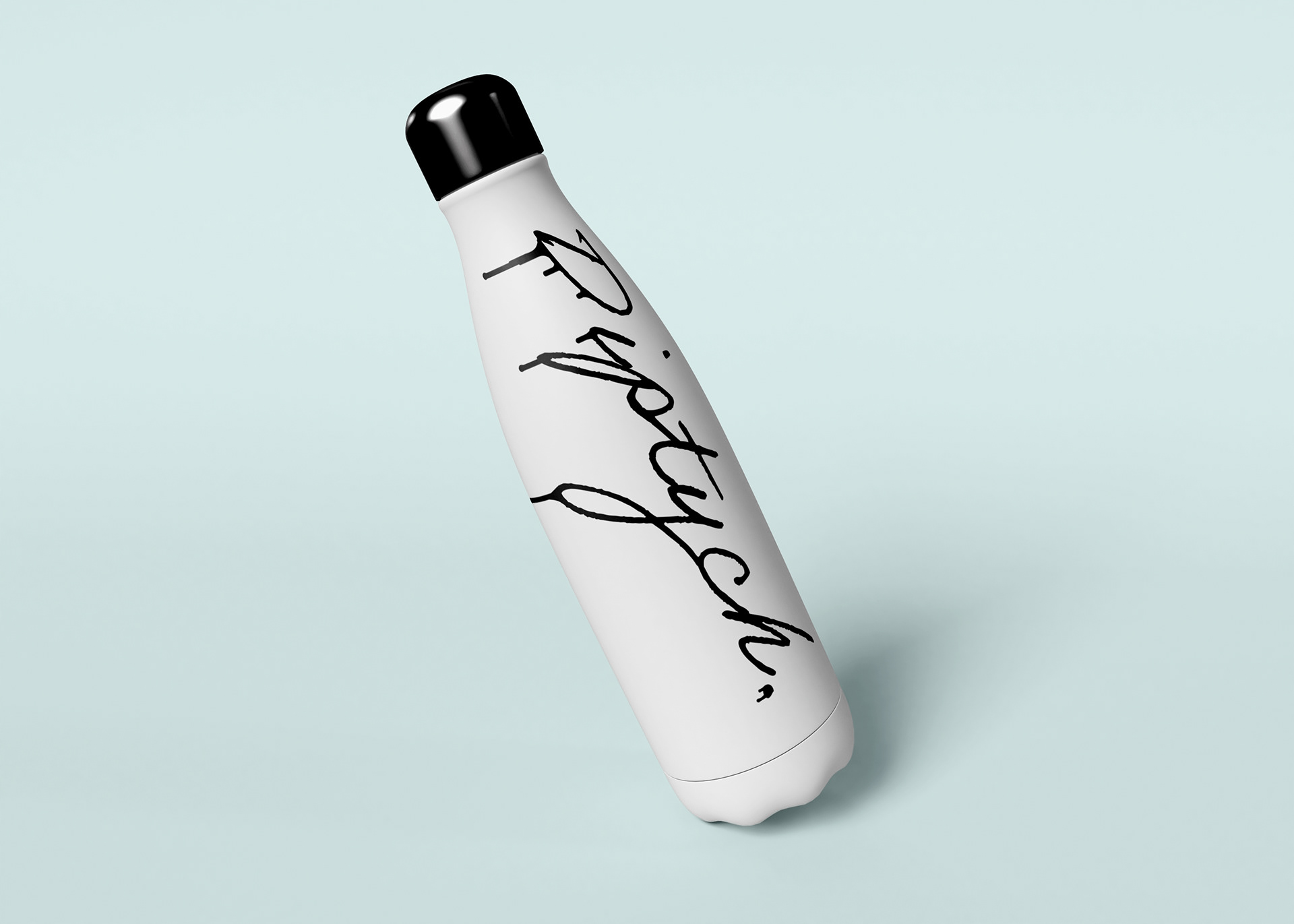
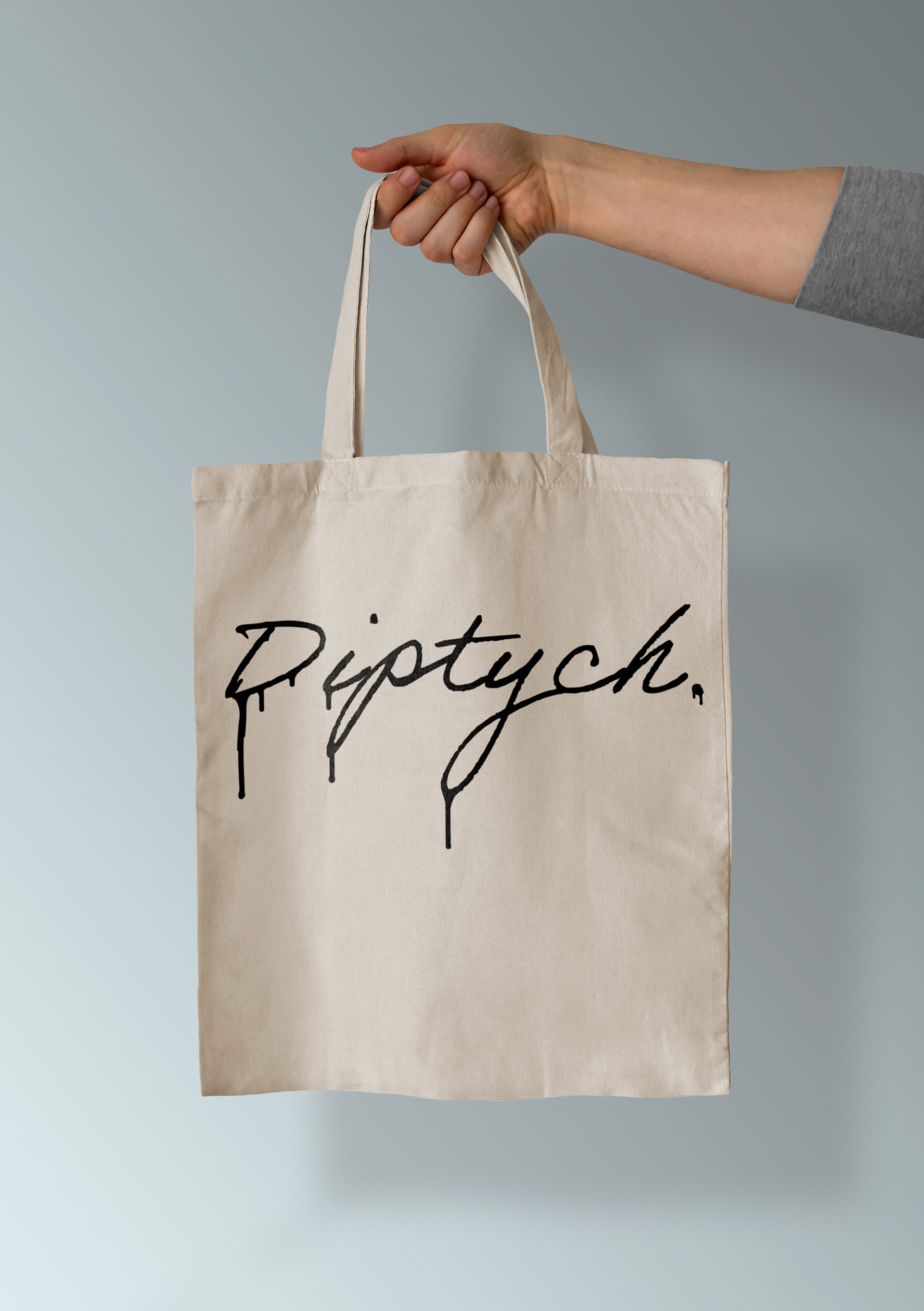
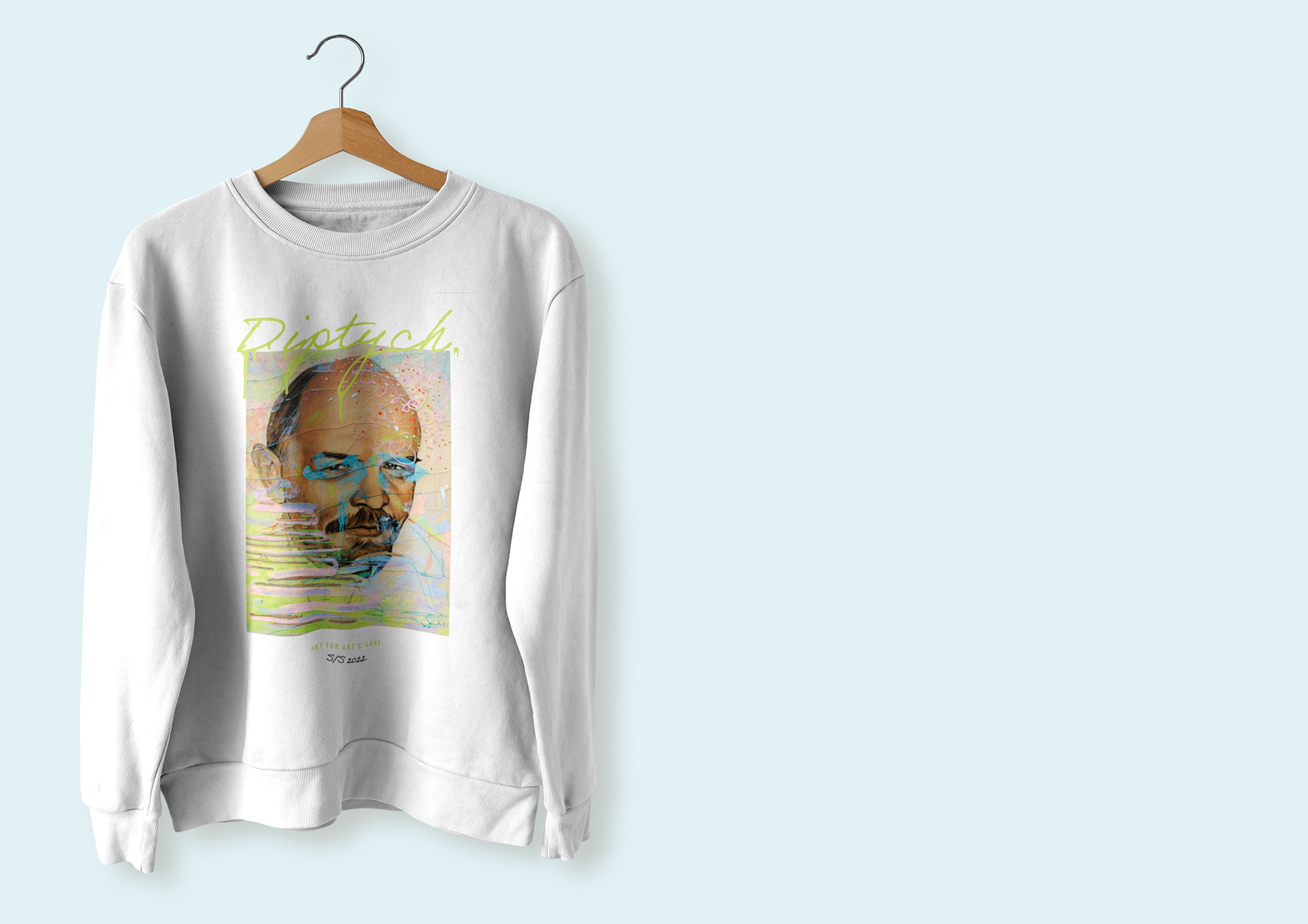
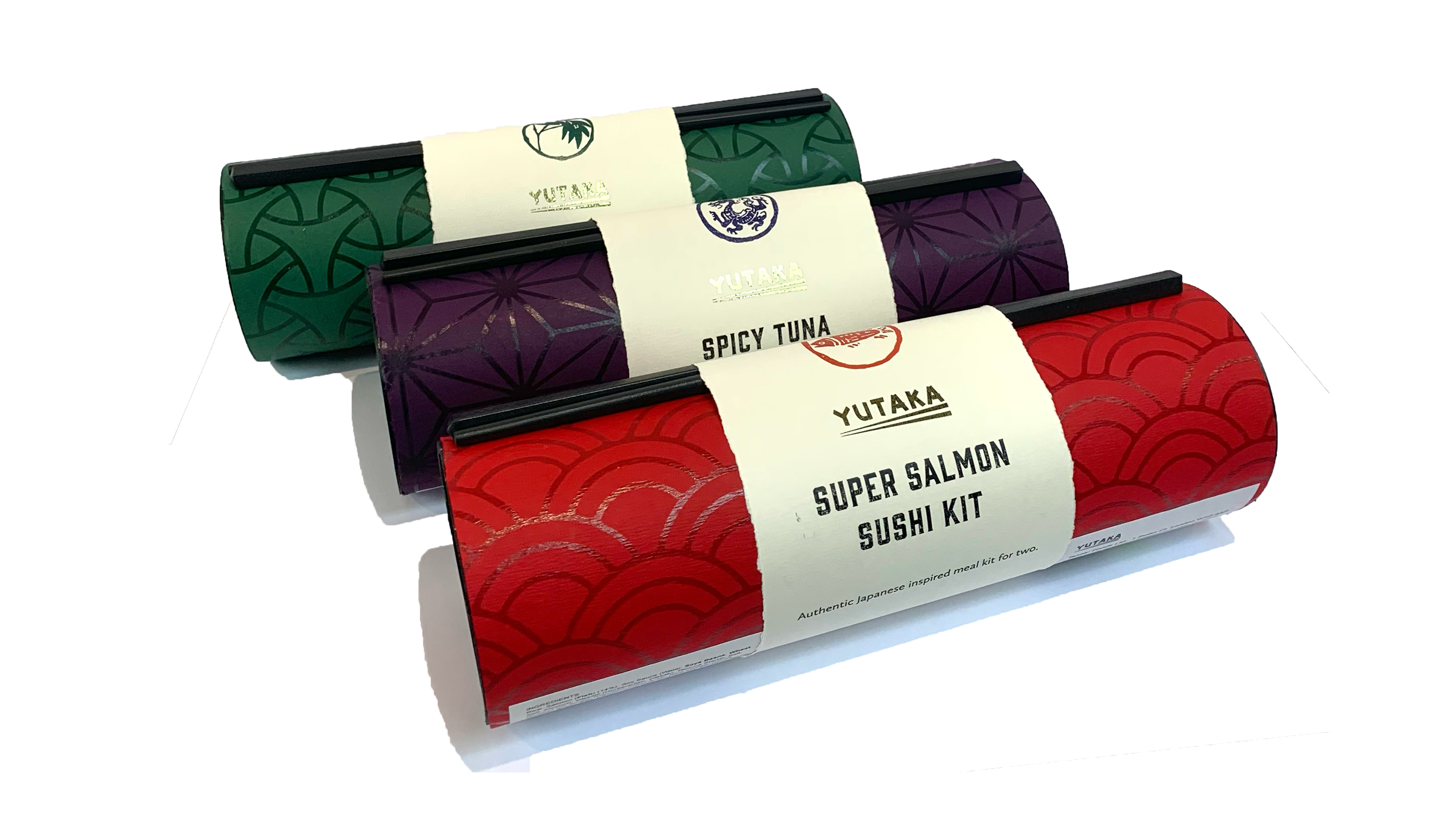
Merchandise mock-ups: